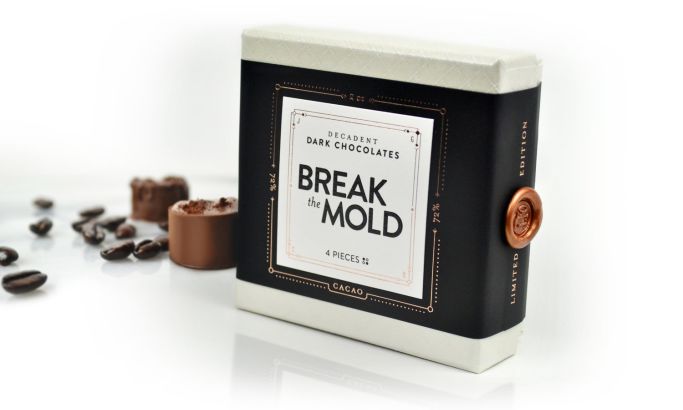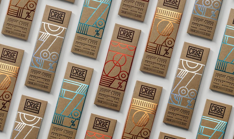
Standout Features:
- Uncoated kraft board packaging
- Metallic foil-stamped geometric patterns
- A restrained color palette
Crude Raw Chocolate embraces minimalism, but not in the predictable, stripped-down way. Designed by Happycentro, the packaging effortlessly balances raw and refined — pairing untreated, textured kraft board with shimmering metallic foil in a way that feels both natural and high-end.
The packaging leans into the honesty of the product itself. The uncoated, corrugated material speaks to its organic, unprocessed nature, reinforcing the brand’s commitment to simplicity.
But then comes the unexpected: intricate geometric patterns in metallic foil, applied in a way that recalls Art Deco elegance. These lines aren’t purely decorative; they create structure, guiding the eye and giving each chocolate bar a distinct presence.
The muted earth tones of the kraft board provide a neutral base, allowing the restrained use of color (subtle blue, copper, silver, and gold foils) to stand out. The effect is sophisticated yet restrained, a visual metaphor for purity meeting indulgence. Unlike many organic brands that rely on earthy, hand-drawn elements, Crude Raw Chocolate proves that sustainability and luxury aren’t mutually exclusive.
This is a masterclass in using materiality as a design language. The juxtaposition of rough and polished, matte and reflective, traditional and modern creates chocolate packaging that isn’t just beautiful — it’s one that also tells a story.