Team Behind the Design
Packaging Design Analysis
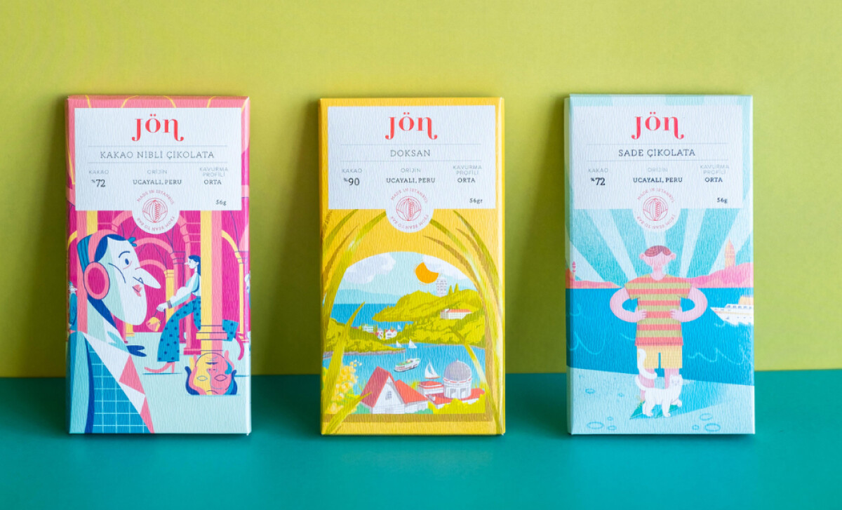
Jön Chocolate transforms packaging into an artistic celebration of place and culture.
Created by Nihan Aydın, this chocolate packaging design merges fine art and brand storytelling, with each bar serving as a visual love letter to Istanbul’s creative pulse.
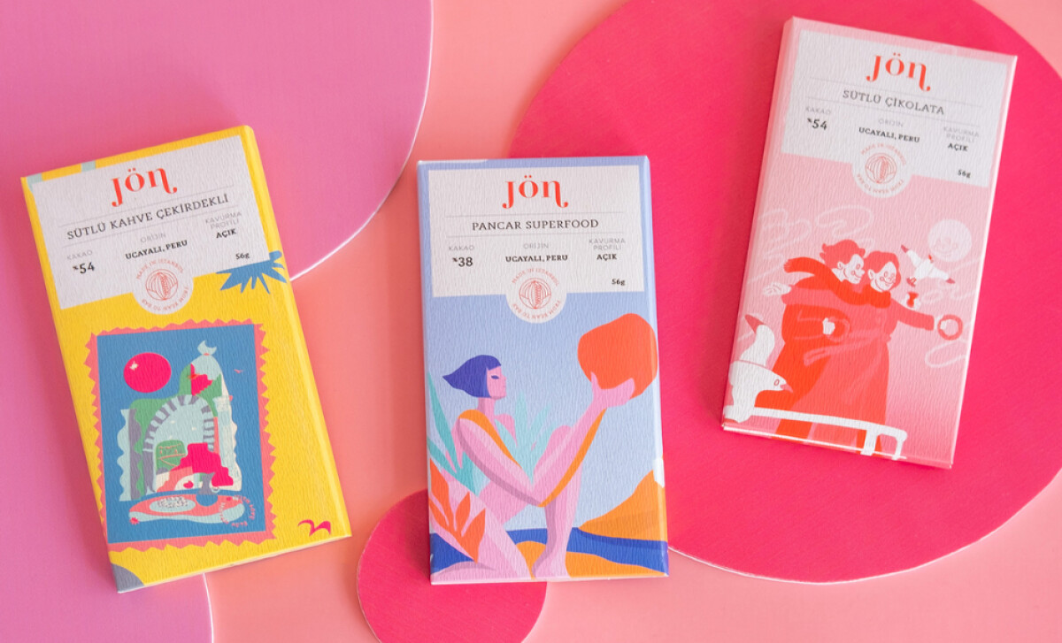
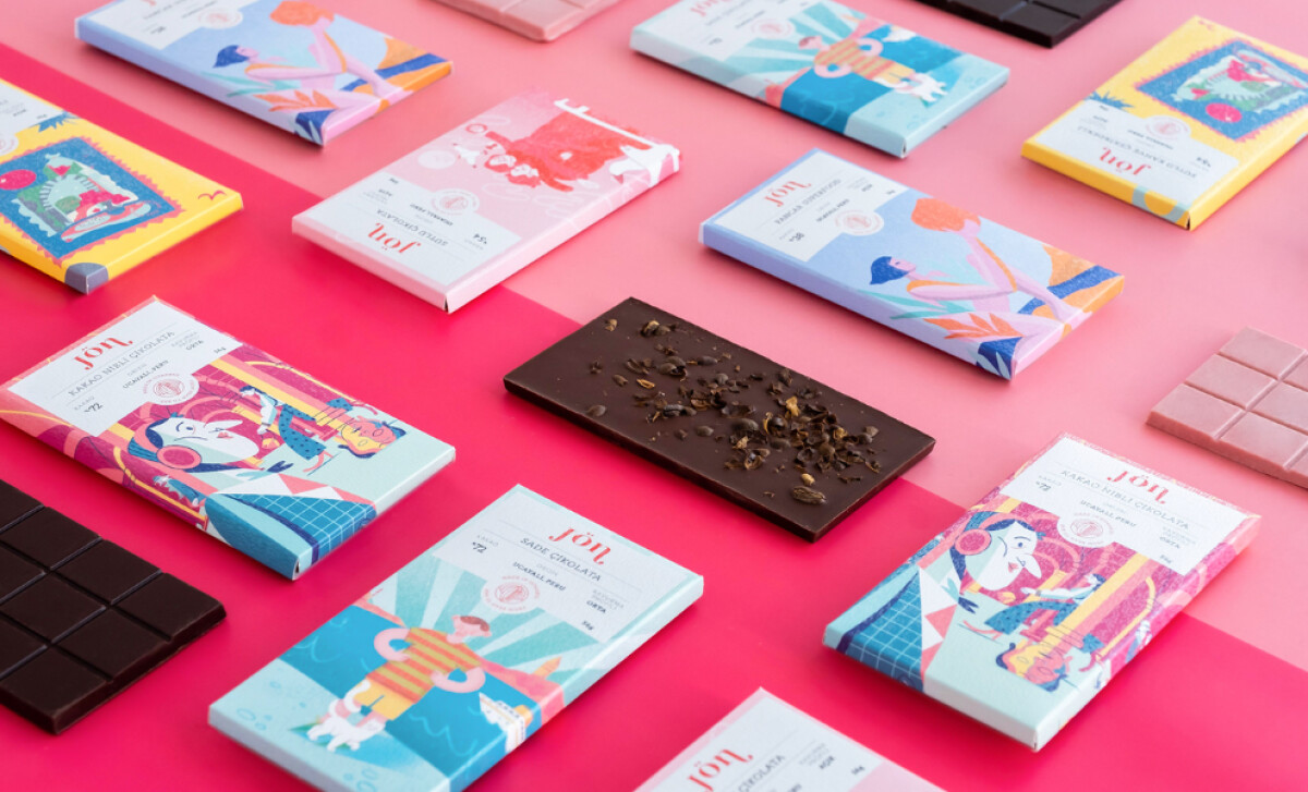
- Illustration and Storytelling: Each bar carries artwork from an Istanbul-based illustrator, turning the packaging into a small rotating gallery of local talent. The geometric shapes and warm tones reflect the city’s creative pulse. Every design feels personal and expressive, giving the brand a sense of cultural life.
- Typography and Layout: The wordmark “Jön” appears in an elegant serif and pairs with minimalist sans serif details for flavor and origin. Clear hierarchy adds structure and calm, balancing the illustrations’ energy with thoughtful order. The result feels both sophisticated and grounded.
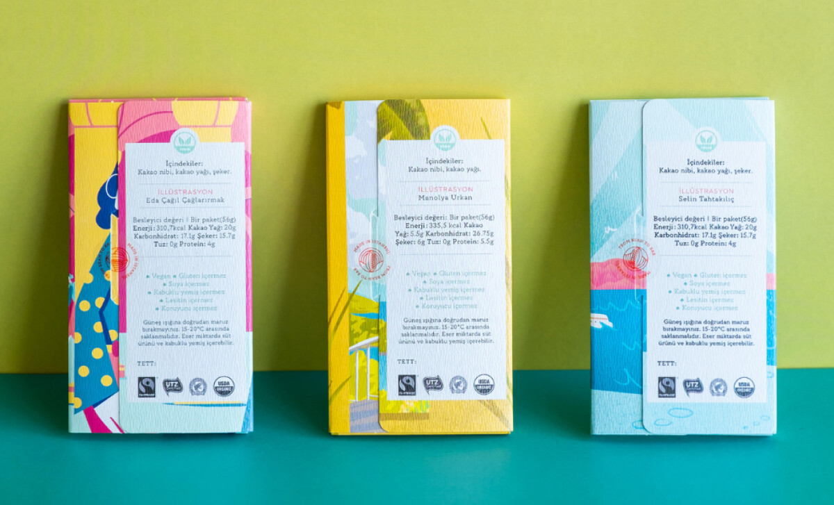
- Color and Texture: The palette includes coral reds, sea blues, and soft yellows that feel joyful yet refined. A matte finish and embossed logo add tactile depth, making the unboxing feel intentional and crafted. Each bar carries a handmade quality that matches its bean-to-bar authenticity.
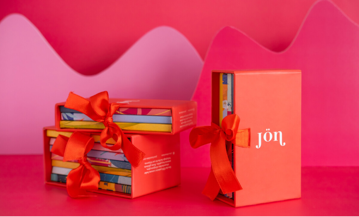
- System and Presentation: The coordinated box set, wrapped in vivid red and finished with white foil branding, extends the design from product to gift. It captures Jön’s dual character, artisanal yet cosmopolitan, made for both everyday enjoyment and special occasions.
What Brands & Agencies Can Learn from Jön Chocolate
Nihan Aydın’s packaging for Jön Chocolate shows how design can celebrate local culture while reaching a global audience.
1. Celebrate Local Voices
Working with local artists adds honesty and depth. When packaging reflects community creativity, it turns products into cultural expressions instead of simple goods.
2. Balance Expression with Structure
Bold illustration pairs well with clear typography and order. A structured system keeps visual variety cohesive, allowing creative freedom to exist within a stable framework.
3. Make Texture Part of the Story
Paper grain, embossing, and finish communicate craftsmanship before the package is even opened. These tactile details create an emotional connection and heighten the sense of quality.
About DesignRush Featured Designs
At DesignRush, we review hundreds of agency projects each month. The featured designs stand out for creativity, relevance, and execution.
Many go on to be recognized as winners of our Monthly Design Awards.
Explore more creative work here:
- Best Packaging Designs
- Best Website Designs
- Best App Designs
- Best Logo Designs
- Best Print Designs
- Best Video Designs
For a full list of design agencies and related services, see our Agency Directory.