- Agency: Purposyn
- Client: Key Kafé
- Category: Packaging – Food & Beverage
- Location: Pensacola, Florida, United States
- Project Brief: Design a packaging system for Key Kafé that supports a premium café experience while reinforcing professionalism, wellness, and community connection tied to the Key Brands ecosystem.
My approach to evaluating food and beverage packaging centers on clarity and restraint.
The Key Kafé system works because it balances organization with a relaxed, approachable tone.
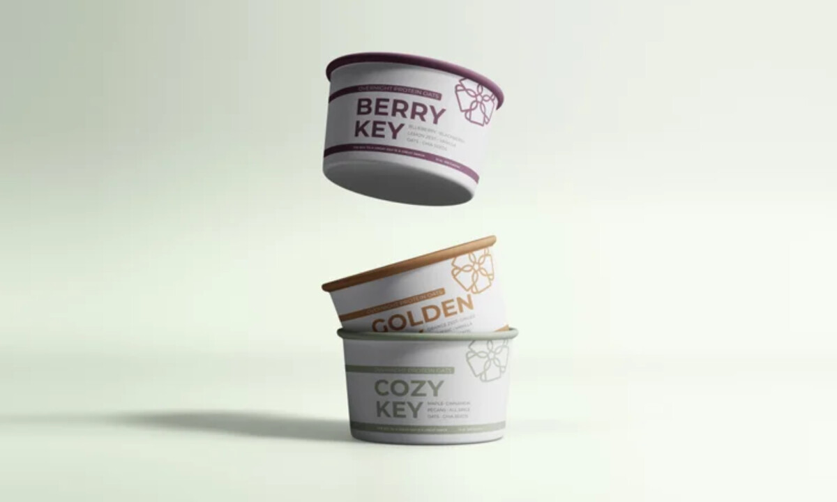
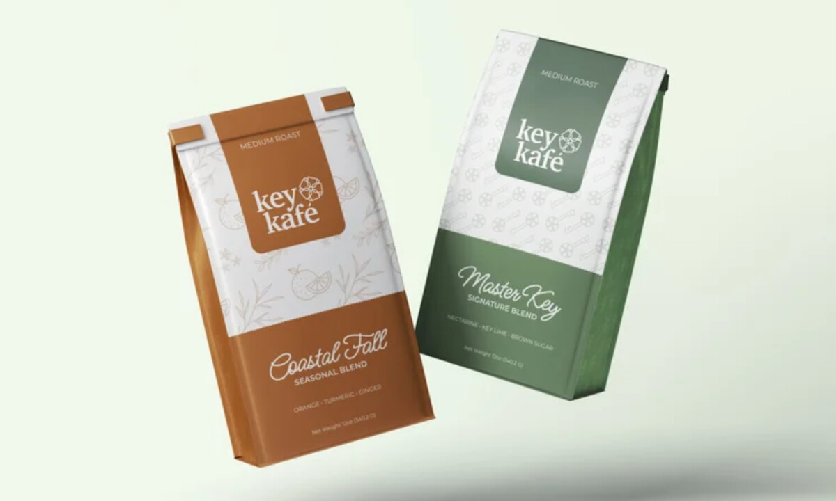
- Color System: I like how the earth-toned palette signals wellness right away. Muted greens, caramels, and warm neutrals feel grounded and nourishing, helping the brand stand apart from louder, high-energy coffee competitors.
- Typography: The refined serif wordmark paired with clean sans-serif supporting text feels considered and appropriate. Script accents are used sparingly on blend names, adding warmth without tipping into decoration and keeping the system professional yet human.
- Pattern & Symbol Use: The repeating key motif works best as a quiet secondary layer. I appreciate how it appears as texture on bags, cups, and packaging bases rather than competing with the logo, reinforcing identity without visual noise.
- System Modularity: Consistent layout logic across cups, bags, bottles, and printed materials creates clarity in a busy café environment. This modular structure makes the system easy to scale as the menu evolves while preserving hierarchy and cohesion.
What Brands & Agencies Can Learn from Key Kafé
1. Use Calm Color to Build Trust
Muted, wellness-led palettes can create approachability and credibility, especially in spaces designed for connection rather than urgency.
2. Separate Brand Voice from Functional Information
Clear typographic roles help customers scan quickly while still absorbing brand personality. This balance is essential in fast-moving food and beverage settings.
3. Design Packaging as an Extension of Place
When packaging reflects the atmosphere of the physical space, the experience feels unified. Consistency across products reinforces intention, care, and long-term brand equity.