Team Behind the Design
Packaging Design Analysis
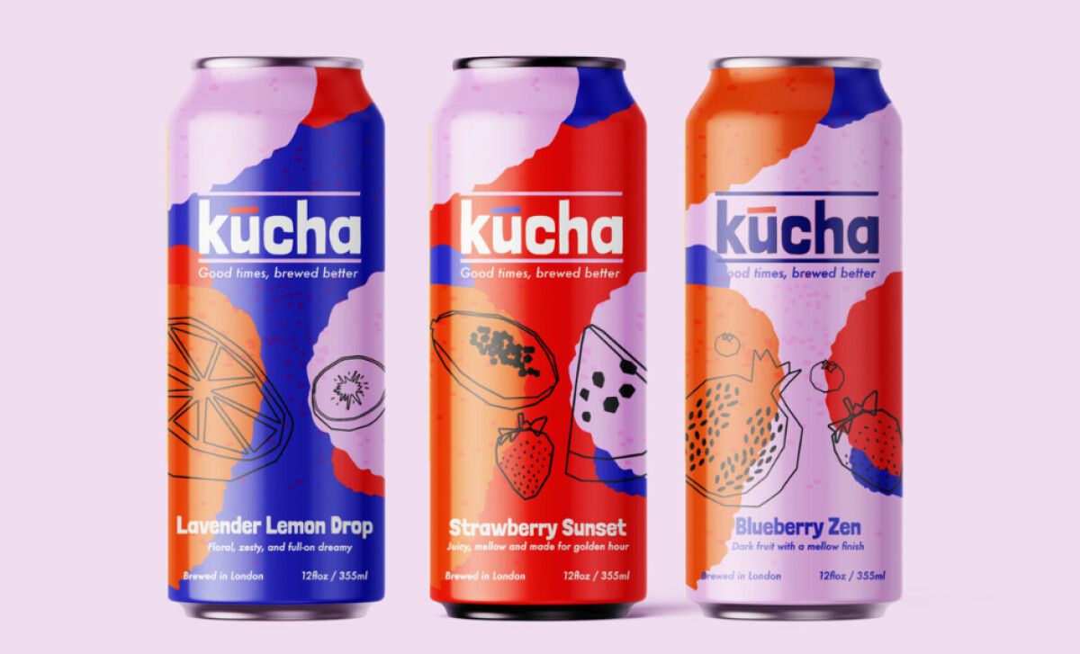
When I evaluate beverage packaging, I look for how color, hierarchy, and illustration work together to convey flavor and personality at a glance.
Kucha excels by presenting kombucha as a celebratory drink, not just a functional wellness beverage.
- Layout & Structure: Each flavor uses overlapping shapes in vivid blues, reds, oranges, lavenders, and pinks. I like how the asymmetry creates a sense of movement, almost like spilled pigment, giving the cans a joyful rhythm that stands out on shelf.
- Illustration Style: The loose black-outline drawings of lemon wheels, strawberries, dragonfruit, and blueberries add flavor cues without clutter. Their hand-drawn feel brings a human touch that fits kombucha’s crafted, fermented character.
- Typography & Recognition: The bold, rounded sans-serif logo, especially the accented “u,” makes the brand instantly recognizable. Paired with clean geometric type for flavor names, the typography blends friendliness with clarity.
- Flavor Messaging: Short lines like “Floral, zesty and full-on dreamy” or “Juicy, mellow and made for golden hour” give each can a small emotional frame. I appreciate how these micro-statements reinforce the colors and illustrations, turning each flavor into its own little identity moment.
What Brands & Agencies Can Learn from Kucha
Here are a few key lessons from Kucha’s packaging design:
1. Use Color Architecture to Differentiate SKUs
Bold, intentional color blocking helps consumers recognize flavors instantly and builds a memorable visual system across a product lineup.
2. Balance Craft with Modern Appeal
Simple line-art illustrations introduce authenticity without overwhelming the design, helping brands communicate natural ingredients in a contemporary way.
3. Pair Clear Typography with Emotional Messaging
Flavor mood statements add personality and help consumers connect the drink with moments or experiences, strengthening lifestyle positioning.
About DesignRush Featured Designs
At DesignRush, we review hundreds of agency projects each month. The featured designs stand out for creativity, relevance, and execution.
Many go on to be recognized as winners of our Monthly Design Awards.
Explore more creative work here:
- Best Packaging Designs
- Best Website Designs
- Best App Designs
- Best Logo Designs
- Best Print Designs
- Best Video Designs
For a full list of design agencies and related services, see our Agency Directory.
-image1-preview.jpg)

-preview.jpg)
-preview.jpg)