Team Behind the Design
Agency: Syrah Uy
Client: L'Incanto Cafe
Category: Packaging Design (Food & Beverage)
Location: Montevideo, Uruguay
Project Brief: Design packaging that strengthens Lincanto Cafe’s shelf appeal and recognition with bold colors and illustrated bean graphics.
Packaging Design Analysis
Related Articles
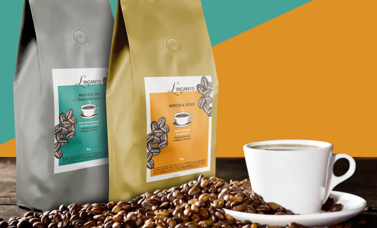
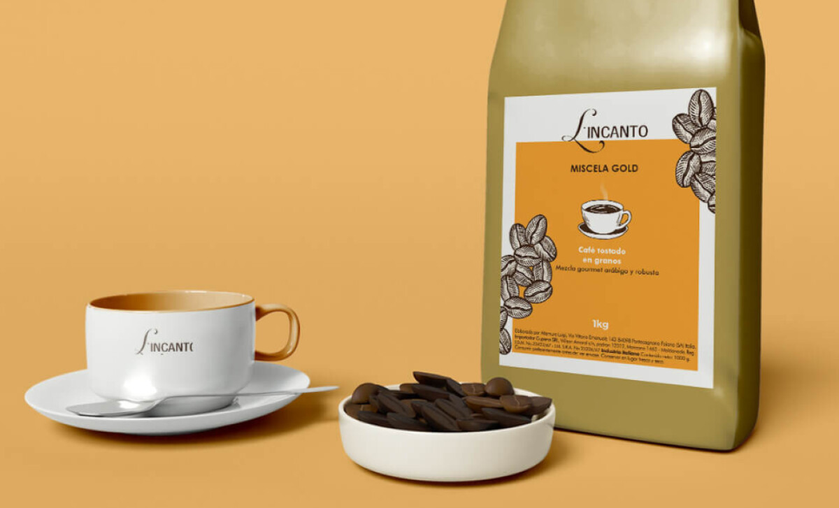
When I review food and beverage packagings, I often focus on structure, shelf impact, information hierarchy, and visual storytelling.
- Structure & Practicality: I appreciate the clean, resealable bag format. It communicates quality while keeping the coffee fresh.
- Shelf Impact: The bold yellow and teal blocks paired with white labels stand out on crowded retail shelves. Strong contrast helps buyers instantly identify product variants.
- Information Hierarchy: The label highlights product type (Miscela Gold, Miscela Dek) clearly at the top, while the illustrated coffee beans frame the composition without distracting from key details.
- Brand Storytelling: The illustrated beans and steaming cup add warmth and authenticity, reinforcing L'Incanto’s Italian coffee heritage in a relatable way.
Receive proposals from top packaging design agencies. It’s free.
GET PROPOSALS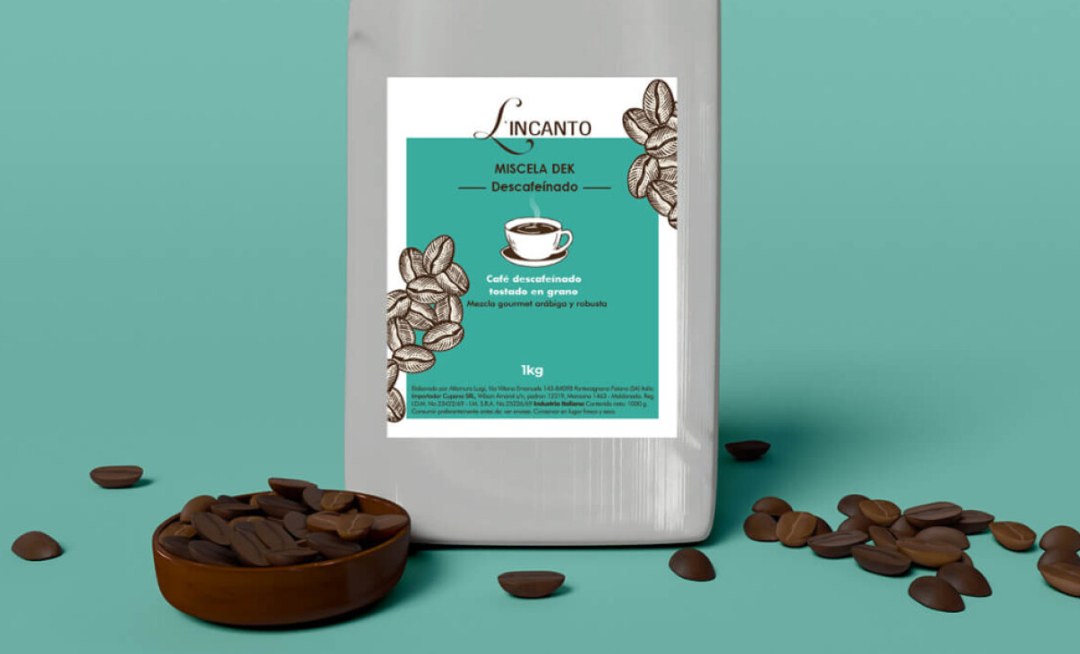
About DesignRush Featured Designs
At DesignRush, we review hundreds of agency projects each month. The featured designs represent some of the most compelling, standing out for creativity, relevance, and execution.
The best among them advance to our Monthly Design Awards as a mark of industry recognition.
Looking for inspiration across industries? Explore:
- Best Packaging Designs
- Best Website Designs
- Best App Designs
- Best Logo Designs
- Best Print Designs
- Best Video Designs
For a full list of design agencies and related services, see our Agency Directory.
Get a chance to become the next Design Awards winner.
SUBMIT YOUR DESIGN-preview.jpg)

-preview.jpg)
