Standout Features:
- Clever use of three colors
- Street art inspired
- Positive
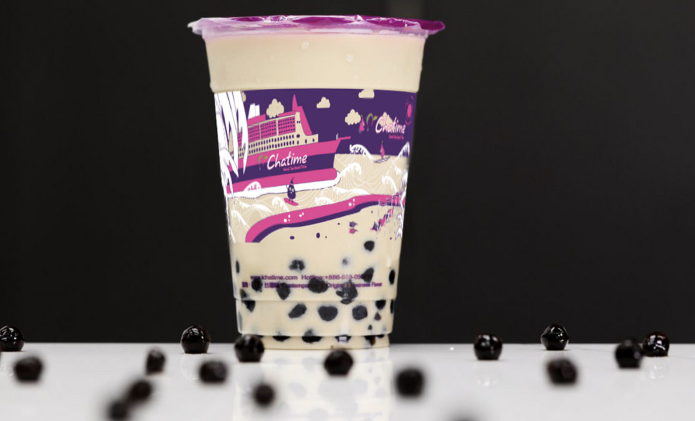
Participating in the Chatime Cup Design Competition, Grace Perdana Mulia designed a cup sleeve for the brand’s “Holiday” theme, masterfully utilizing their logo, color scheme, and mascot, giving a unique “street art” spin to “hug” the cup template.
The rule was to use only three (on-brand) colors; purple and white (compulsory) and the other color is black, green, or pink. The concept behind the cup sleeve is a fun cruise holiday by using Chatime’s mascot (Chatime Baby Tea) and spinning the adventure around it (and the cup).
The positioning of individual elements demonstrates a carefully thought-out layout. For example, the illustration’s cartoon-like clouds are ideally positioned to mirror where the tea level ends and aromatic steam starts to rise.


-preview.jpg)
