Standout Features:
- Refined color palette and textures
- Elegant typography for brand elevation
- Cohesive product system across packaging
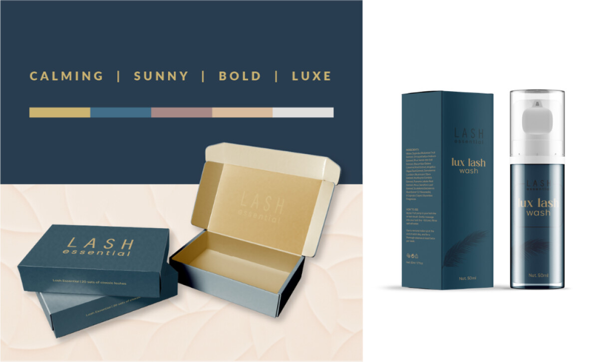
Lash Essential’s refreshed brand identity, designed by Silver Fern Creative, brings a much-needed sense of calm and confidence to the beauty market. The polished design introduces a mature look without losing warmth, showing that packaging can build loyalty before a customer even opens the product.
A deep navy blue grounds the brand in professionalism, while gold and muted rose add brightness and charm. Soft neutrals and textured backgrounds layer in a tactile richness, making the packaging feel high-end without overwhelming the senses.
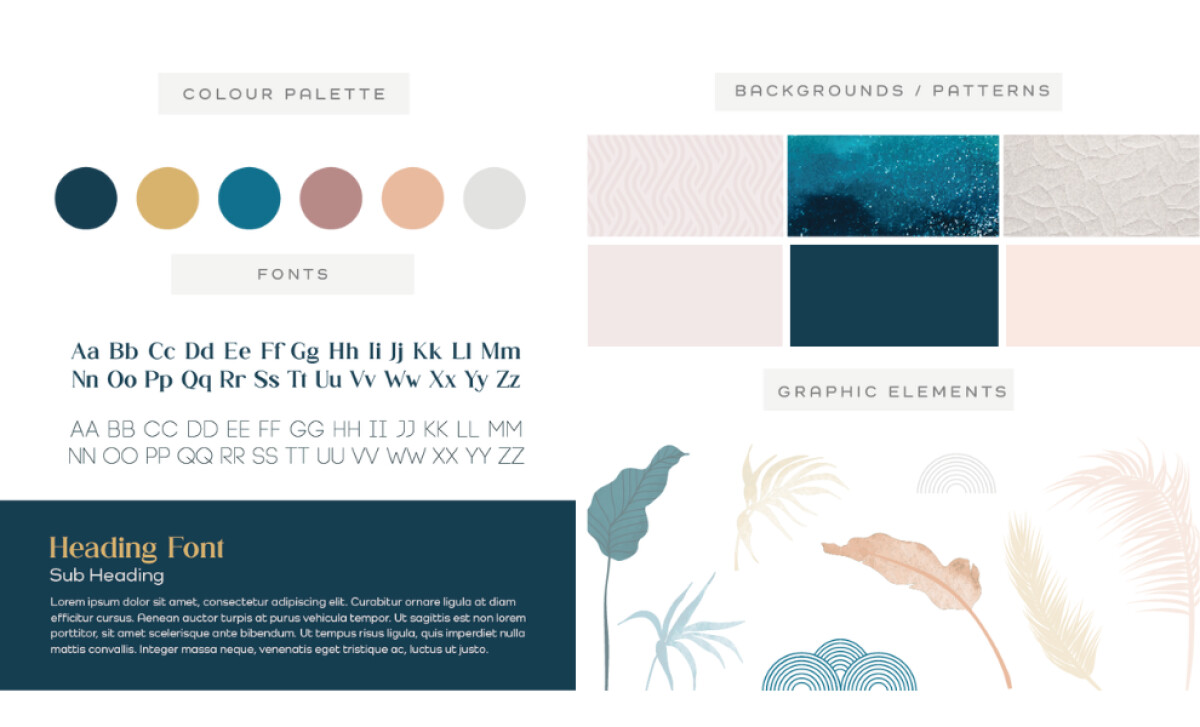
The new wordmark shifts from a stark, boxy style to slimmer, rounded letterforms. Still, its typography is clean and deliberate, creating a refined yet approachable tone that supports the brand’s promise of quality and elegance on every shelf. Consistency runs across the full product line, from adhesives to lash washes. Small touches like feather graphics and slight color shifts help each product feel distinct while still fitting seamlessly into the larger brand system.

Silver Fern Creative’s work on Lash Essential proves that sophistication and warmth can go hand-in-hand. Through thoughtful use of color, typography, and structure, the brand feels both premium and personal — a true example of the best packaging design done right.