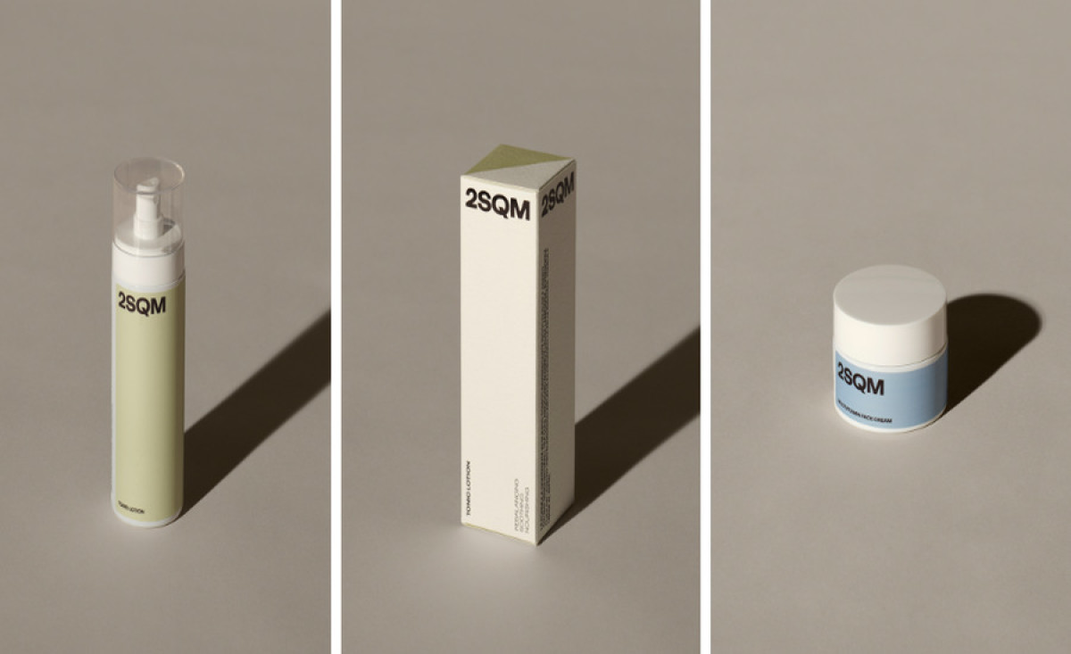
Standout Features:
- Paper materials
- Glossy hot foil printing
- Muted color palette
Eremo Studio’s packaging design for 2SQM COSMETICS exemplifies formal simplicity. Each element echoes the brand's commitment to quality and care.
It all starts with paper materials chosen intentionally as a metaphor for skin. The clean paper symbolizes the company’s dedication to nurturing well-being, as skin requires thoughtful care and protection.
To add a layer of luxury and sophistication, the designer used glossy hot foil printing. This tactile element gives the packaging a refined finish reflecting the high-quality ingredients. Plus, this shiny foil catches the light, creating a subtle shimmer that draws attention.
A muted color palette completes the look, reinforcing the message of maximizing well-being through devoted care. The soft, earthy tones evoke natural beauty and serenity. They harmonize perfectly in this inviting display of simplicity and sophistication!


