Standout Features:
- Vibrant, beach-inspired colors
- Playful and dynamic typography
- Surfer-inspired graphics and imagery
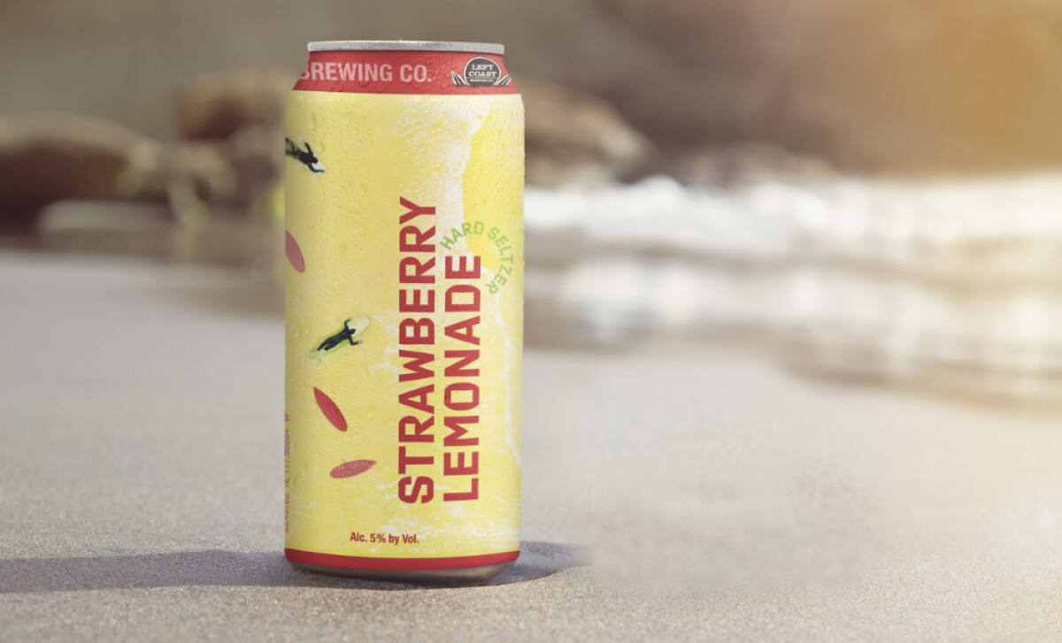
From the iconic surf town of San Clemente, Left Coast Brewing Company brings its award-winning craft passion to hard seltzers. Making the hard seltzer feel like an instant beach day in a can, Our Friends created packaging that reflect the brewery's commitment to quality and the carefree, adventurous lifestyle synonymous with its San Clemente roots.

The seltzer cans immediately catch your eye with their vibrant, beach-inspired colors, like bright yellow for Strawberry Lemonade or soft peach for Bahama. These hues are a nod to the laid-back California lifestyle and the refreshing nature of the seltzers, making the product feel like a perfect companion for sun-soaked days and casual gatherings.
You'll also notice the playful and dynamic typography, with flavor names in large, easy-to-read, vertical letters. This bold type, contrasting against the background, helps the product communicate an approachable, energetic personality, ensuring the flavors and brand are quickly identifiable on crowded shelves.
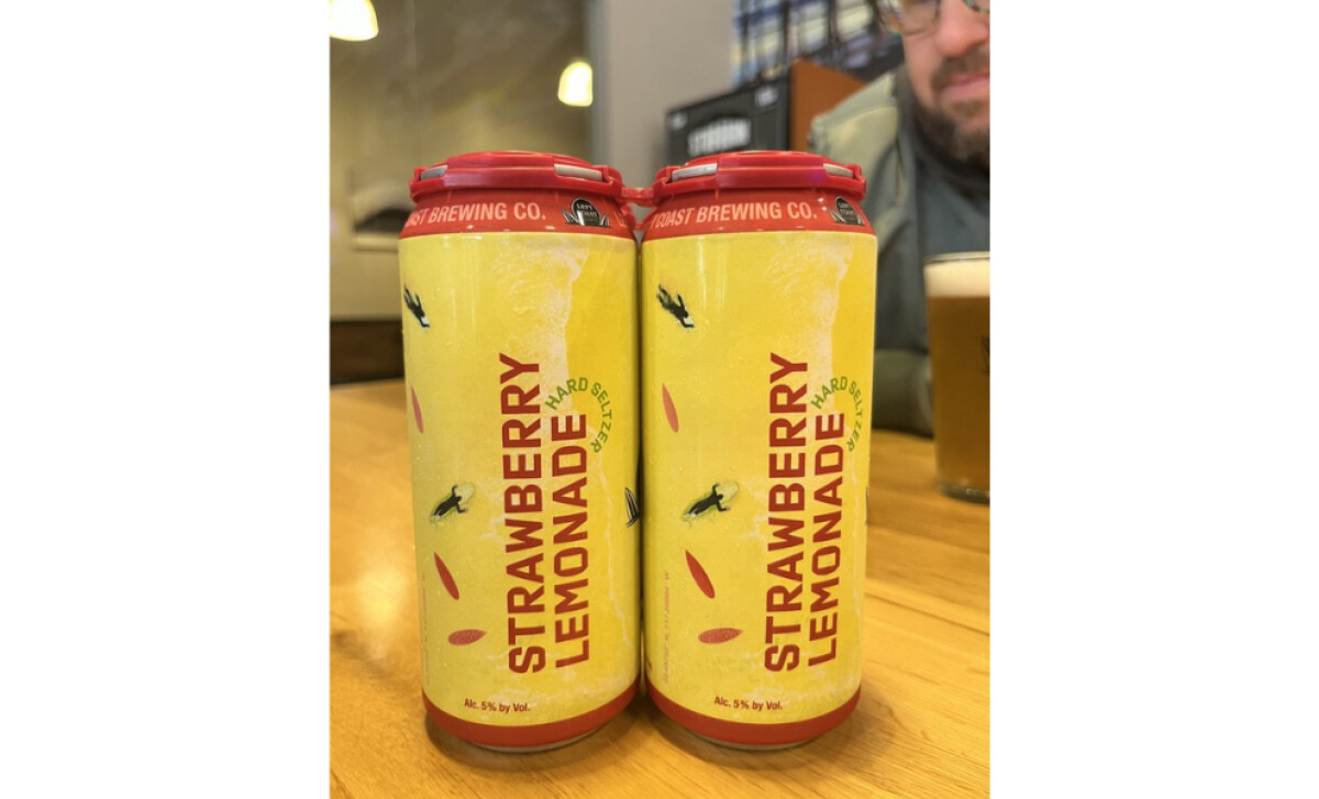
Adding to the theme, each can features subtle surfer-inspired graphics and imagery, such as small surfer silhouettes near the product name. These elements, along with background textures resembling water or sand, strengthen the connection to the relaxed, sunny lifestyle Left Coast represents.
Our Friends successfully bottled that "Taste of California" in Left Coast’s seltzer packaging, making every can a mini vacation. It’s a strong reminder for food and beverage brands that packaging can transport consumers. Align your product with a desired lifestyle or location, and you create a much more engaging and aspirational brand experience.