
Patience Fruit & Co.'s Sour Cran snack line got a bold refresh from designer Cecilia Castelli, resulting in a packaging system that’s both delightfully expressive and functionally precise. With a mission to make dried cranberries feel more fun, the design swaps generic health-food cues for pop-art sensibilities, all while preserving organic and ingredient-first messaging.
Key Insights for Brands:
- Bold visuals can turn everyday snacks into shelf-worthy standouts
- Color-coded packs simplify flavor choice and strengthen branding
- Clear messaging keeps playful packaging grounded in trust
The Patience Fruit & Co. Packaging Uses Lively Color Blocking to Create Instant Flavor Recognition
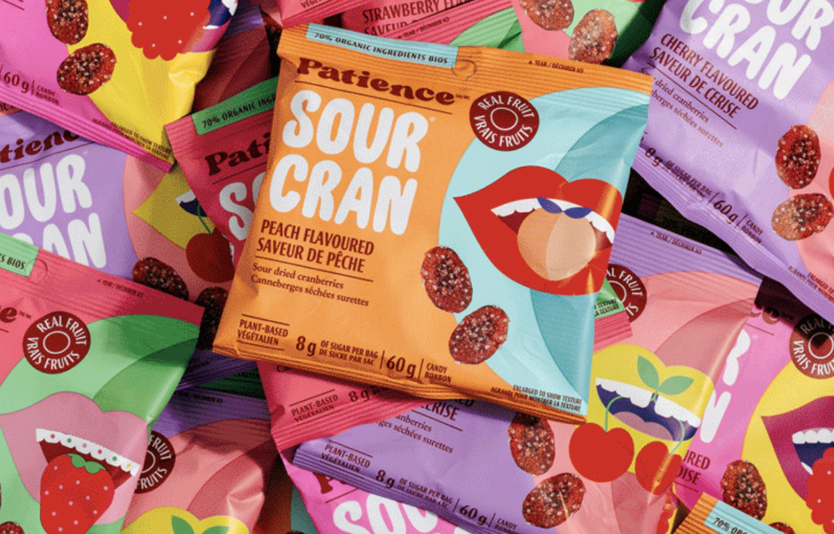
One of the first things that stands out about Cecilia Castelli’s take on this packaging is its fearless use of color. Each flavor in Patience Fruit & Co.'s Sour Cran lineup features its own bright, playful color pairing.
For instance, the strawberry version comes in pink and mint green, while the peach flavor combines orange with light blue. The watermelon flavor follows suit with its own twist on the theme, using greens and reds that echo the fruit.
Explore the colorful packaging designs that make everyday products unforgettable.
This color blocking does more than look good. It also helps customers quickly spot their favorite flavor on the shelf. Plus, it makes the product lineup feel cohesive without being repetitive.
The saturated tones aren’t just there to be pretty, either. They signal that this snack is fun, bold, and a little unexpected. That’s a powerful message in an aisle full of muted greens and browns.
A Cheeky Pop-Art Mouth Illustration System Establishes a Playful Brand Persona

The most unique element here is the recurring set of illustrated mouths, each styled to match a flavor. The strawberry package features smiling lips biting into a strawberry, while the peach and watermelon flavors have their own custom mouth graphics. This playfulness helps the product stand out and provides a recognizable identity without relying on a logo alone.
The illustrations do more than decorate the pack, they hint at the snack-eating experience. Each open mouth paired with fruit gives the packaging a playful, human touch. It’s a subtle way of making the product feel more relatable and more personal — like it’s meant to be enjoyed, not just consumed. That visual cue makes the design easier to connect with.
Plus, the style isn’t overdone. Its clean, bold, and pop art-like graphic polish, characteristic of professional packaging design, makes it cheeky enough to grab attention without veering into gimmick territory.
Hierarchical Typography Supports Fast Decision-Making and Cross-Market Legibility

Typography plays a crucial role in this packaging’s success. The product name “Sour Cran” is printed in large, white block letters, standing out sharply against the vibrant backgrounds. It’s impossible to miss. Just above, the brand name “Patience” is printed in its familiar bubble-style logomark, anchoring the new design.
The rest of the type is functional and clean. Flavor names are clearly labeled in both English and French, ensuring the product complies with Canadian bilingual packaging requirements.
Health-related claims like “70% Organic Ingredients” or “8g of sugar” are placed strategically. The labels are visible but not intrusive. This helps health-conscious shoppers get the info they need without sacrificing visual appeal.
The overall structure gives the design room to breathe. There’s no clutter. Every word feels like it has a reason to be there.
Photography and Presentation Style Reinforce the Product’s Freshness

The packaging isn’t the only thing that makes this product shine. The way it’s photographed and presented also plays a big part. One standout shot places several Sour Cran packs inside a grocery basket, nestled among leafy greens, bananas, milk, and colorful produce. The scene communicates freshness and quality while reinforcing the product’s place in a wholesome, everyday grocery run.
Unbox the box design trends defining standout packaging this year.
The Patience Fruit & Co. Sour Cran packaging is a great example of how smart design can transform a simple product into a strong brand experience. Designer Cecilia Castelli created a look that’s fun without being silly, health-forward without being preachy, and eye-catching without being overwhelming.
Everything from the bold color blocking to the illustrated mouths works together to make dried fruit feel exciting and new. It’s the kind of great packaging design that invites you to pick it up, take a second look, and maybe even share it on social media.
For brands trying to make an impression in competitive categories, this Design Awards winner packaging design is a reminder that originality, clarity, and character often have a stronger impact than trying to follow what everyone else is doing.


