- Agency: Steven Noble Illustrations
- Client: Left Field Wines (Te Awa Collection)
- Category: Packaging Design — Wine Packaging
- Location: California, United States
- Project Brief: Design wine packaging that enhances shelf appeal and communicates brand storytelling through illustration and a distinct visual system.
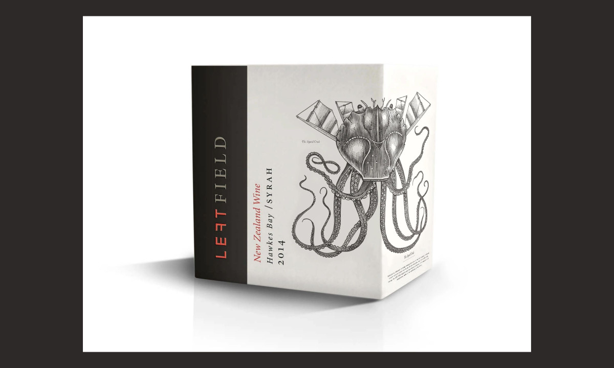
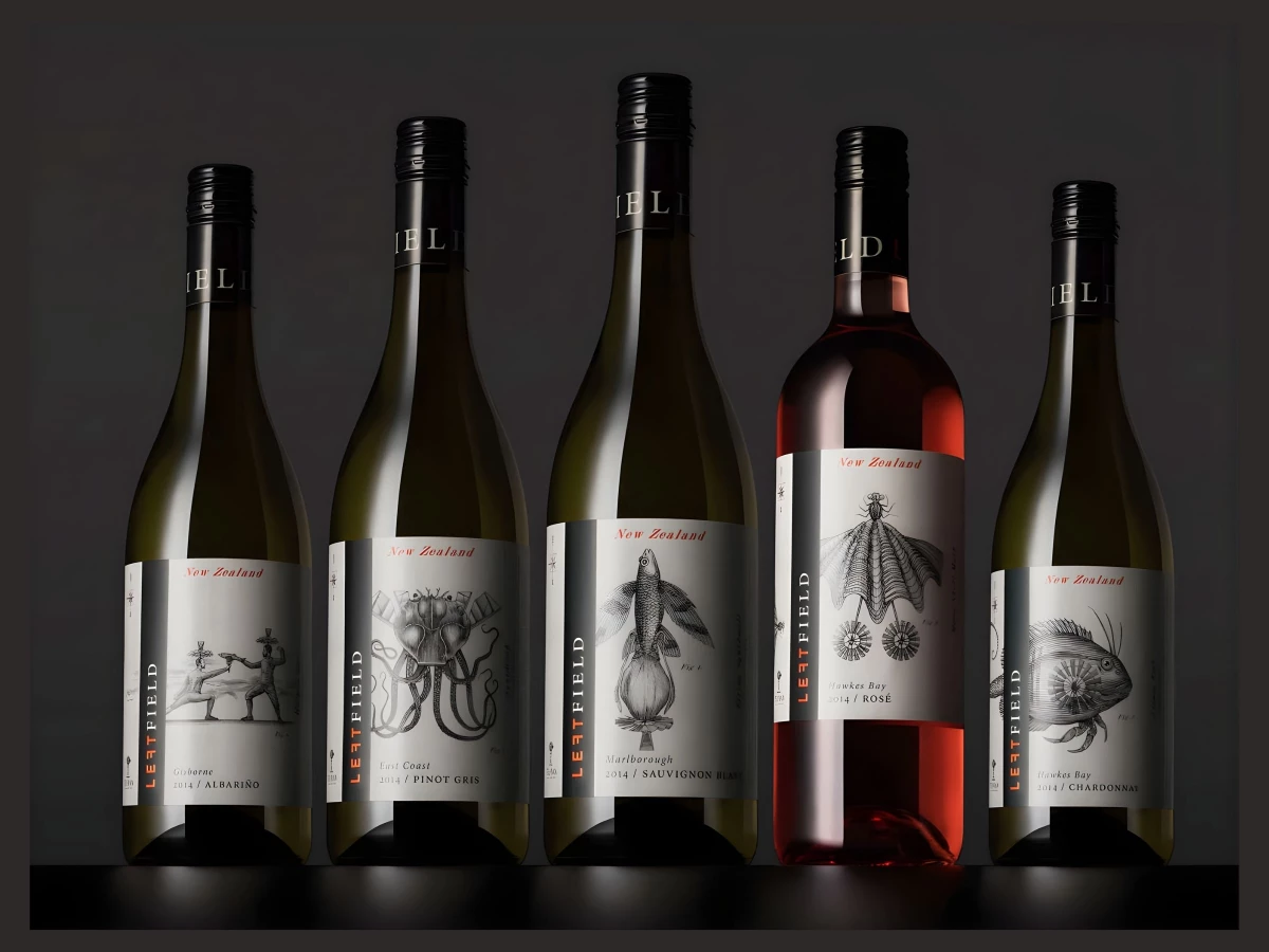
A great wine packaging starts the conversation before the cork even pops. Left Field Wines ignores predictable vineyard scenes and instead uses odd, folklore-heavy characters that feel entirely original.
The visual identity relies on sharp scratchboard art that feels both ancient and modern. These hand-carved images use deep shadows and fine lines to grab attention, making each bottle a distinct centerpiece on a shelf.
The label layout invites a physical connection with the consumer. As people turn the bottle, they find small, hidden details tucked into the intricate carvings that encourage them to slow down and explore.
Bold creative choices define the entire brand. Choosing to focus on the quirky side of New Zealand culture helps the design avoid a stuffy reputation and speak directly to drinkers who value curiosity and original ideas.
Technical precision keeps the artwork crisp during the printing process. Carving into clayboard with X-Acto knives provides a professional, high-end finish that preserves the restless energy of the original sketches.