- Article by
- Rafi Lim

#9BBC6B #8F73A5 #904332 #CEC9E8
- Agency: Misami
- Client: Liven
- Category: Packaging Design - Health & wellness
- Location: Amsterdam, Netherlands
- Project Brief: Design packaging that communicates softness and care while improving clarity, usability, and shelf presence for a supplement line.
Packaging in the health and wellness space must communicate function while maintaining a sense of calm. Liven does this through a considered use of color, type, and form that supports clarity and differentiation.
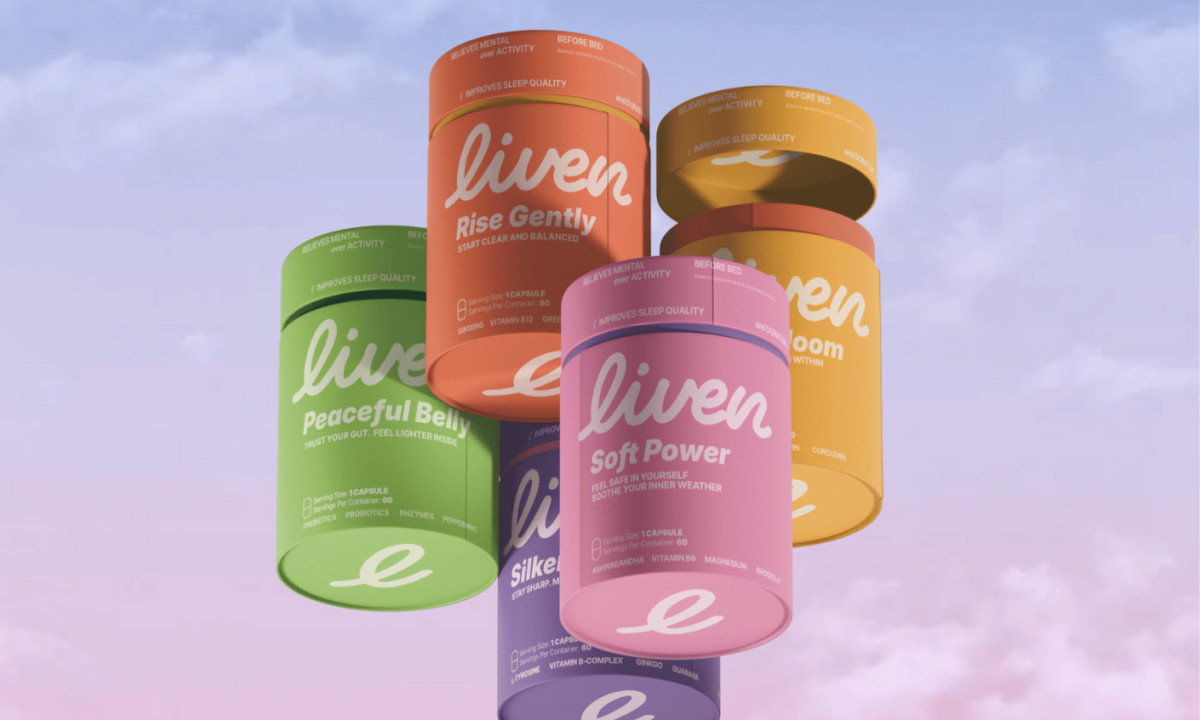
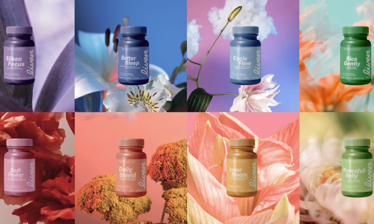
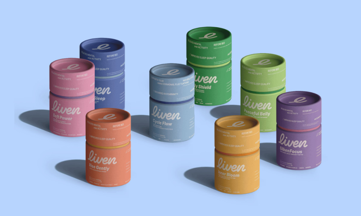
Color acts as the primary navigation tool. Each variant uses a distinct, softly saturated palette to signal function while maintaining a cohesive identity across the range.
Form reinforces consistency. The cylindrical structure creates a uniform system, allowing visual design to handle differentiation without adding complexity to production or use.
Typography softens the overall tone. Rounded letterforms and minimal layouts move away from clinical conventions, positioning the product within a more approachable, lifestyle-focused space.
Restraint supports clarity. Limited on-pack information and a clear hierarchy reduce cognitive load, helping users quickly understand each product’s purpose.
The overall system balances visibility with calm. It stands out on the shelf while maintaining a sense of care and softness that aligns with the brand’s wellness positioning.
Hushō

Mật Mã Gift Set

I AM ITALIANO