Team Behind the Design
- Agency: Bolden Branding
- Client: Maison Protéine
- Category: Packaging Design - Beverage
- Location: São Paulo, Brazil
- Project Brief: Design packaging for a vegan protein brand that communicates flavor, personality, and approachability through bold visuals and clear hierarchy.
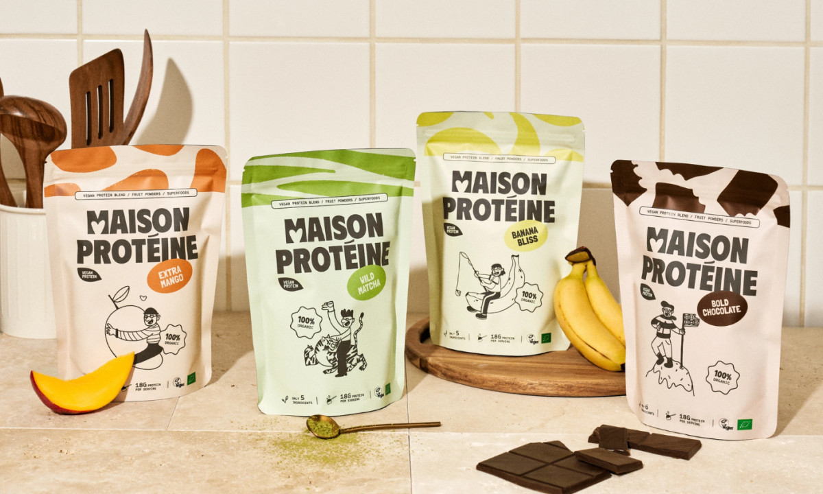
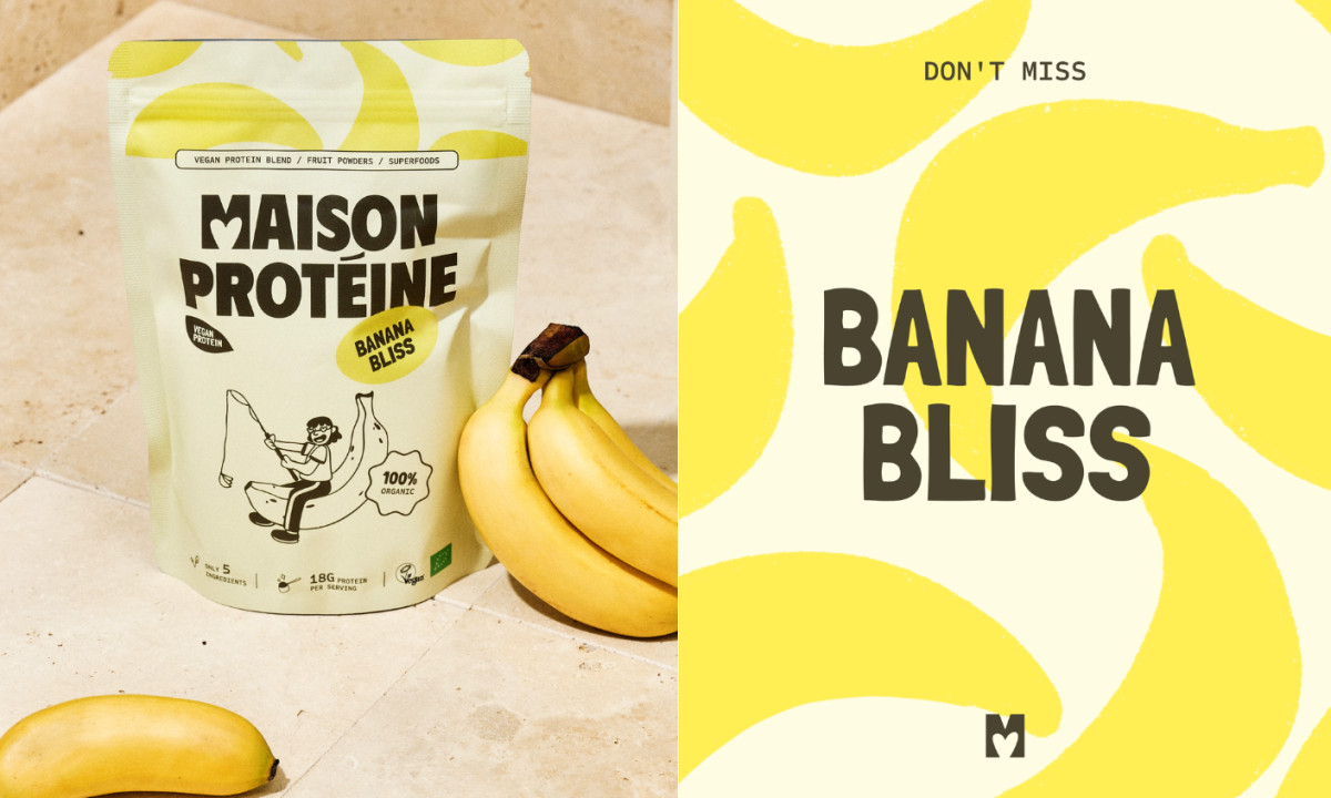
Beverage and supplement packaging often leans toward performance cues, but the Maison Protéine packaging design shifts toward emotional engagement. It uses color, illustration, and typography to make nutrition feel accessible while maintaining clarity in product communication.
Color drives differentiation. Bold, flavor-led palettes help each variant stand apart while signaling taste in a direct, intuitive way.
Illustration adds personality. Simple, hand-drawn characters interacting with ingredients introduce humor and soften the category’s typically serious tone.
Typography supports that shift. The bold, slightly irregular logotype feels human and relaxed, aligning with a focus on ease rather than intensity.
Structure keeps everything clear. Even with expressive elements, the layout maintains hierarchy, making it easy to identify flavor, benefits, and product type at a glance.