- Article by
- Rafi Lim

#F37C7F #A0811A #485027 #292021
- Agency: Andreea Moise
- Client: Matin & Nuit
- Category: Packaging Design - Tea
- Location: Bucharest, Romania
- Project Brief: Design packaging that differentiates energizing and calming tea blends through illustration, color, and clear product storytelling.
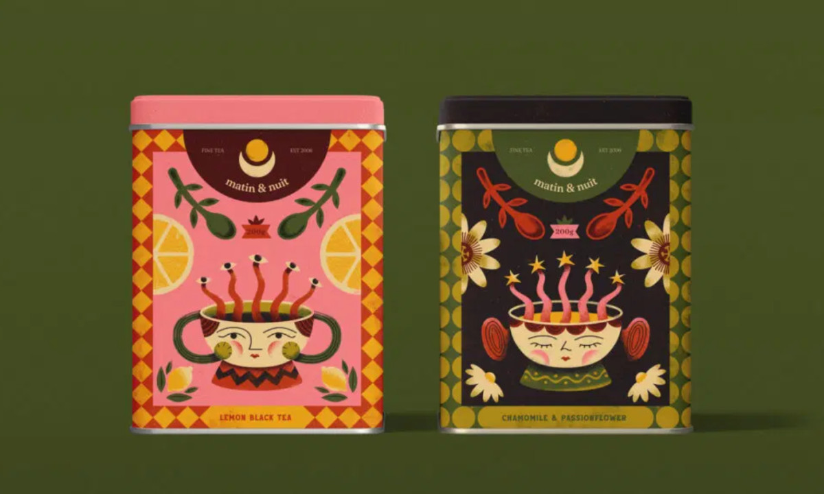
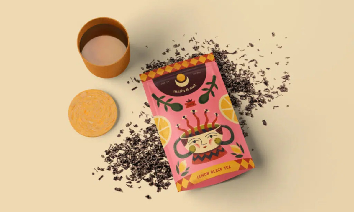
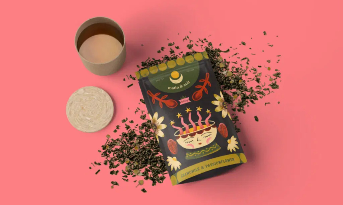
Packaging design for functional tea products relies on clarity and distinction. Matin & Nuit achieves that through character-driven illustration, distinct color palettes, and structured composition that help communicate each blend’s purpose at a glance.
At the center is a dual-character system that translates benefits into emotion. The “Morning Boost” figure feels alert and active, while “Night Calm” reads as relaxed and slow. These visual cues reduce the need for heavy explanation, letting you grasp the product’s function instantly.
Color reinforces that split. Bright, warm tones signal energy in the morning blend, while deeper, muted hues create a calmer feel for the night version. The contrast helps each product stand apart while keeping the range unified.
Patterned borders frame each layout, adding structure without pulling focus from the illustration. This keeps the design engaging while maintaining order across the system.
Typography stays contained within curved headers and structured labels, keeping information easy to read. A mix of serif and sans-serif styles adds a touch of refinement while supporting clarity.