Standout features:
- Minimal design and use of colors
- Fun juxtaposition of the elements
- The brand name takes a backseat
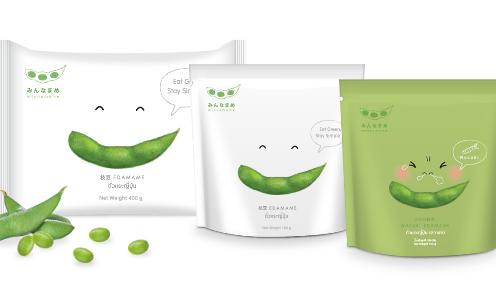
Minnamame is a Japanese manufacturer of organic soybean with over a decade of experience in the food market. Yindee Design, a Thai agency behind its product packaging, kept the organic thread going with a remarkably simplistic and uplifting design.
The agency tied minimalism to the brand's natural methods of food production to convey the sense of purity and feel-good effect of organic food. The packaging comes in two color versions, green and white, but both are strictly restricted to these hues in varying combinations.
However, the defining element of this design is the juxtaposition of a soybean pod and two tiny slits above it. Together, they make a wide and bright smile that complements the brand's slogan "Eat Green, Stay Simple."
The name of the brand, in English and Thai, is written in a very small, light grey font, almost gaining a secondary role to the popping, green "smile" that radiates off the retail shelves.
The packaging is square-shaped with a very simple opening mechanism that lets the consumer reseal it in order to preserve the freshness of the contents.
The back of the packaging contains a scannable QR code that leads the consumer to a web page outlining the philosophy of the brand as being devoted to growing the ingredients on healthy soil and nurtured by their Earth Care Family.

-preview.jpg)

-preview.jpg)