Standout Features:
- A mix of vintage and modern design
- Large typefaces for better legibility
- Retro-style colors and layouts
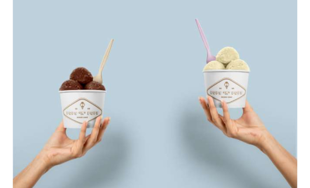
Serving up scoops since 1980, Pops n Pops is among the first ice cream shops in Minas Gerais, Brazil. Highlighting the brand’s roots and heritage, Matheus Machado whipped up an ice cream box packaging design that perfectly marries traditional and contemporary visual elements.
For starters, the brand is known for its commitment to using 100% all-natural ingredients. The designer made sure to incorporate this into the ice cream pints by stamping a large slogan that reads “everything is always naturally delicious.”
Do you know what else is large? The typography. On top of every pint, the flavor label sits at the center and occupies almost the entire space. This makes it easier for customers to pick and buy what they like.
Parallel to the slogan above, a massive “P’N’P” text is also printed on the pint’s body. It’s a shortened version of the brand name, adding a great modern touch and establishing an instant brand recall.
As an homage to its history, the product labels and other text descriptions reflect the logo’s vintage style. To match this, the designer used a bunch of retro colors like pink, blue, orange, purple, and green.
And it isn’t just for aesthetics. Each color serves as an indicator for a specific flavor, too!
-preview.jpg)