- Article by
- Jermaine Dela Cruz

#C59E7F #337B6F #D2D2D2 #9F0112
- Agency: Brands&People
- Client: Moctezuma
- Category: Packaging Design — Manufacturing
- Location: Monterrey, Mexico
- Project Brief: Create a packaging system that celebrates Moctezuma’s heritage while redefining how cement brands connect with culture and identity.
Most cement bags read like spec sheets, so Moctezuma's packaging stands out the moment you see a stack of it. Brands&People rebuilt a near-century-old Mexican brand around pre-Hispanic geometry, turning a manufacturing commodity into something closer to a cultural object.
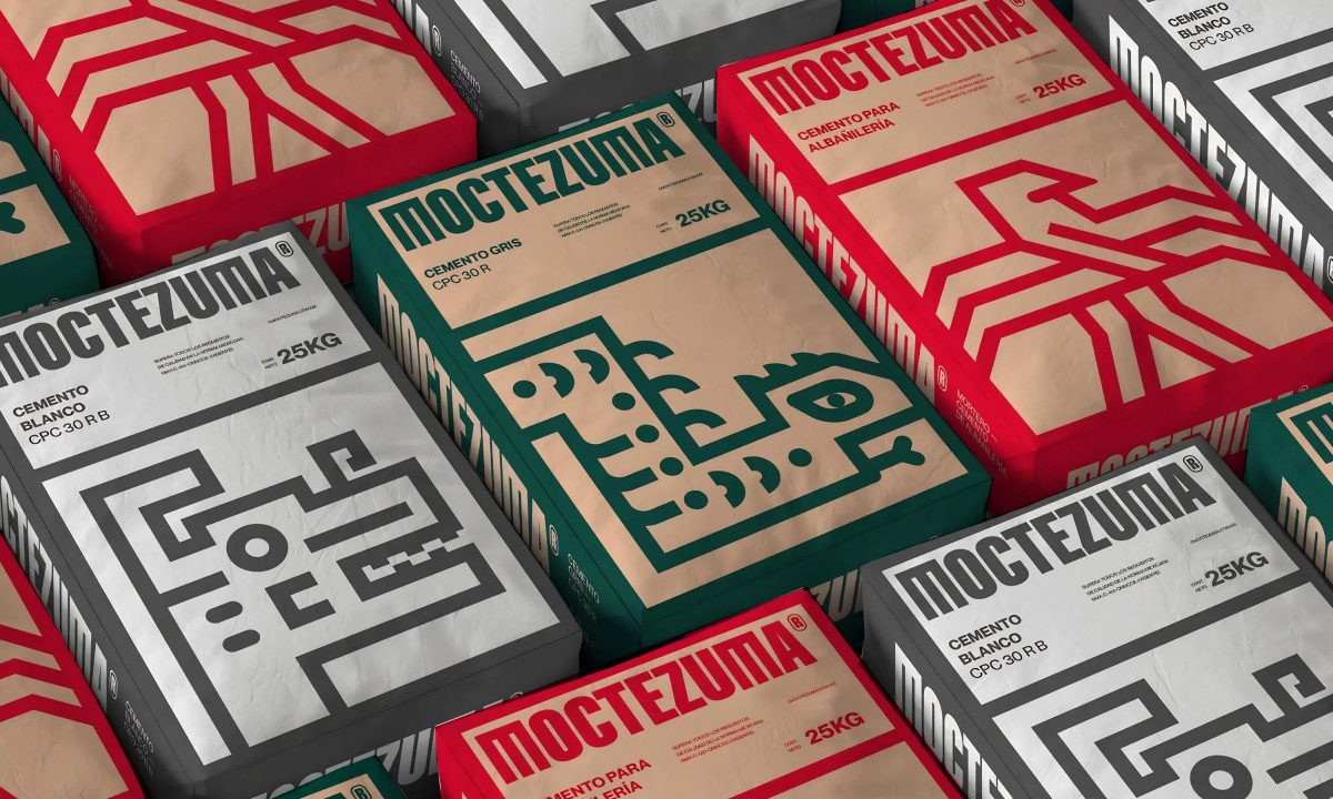
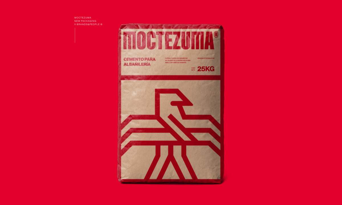
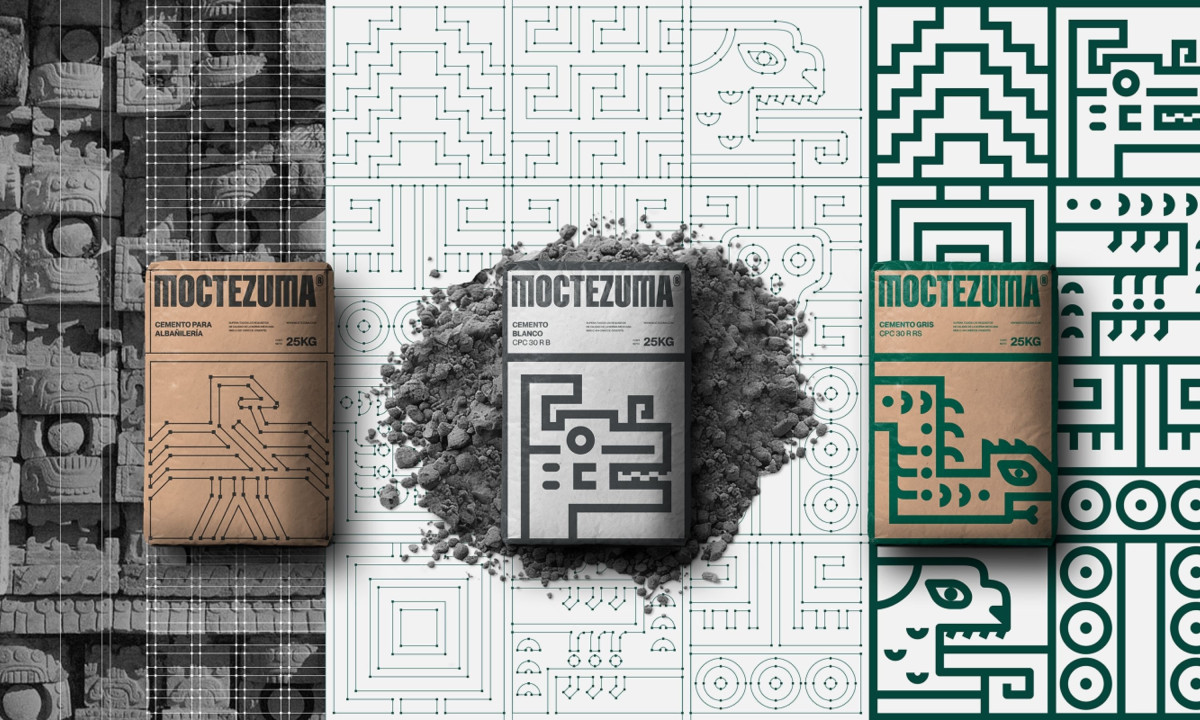
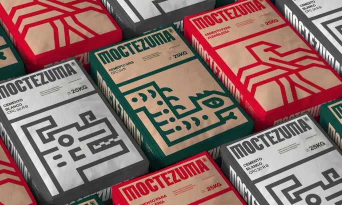
The system runs on a modular icon language drawn from Aztec line motifs and a custom brutalist typeface. Each variant carries its own glyph, a circuit-like eagle on kraft, a stark blocky figure on white, a serpent in deep green, so the range stays legible while every bag still feels distinct.
Color does the sorting work without losing the theme. The palette pulls from the Mexican flag, with green, red and natural kraft separating cement types at a glance on a noisy hardware-store shelf.
The smartest move is structural: the design wraps onto the sides of the bags, not just the face. Stacked on a pallet, the icons line up into a continuous mural, which turns standard manufacturing and warehouse storage into branding that builds itself. That is how a category nobody styles becomes one worth looking at.
Moctezuma
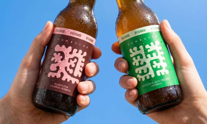
Fooshi
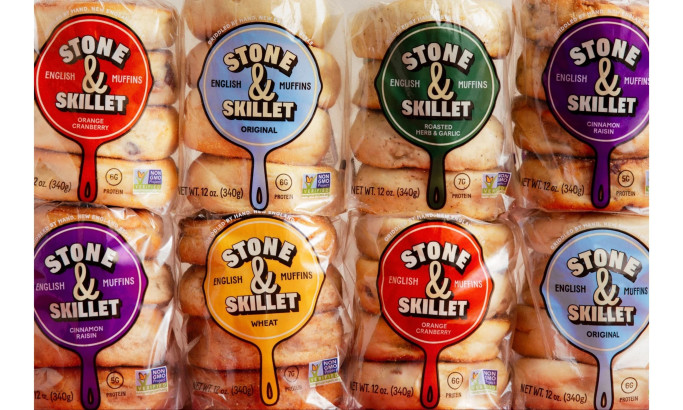
Stone & Skillet
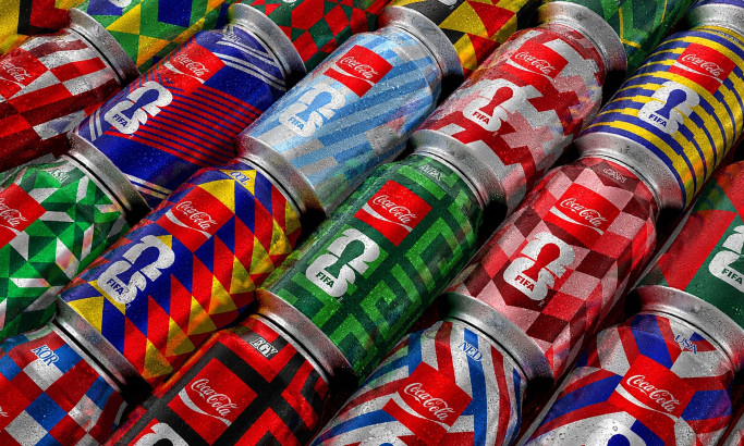
Coca-Cola FIFA World Cup 26 Collectible Country Cans
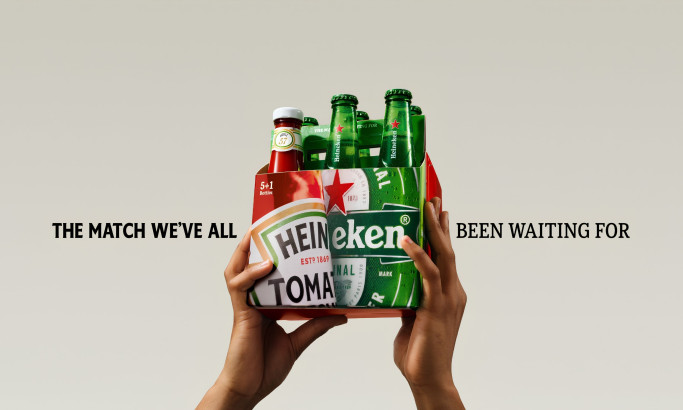
HEINZ x Heineken® Limited Edition Six-Pack

Coors Light Tallerboy
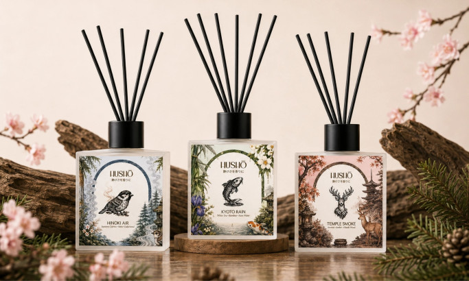
Hushō

Mật Mã Gift Set
