Nhance Packaging Design by Aaqib Shah
Nhance introduces terpene-infused functional water with packaging that leads the brand story. Clean layouts, vibrant colors, and clear messaging highlight the product’s natural ingredients while creating a fresh, modern beverage identity built around the signature can.
Informative can design explains terpene benefits and product ingredients
Bold typography on cans strengthens shelf impact and brand recognition
This website uses a colour palette of 4 colours
  • #91C55F
  • #E84245
  • #C3D022
  • #2D945D
Technologies & Tools
Description
Team Behind the Design
  • Designer: Aaqib Shah
  • Client: Nhance
  • Category: Packaging Design — Beverage
  • Location: Toronto, Canada
  • Project Brief: Develop packaging for Nhance’s terpene-infused flavored water that communicates both wellness benefits and refreshing flavor.

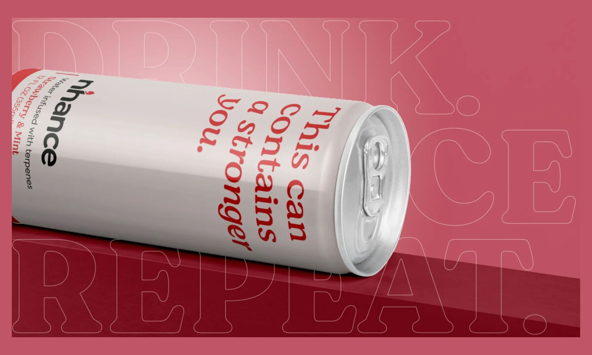
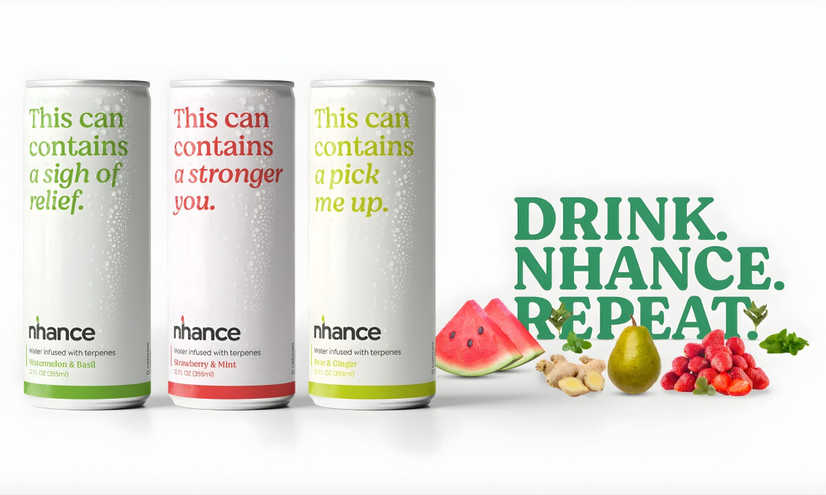
Compelling beverage packaging often lets typography do the talking. Nhance features large, confident statements like “This can contains a stronger you,” turning the can itself into a brand voice that reinforces wellness benefits and flavor personality.

Ready to elevate your designs?