

- Agency: Opposite
- Client: Octopus
- Category: Packaging Design — Beauty and Fashion
- Location: Panaji, India
- Project Brief: Create distinctive fragrance packaging for Octopus using maximalist visuals, bold typography, and a custom bottle system that gives each scent its own identity.
Beauty and fashion packaging usually treats a big fragrance range as a cost problem, flattening every scent into one shared box. Opposite went the opposite way for Octopus, engineering a system where the structure itself, from the carton to a scratch-built bottle, carries the brand's maximalism.
Juror Sam Channa read the result as a direct challenge to category habit, calling it "a bold and highly distinctive packaging style that challenges traditional fragrance conventions with confidence."
The build starts with a custom bottle and closure designed from scratch. A faceted glass flacon and a chunky red cap give the line a proprietary object rather than a stock bottle with a label, so the physical form does as much brand work as the graphics.
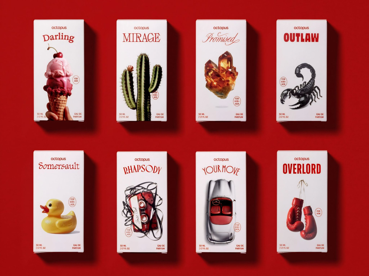
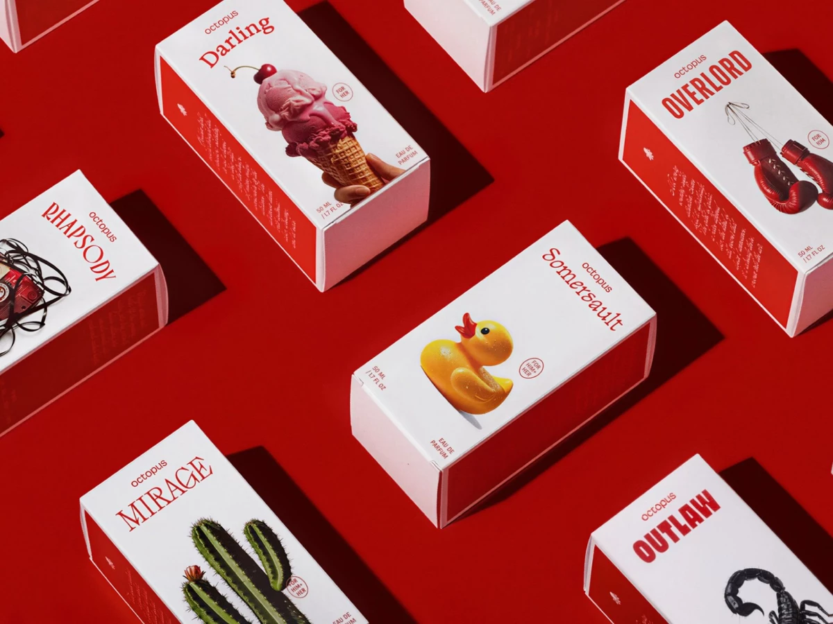
Each carton is then treated like its own product. Every scent gets its own name, type, and single surreal image printed on the same box structure, so Darling, Overlord, and Somersault feel distinct on shelf while sharing one production spec. Juror Fran Mendez saw the system holding together across every touchpoint, describing "a great 360 brand" with "amazing packaging."
Two anchors keep the range manufacturable without going quiet. A relentless flaming red runs across every carton and closure, and the shared bottle and box format hold twenty variants to one disciplined frame, which is what lets the packaging stay loud and still ship as a coherent system.
Channa named the same balance and its commercial payoff: "The striking red palette, custom bottle and expressive visual identities give every fragrance its own personality while maintaining a strong and recognisable brand connection." She credited the range with "excellent shelf impact," calling it proof that "daring designs can be commercially effective."