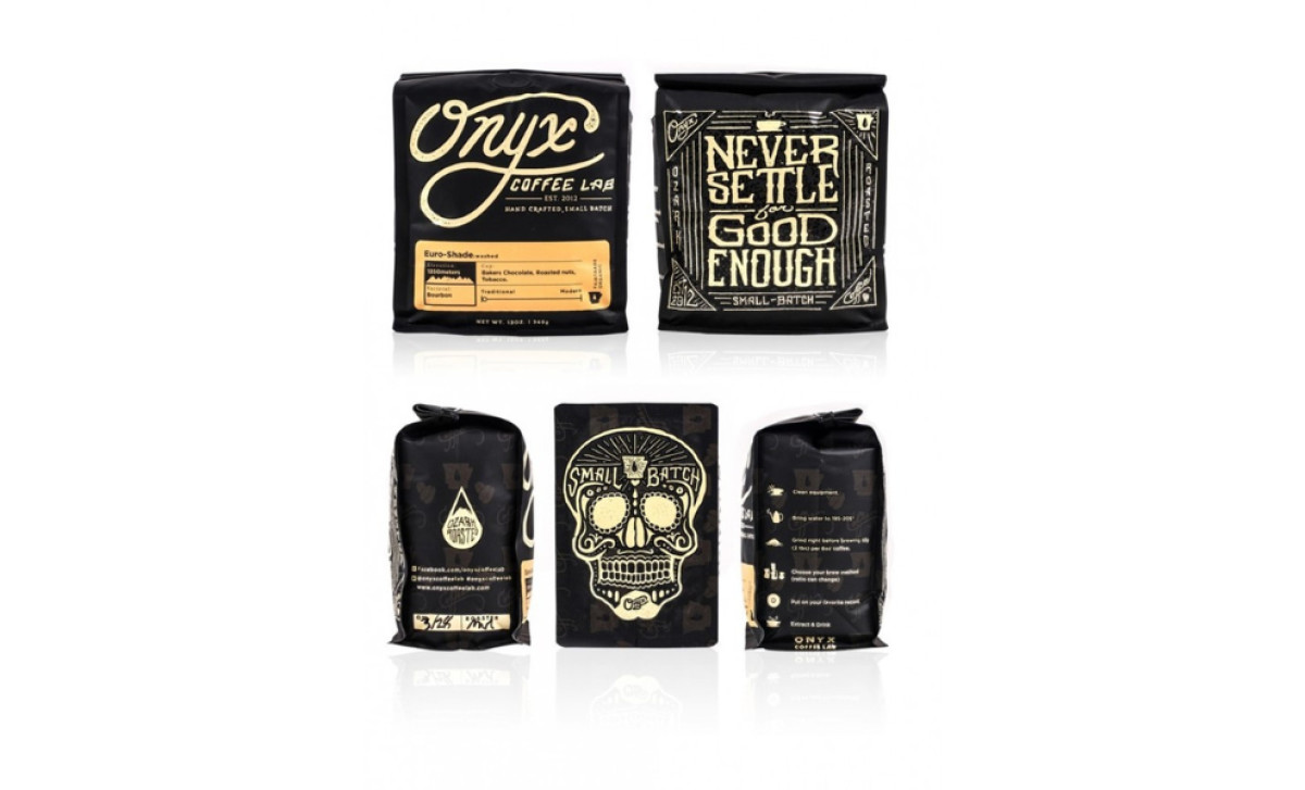
Standout Features:
- Stylized, eye-catching skull illustration
- Motto-amplifying how-to infographic
- Informative, iconography-rich labels
Onyx Coffee Lab is a great example of how modern coffee packaging design tendencies can market a traditional product. Think about the perfect blend of infographic features, tattoo-parlor ink and background with black hues just like those found in onyx stones.
Every side of this package has a story and a goal. The front has an eye-catching Dia de Los Muertos style skull depicting a higher state of focus, clearly associated with drinking coffee. Even the brand name settles nicely on the forehead. Notice how the nose is made up of coffee beans.
The infographic how-to on the side is pleasing to the eye, but it has a deeper meaning that aligns with the brand’s motto, “Never Settle for Good Enough.” To highlight this message it employs clean, simple icons, concise text that serves the point and clear instructions for a perfect cup of coffee. On the other hand, the opposite side is reserved for contact information and social media links, inviting Onyx drinkers to join its community.
Lastly, the back presents attention-grabbing color labels that differentiate Onyx Coffee Lab’s products, again with icons depicting strength, type of blend, taste, hints and even elevation rate where the beans are collected, showing the coffee’s organic origin.

-preview.jpg)

