Standout Features:
- One-tone color blocking with vibrant, distinct hues
- Branded typography with friendly, rounded letterforms
- Minimalist product photography
Anatomy Studios designed the packaging for People haircare, a brand they also founded. The goal was to offer beautifully designed, effective products for supermarket consumers. The packaging needed to communicate this vision of accessible, salon-grade haircare that makes people feel good without a high cost.
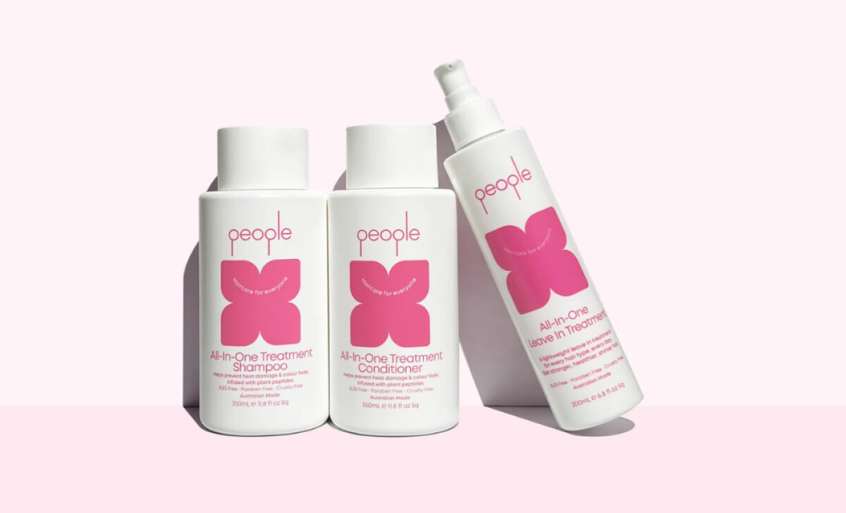
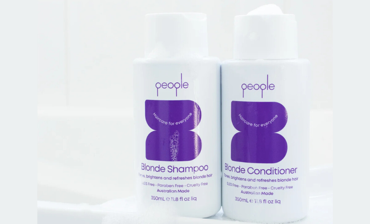
Studies suggest that 62% to 90% of a product's initial assessment is based on color. The beauty packaging design features clean white bottles with prominent, abstract color blocks in colors like bright pink, blue, or purple.
These stylized butterfly-slash-floral forms are central to the visual identity. Each variant’s distinct color aids differentiation, creating a playful yet highly readable look that stands out on supermarket shelves.
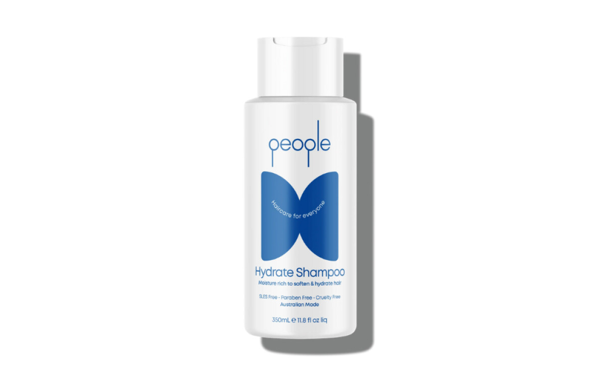
With its unconventional descender line for the letter “P,” the custom, rounded typeface presents the "people" brand name in an understated lowercase. The letters are comfortably spaced, similar to the clean sans-serif fonts for other supporting text, ensuring the brand feels trustworthy yet friendly.
Product photography supporting the brand is consistently shot on clean, pastel backgrounds like soft pink or white. Natural shadows give the bottles a tangible, three-dimensional presence. The uncluttered composition allows the bold packaging design to be the hero.
This packaging design illustrates that for brands aiming to make salon-quality accessible, visual simplicity paired with vibrant color can be a powerful strategy. All in all, People haircare’s approach offers valuable insights into creating a memorable and trustworthy identity.


-preview.jpg)