- Article by
- Lensey Etcubañas

#D1C6C5 #D387C3 #8CB3EC #1A1D17
- Agency: COOOT Studio
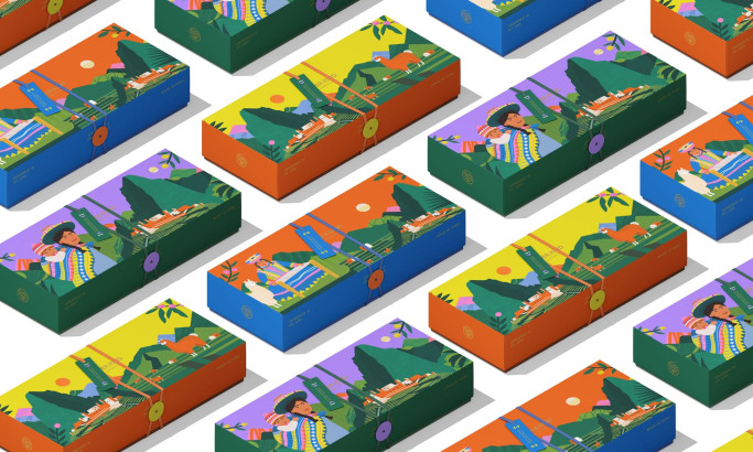
- Client: PocketTAILS
- Category: Packaging Design - Beverage
- Location: Nanjing, China
- Project Brief: Create a portable cocktail identity that elevates the ready-to-drink market through structural innovation, bold color systems, and a pocket-friendly form factor.
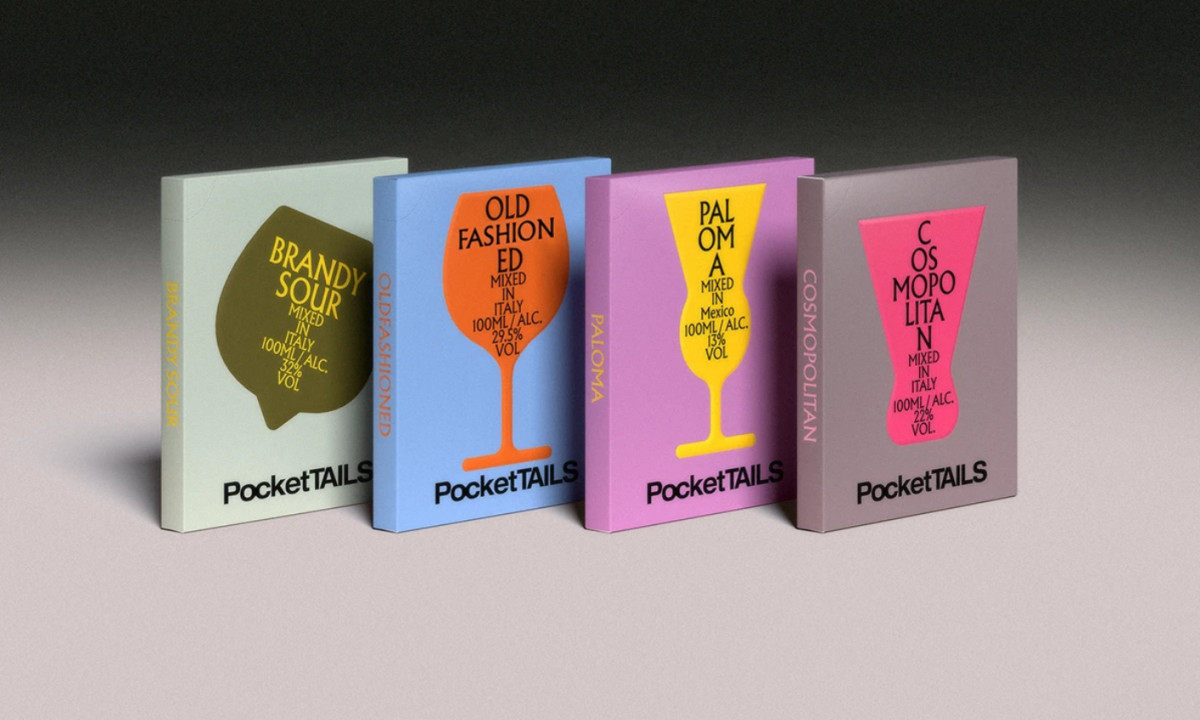
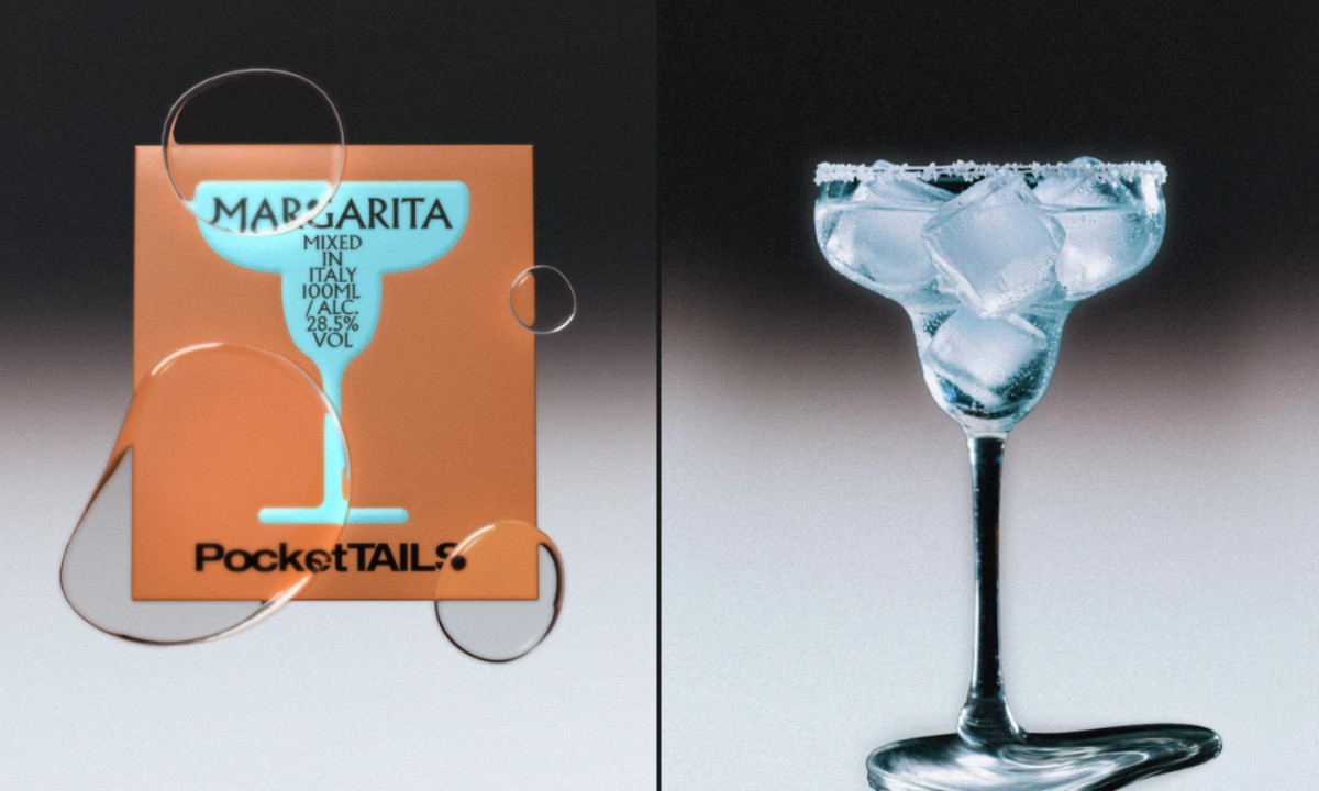
Modern spirits branding frequently leans on traditional glass aesthetics, but the PocketTAILS packaging disrupts this by embracing a slim, architectural silhouette. It merges the convenience of a pocket-sized container with a high-end graphic language to bridge the gap between utility and luxury.
Geometry defines the experience. The flat, rectangular box replaces the conventional bottle, providing a tactile, ergonomic shape that fits seamlessly into a modern lifestyle while maximizing shelf-presence through its unique profile.
Chromatic coding drives recognition. Vivid, saturated palettes are applied to each cocktail variety, creating an instant visual shorthand for flavor profiles that allows the product line to feel like a cohesive, collectible set.
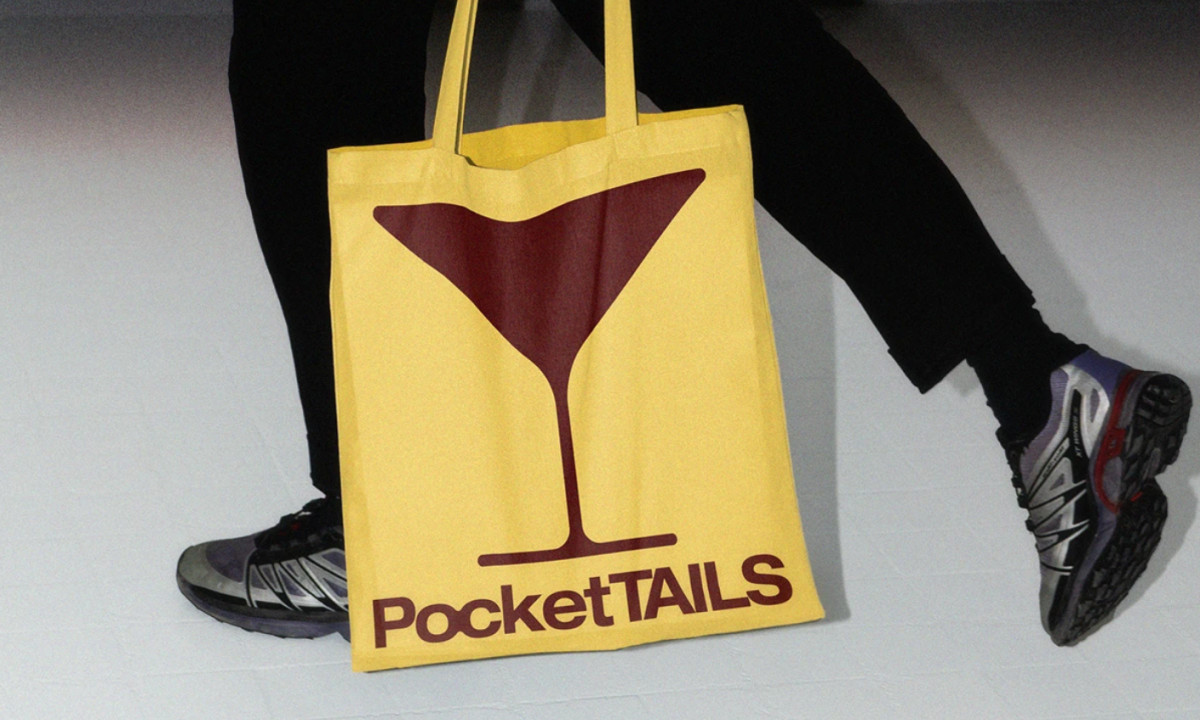
Minimalism ensures impact. Heavy, stacked typography and clean icons strip away unnecessary clutter, focusing the consumer’s attention on the brand name and the craft nature of the contents. This meticulous approach to package design ensures the product stands out as a sophisticated, high-contrast lifestyle accessory.
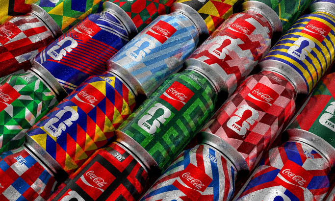
Coca-Cola FIFA World Cup 26 Collectible Country Cans
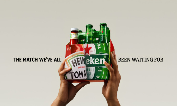
HEINZ x Heineken® Limited Edition Six-Pack
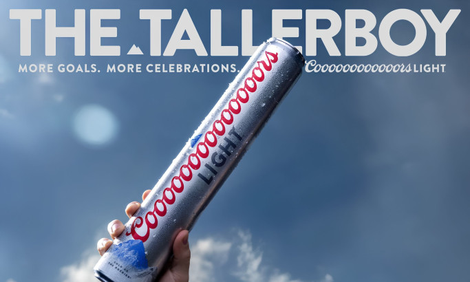
Coors Light Tallerboy
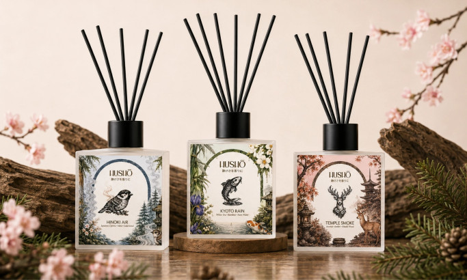
Hushō

Mật Mã Gift Set

I AM ITALIANO