- Designer: Elizaveta Voronova
- Client: Pure Froot
- Category: Packaging Design — Beverage
- Location: Milan, Italy
- Project Brief: Create vibrant beverage packaging for Pure Froot that communicates organic quality through bold typography, playful illustrations, and flavor-specific visual personalities.
Beverage packaging for organic juice usually falls back on kraft paper and leafy green clichés. Elizaveta Voronova skips all of that for Pure Froot, running bold cartoon characters on a clean white can so a health drink reads as fun rather than worthy.
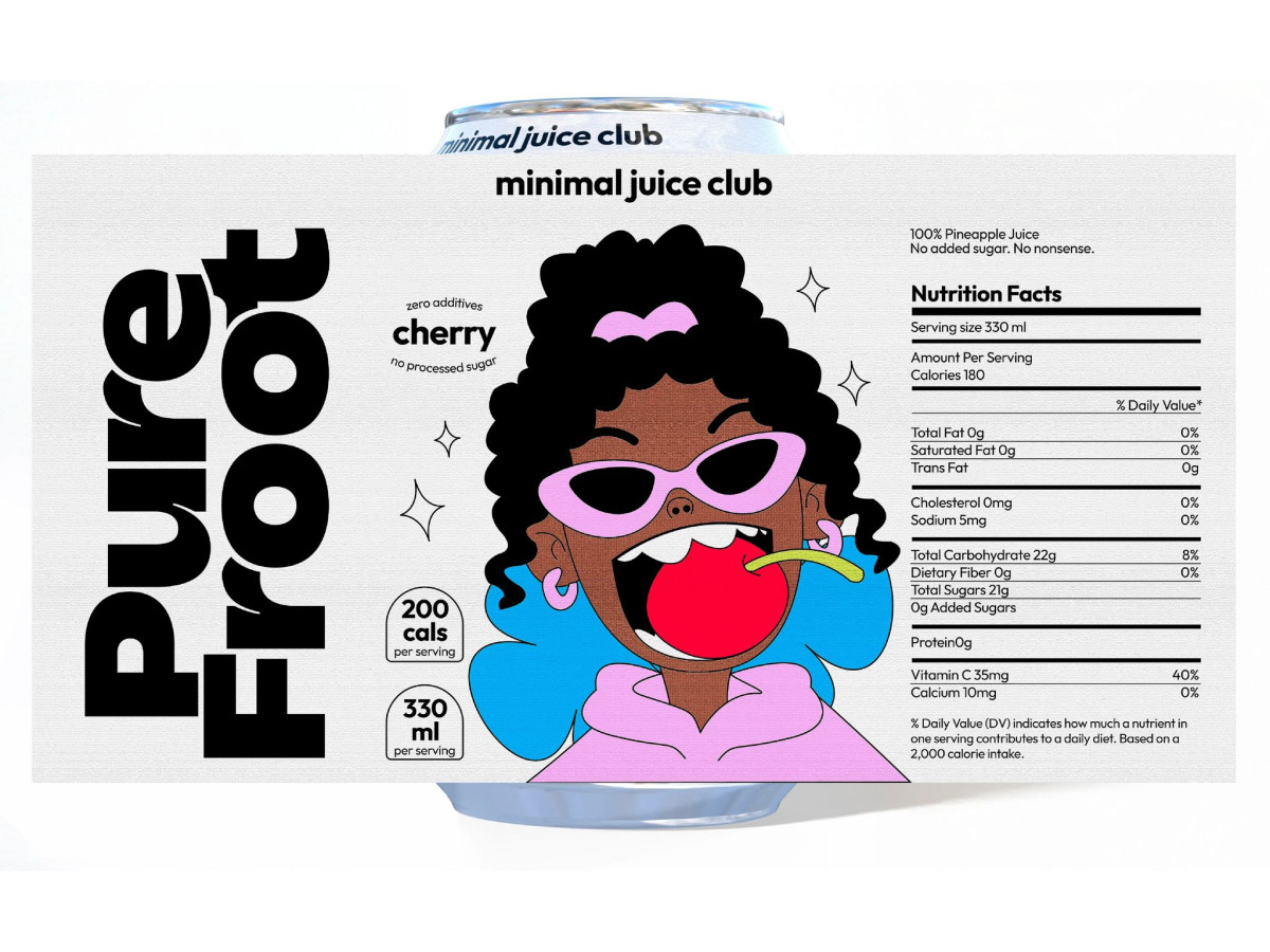
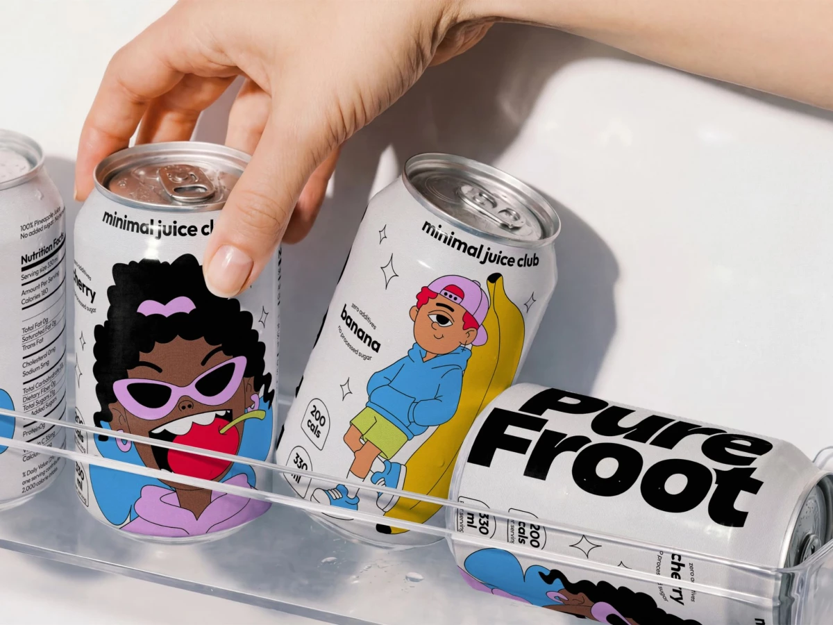
The character illustrations give each flavor a personality. A cherry-biting girl in pink shades, a pineapple-hatted grin, a kid lounging on a banana, each one turns a flavor into a face a shopper remembers.
The white base is what keeps the fun from tipping into chaos. A heavy black "Pure Froot" wordmark and simple "200 cals, 330 ml" tags anchor the loud art, so the can still signals clean and premium up close.
The layout is also built for a second life on social. The characters sit centered with room to breathe, so a single can photographs well on a feed, which is exactly where this young, active buyer finds a drink before the shelf.