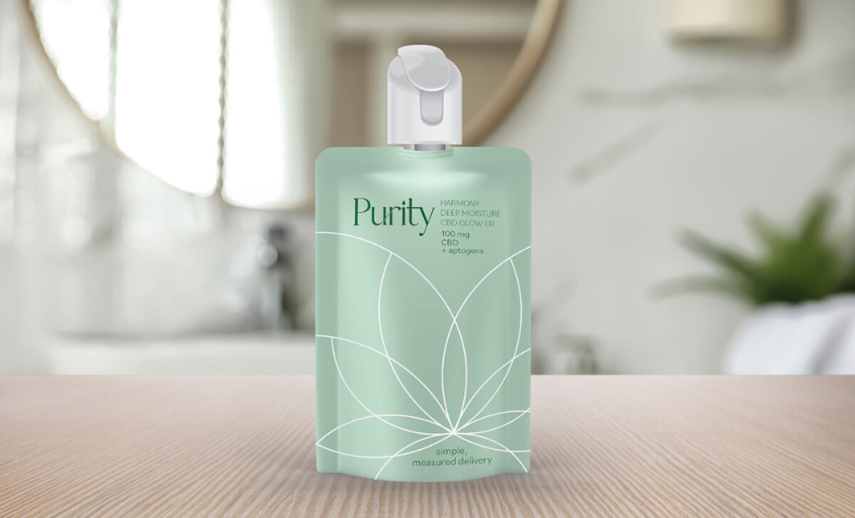
Standout Features:
- Soft sage color palette
- Abstracted cannabis leaf line art
- Ultra-minimal typographic hierarchy
Levitskie Creative LLC brings an elegant sense of restraint to the CBD beauty space with this packaging for Purity CBD Glow Oil.
The visual identity exudes calm, sophistication, and trust. It’s a perfect design for a wellness-conscious and discerning skincare audience.
We like that sage green is such a powerful color choice for skincare. It communicates cleanliness, serenity, and organic purity.
Research by Sun & Wu (2022) indicates that the color green can positively influence consumer perceptions of a brand's environmental friendliness. It also subtly nods to the cannabis plant without being too overt, which is a very smart move.
A minimalist, overlapping line illustration spans the front of the package in a clean white. The art is very clever: the design is clearly abstracted from a cannabis leaf without making it too literal.
The typography also helps to reinforce the brand’s identity. It feels clean, trustworthy, and a little bit luxurious.
The supporting product description is typeset in a minimalist, all-caps sans-serif. This pairing creates a beautiful and effective typographic hierarchy.
All in all, this health and wellness packaging design is a fantastic case study in how "less is more" can be a powerful strategy in a saturated market.
With packaging design, it's a real challenge to get noticed, but sometimes the most effective way to stand out is with a quiet and confident design.
That's why brands turn to expert partners, and our team has ranked the best agencies worldwide to make finding them simple.
Visit our Agency Directory for the Top Packaging Design Companies, as well as:
Our design experts also recognize the most innovative design projects across the globe. Visit our Awards section to see the best & latest in packaging design.