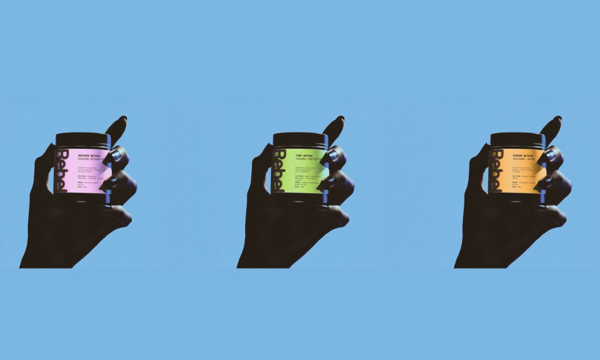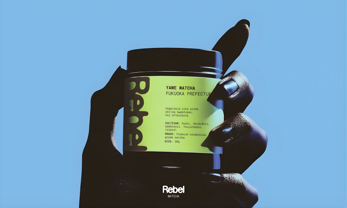
- Agency: Vlad Savruk
- Client: REBEL Matcha
- Category: Packaging Design
- Location: Calgary, Canada
- Project Brief: Design packaging that enhances shelf appeal and communicates premium matcha quality through bold typography and minimal structure.
In the premium tea category, beverage packaging often determines first impression and perceived quality. REBEL Matcha achieves this through confident type, high-impact color, and clear product details that frame ceremonial matcha as modern, premium, and unmistakable.