Standout Features:
- Monogram-based brand seal
- Balanced minimalist layout with soft color contrasts
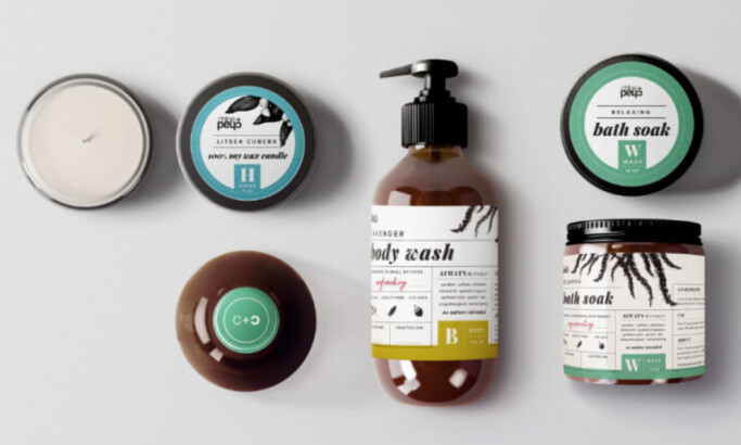
- Versatile packaging lineup for multiple product types
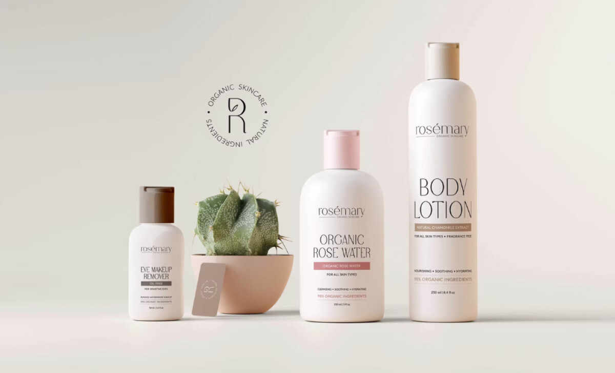
Rosemary Organic Natural Skincare is a beauty brand rooted in purity, transparency, and thoughtful sourcing. Zhillmatic encapsulates this ethos through a packaging design system that speaks the language of modern wellness consumers.
The centerpiece of the identity is a circular "R" monogram badge that reads: “Organic Skincare • Natural Ingredients.” It’s a signature mark that reinforces the product’s promise across multiple touchpoints. From embossed packaging to digital placements, the seal plays a key role in brand consistency and trust-building.
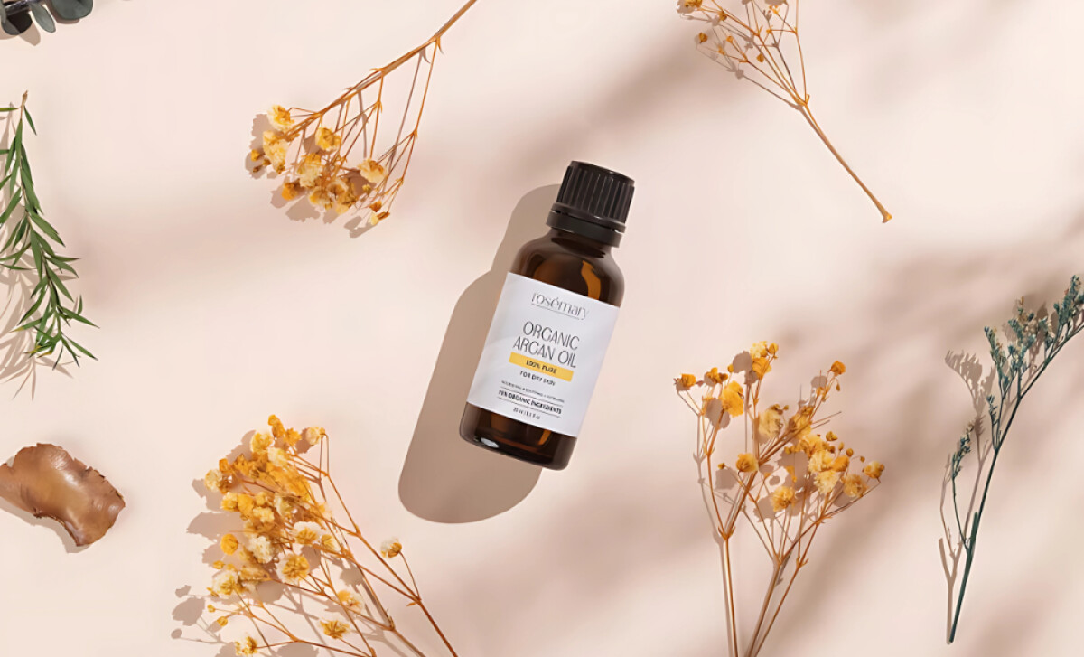
Each product’s design uses carefully selected typography and muted tones (rose beige, ivory, and pale gray) to deliver calm, premium shelf appeal. Label information is well-structured with enough breathing room to be easily scanned. The elegance lies in the quiet: no over-design, just confident restraint that mirrors the brand’s clean formulations.
The system scales seamlessly across various product shapes, from dropper bottles and tall lotion tubes to compact boxes. This flexibility ensures the brand maintains visual coherence without forcing a one-size-fits-all solution. Each format feels tailor-made for its content while staying unmistakably Rosemary.

Zhillmatic’s work for Rosemary Organic Natural Skincare shows that when design aligns with product philosophy, packaging becomes a visual ambassador for brand values. Clean lines, earthy tones, and strategic branding work together to make this product not just a shelf item, but a statement.