Standout Features:
- Grid-based and apothecary-like label architecture
- Clear color-coding for distinct product families
- Botanical illustrations
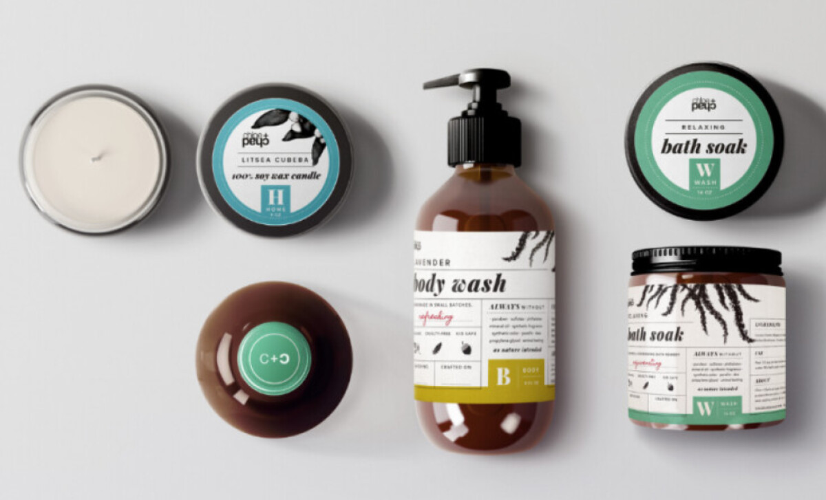
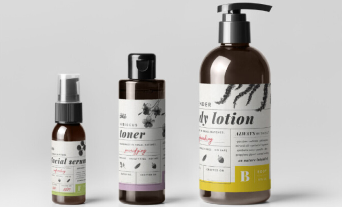
Developed by Gyst Design, the packaging for Chloe & Chad, an organic and natural lifestyle brand features a beautiful, well-organized system combining the charm of old-world apothecaries with crisp, modern design.
Each beauty product label employs a structured, column-style layout, reminiscent of heritage apothecary design. Serif-heavy primary product names are offset by small caps, slab fonts, and red handwritten-style descriptors.
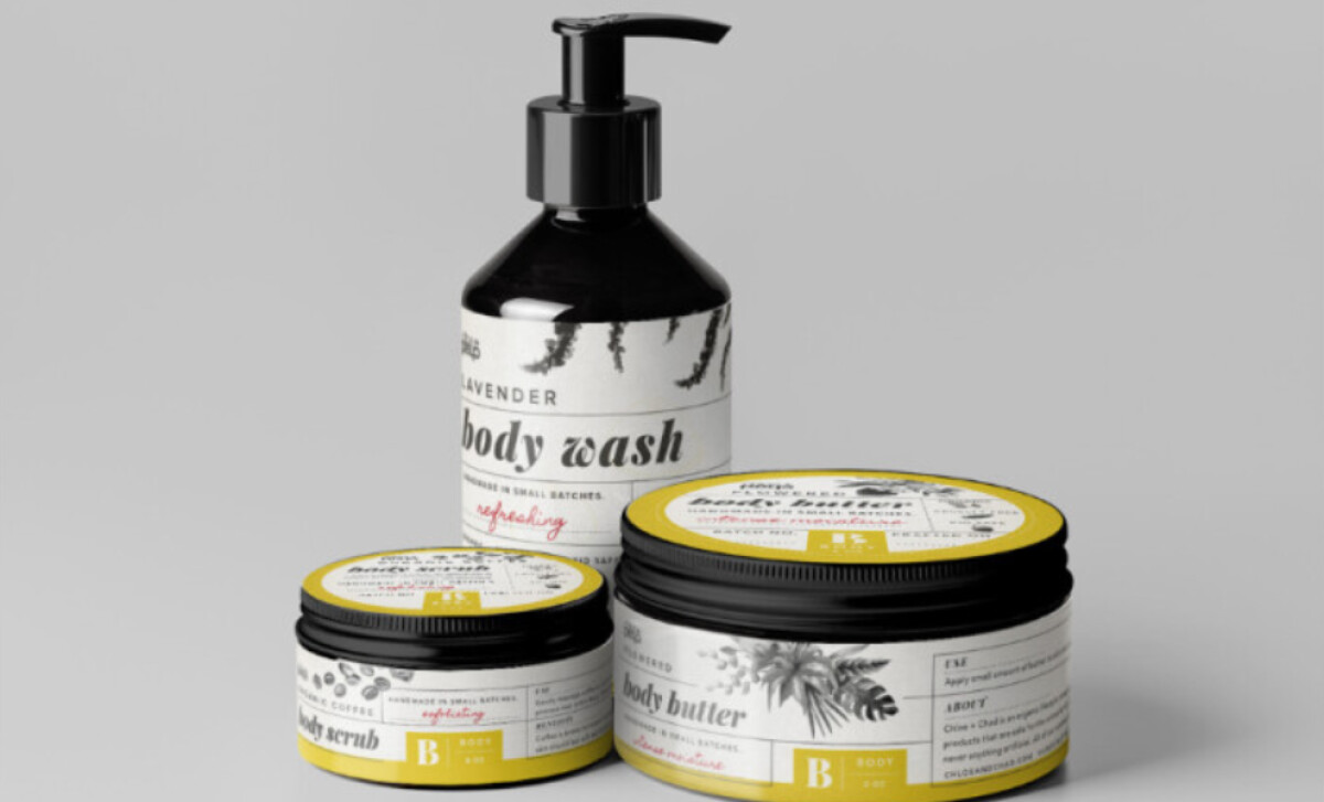
The packaging uses a color-coded system to distinguish product families. Facial care might be green, body products yellow, and so on, with colors used for label highlights or cap details. This creates a visually cohesive collection where each item retains its own character.
Monochrome botanical illustrations, such as sketched lavender or coffee beans, feature on each label. Since package designs with representations of nature lead to higher perceived naturalness by consumers, these illustrations enhance the brand’s natural promise. They make each label feel personalized and handmade, too.
Chloe & Chad exemplifies how to create a strong shelf presence through thoughtful structure and authentic detail. It proves that even handmade, organic products can benefit from a sophisticated, systematized design approach that enhances both brand storytelling and practical usability for the consumer.