Standout Features:
- Rustic label design
- Countryside house illustration
- Print and cursive typography
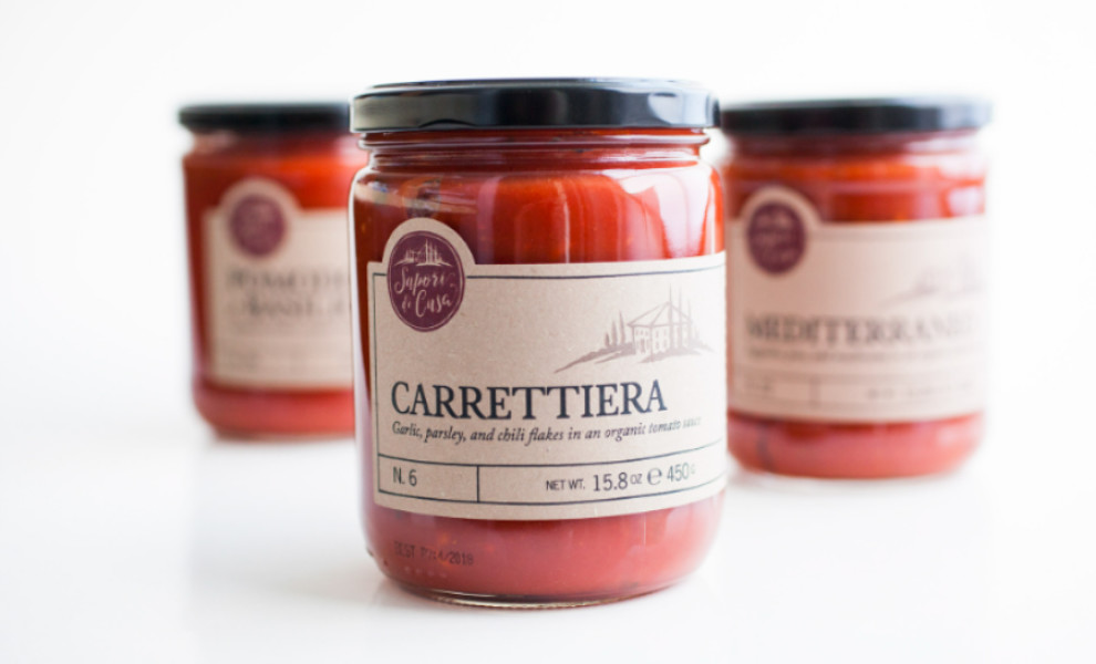
Sapori di Casa's packaging captures the essence of tradition, quality, and craftsmanship, resonating with consumers who value high-quality food.
Designed by Paper Moon Creative, the label's kraft paper-like material gives off a vintage vibe. It features a countryside house illustration, enhancing the rustic atmosphere. The visual conveys the idyllic Italian countryside, transporting viewers to where quality ingredients and time-tested recipes are the norm.
In addition, opting for a clear jar is a wise design strategy. It gives consumers a peek into the product and increases the chances of being noticed on the shelves.
The packaging blends print and cursive fonts. The print typeface displays the product names, infusing the design with a timeless charm, while the elegant cursive font highlights the ingredients, symbolizing the artisan nature of the products.
The overall result is a simple yet timeless packaging design that emphasizes the product's quality and taste.

-preview.jpg)
-preview.jpg)
