_51c85aea8591-desktop.jpg)
Standout Features:
- "Disrupting a conservative sector with a vibrant identity”
- Joyful design
- Custom illustrations
Whisky Is The Limit (WITL) began life on social media, opening the door to a rather exclusive spirit category to broader audiences. Building up a loyal following, sharing stories, travel logs and tasting notes made whisky, in general, more inclusive.
Having established excellent relationships with distilleries worldwide, they were ready to start selecting and bottling their products.
The first challenge ByVolume faced was overcoming the conservative image of the sector to reveal its genuine boldness and progressive spirit packaging. They've created a brand that feels exciting and accessible to adult drinkers from all backgrounds and levels of interest.
The agency developed a strategy that reflected the joy of discovering a great whisky. Your typical imagery of luxurious weekend estates, drinking ages-old whisky by the fireplace is thrown into the trash. In its stead - a creative direction that shuns old stereotypes.
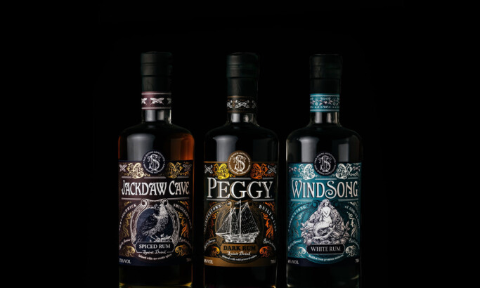
The new logo system composed of hand-drawn lettering in a broad pastel-hued color palette is akin to something found in the craft beer industry. When paired with an illustrative pyramid logomark, it evokes the ideas of height, visually playing with the old sentiment: Sky is the limit! It doesn’t only reflect the simple novelty but also the limitless possibilities of whiskey.
For the packaging design, or to be precise, for each “member” of WITL’s range, the agency drew from each distillery’s history, locales, and mythology. Each bottle is adorned with abstract landscapes overlaid with more detailed spirit animals that embody each whiskey’s character. Talk about adding volume to the vibrancy!

-preview.jpg)