- Article by
- Jermaine Dela Cruz

#A0A19B #B3B3B3 #CBD0D6 #010103
- Agency: Hello Comrade
- Client: SPYRE
- Category: Packaging Design — Beverage
- Location: Amsterdam, Netherlands
- Project Brief: Design packaging that enhances shelf appeal and communicates a high-performance product through a clear, modern visual system.
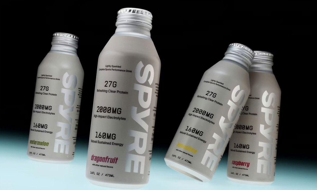
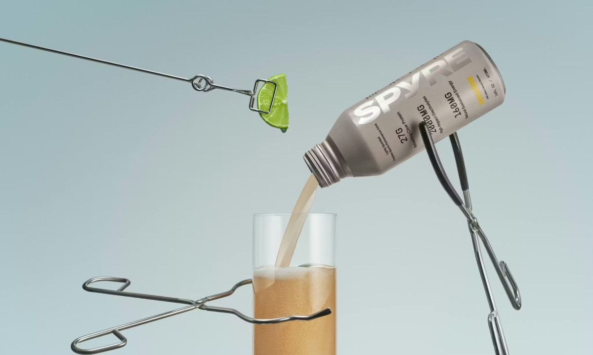
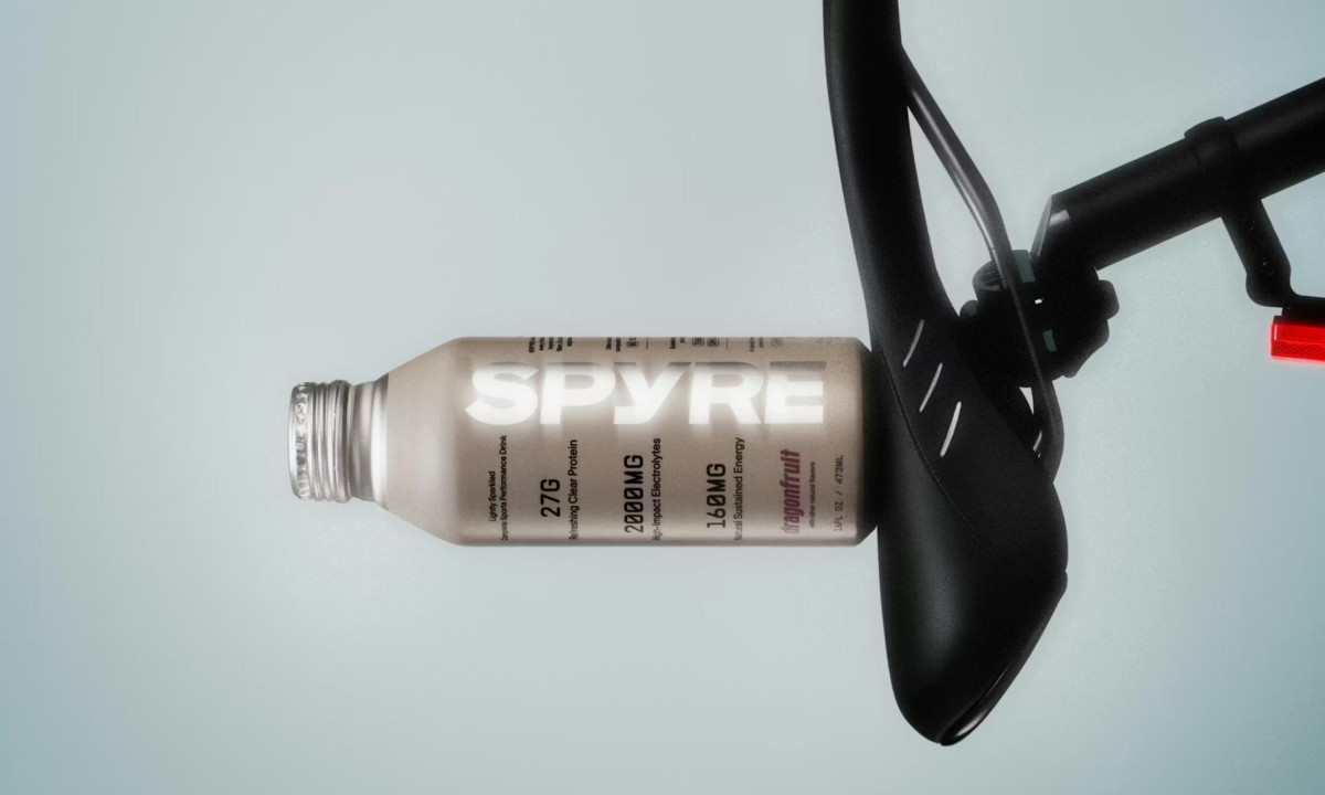
A beverage packaging design earns its shelf space by making nutritional information readable without making the bottle look like a lab report. In SPYRE, Hello Comrade strips the typical heavy supplement aesthetic down to a minimalist system built around the clarity of the drink itself.
Matte greys and clinical whites form the base, with dragonfruit pink and lemon-lime yellow marking each flavor with such precision that the color functions as navigation before it functions as decoration. Nothing competes for attention on the label because the hierarchy was engineered to prevent it.
Performance data sits in a typographic structure optimized for scanning, not reading. The person reaching for this bottle mid-workout needs the key numbers in under two seconds, and the layout delivers that without sacrificing the overall design.
SPYRE balances supplement credibility and lifestyle aesthetics in the same system without softening one to accommodate the other. The bottle works on a pharmacy shelf and in a design blog, and the packaging never has to explain why.
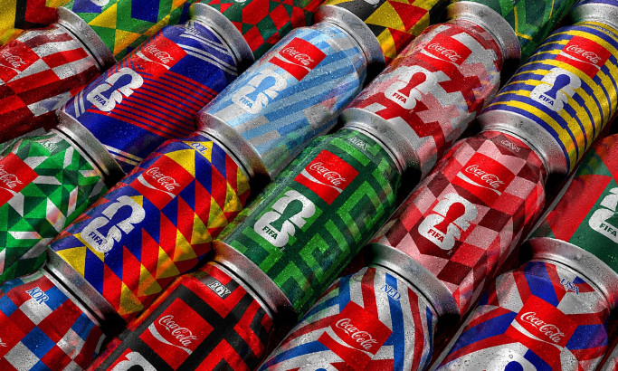
Coca-Cola FIFA World Cup 26 Collectible Country Cans
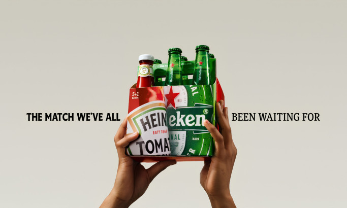
HEINZ x Heineken® Limited Edition Six-Pack
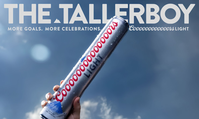
Coors Light Tallerboy
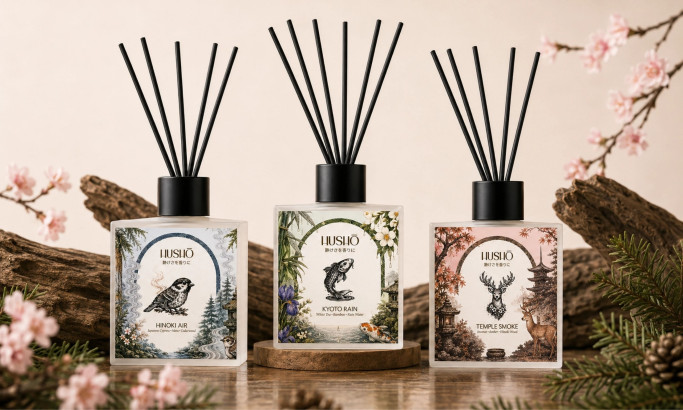
Hushō

Mật Mã Gift Set

I AM ITALIANO