Standout Features:
- Woman with a cup of coffee
- Muted color story
- Sans-serif typography
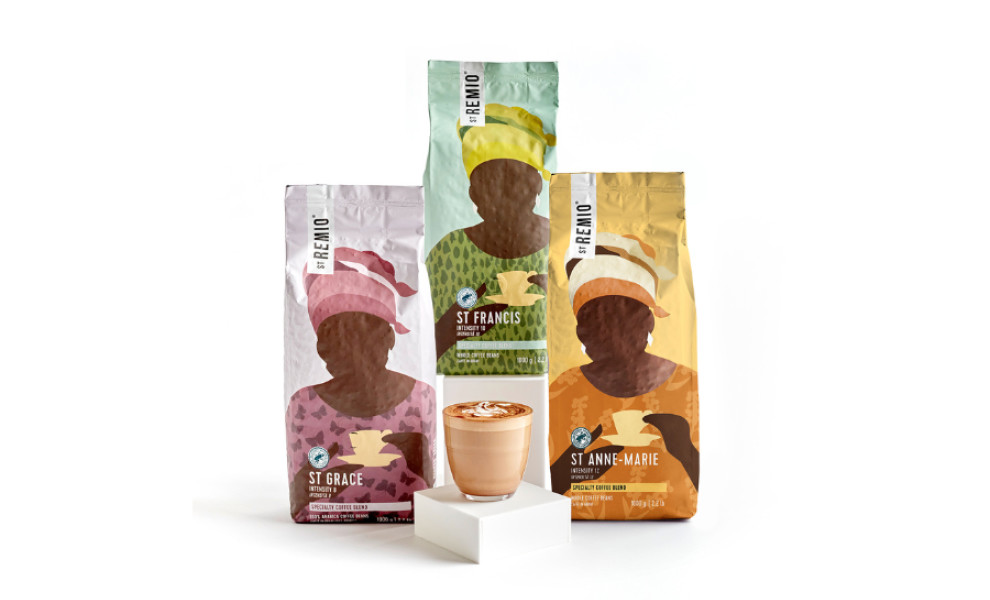
The packaging design for St Remio Cafè Series celebrates female coffee farmers while emphasizing the brand's commitment to sustainability and natural ingredients. Central to Luisa Molinaro's design are the illustrations of women holding coffee cups, inspired by the Rwandan project to support the female coffee farmers of Cocagi.
These drawings, mostly undetailed and void of facial features, are a tribute to all those people we wouldn’t normally see but are behind every cup of coffee. In contrast, the woman's clothes and coffee cup stand out, adorned with nature-inspired elements such as butterflies, trees, and flowers. These symbols hint at the brand's dedication to natural ingredients and sustainability.
The design's muted color palette evokes a sense of gentleness and care, mirroring the careful and delicate process of coffee making. The soft hues create a calming aesthetic that aligns with the brand's welcoming image.
The use of sans-serif typography complements the illustrations and color scheme. This modern typeface brings a contemporary touch to the packaging design, ensuring the text is clear and readable. The simplicity of the sans-serif font contrasts the pastel-colored illustrations, creating a balanced and harmonious layout.

-preview.jpg)

