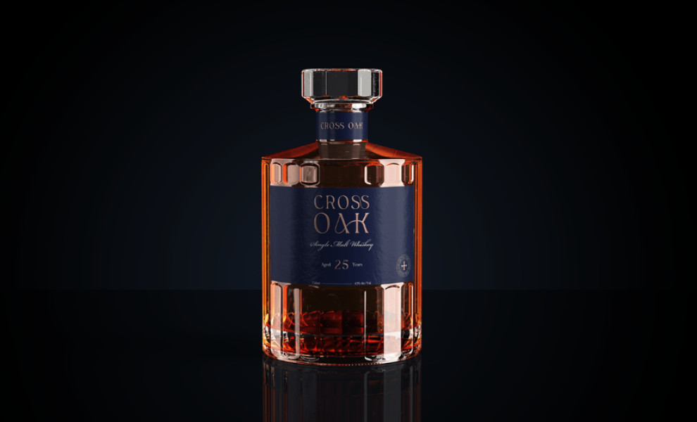
Standout Features:
- Unique bottle design
- Matte-blue label
- Elegant typography
Cross Oak is a US-based distillery producing premium whiskey. Aged for a quarter of a century in oak casks, Cross Oak’s single malt is smooth and bold yet highly approachable.
These attributes were perfectly bottled and embodied in the classy packaging designed by Intertidal Design.
Besides the appealing bottle, the agency carefully “distilled” the whole visual identity by developing an elegant, adaptable system that adds dimension to the brand, centered around the ideas of luxury, craftsmanship, mastery, and sophistication. All of which can be attributed to Cross Oak’s taste. Check out our article on best bottle label designs.
The packaging solution achieves the impossible as it simultaneously stands out with its distinct shape and label while perfectly fitting into the traditional aesthetic of American whiskey brands.

-preview.jpg)