- Article by
- Jermaine Dela Cruz

#BD7E13 #EAD2B0 #262B15 #CD1110
- Agency: Cactus Country
- Client: Steve McQueen Coffee
- Category: Packaging Design — Coffee
- Location: Phoenix, Arizona, United States
- Project Brief: Design coffee packaging that captures a spirit of freedom and adventure through a collectible, story-driven format.
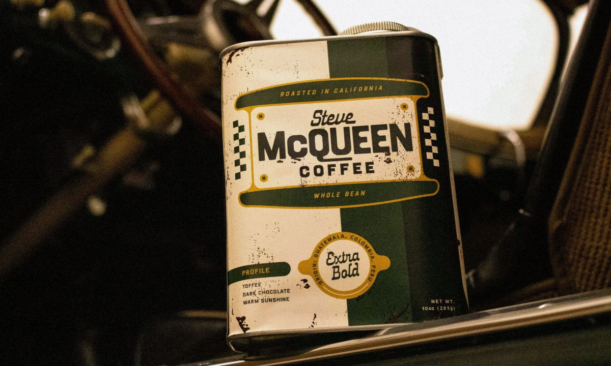
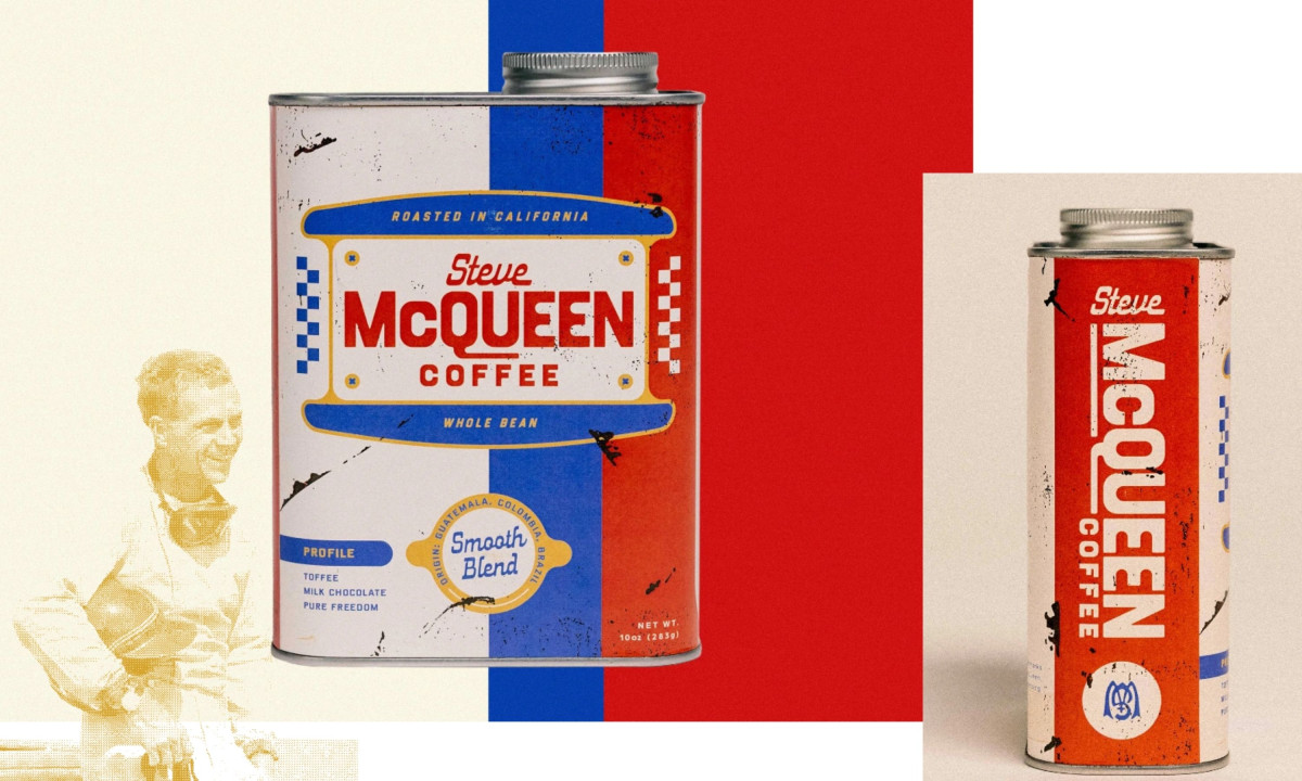
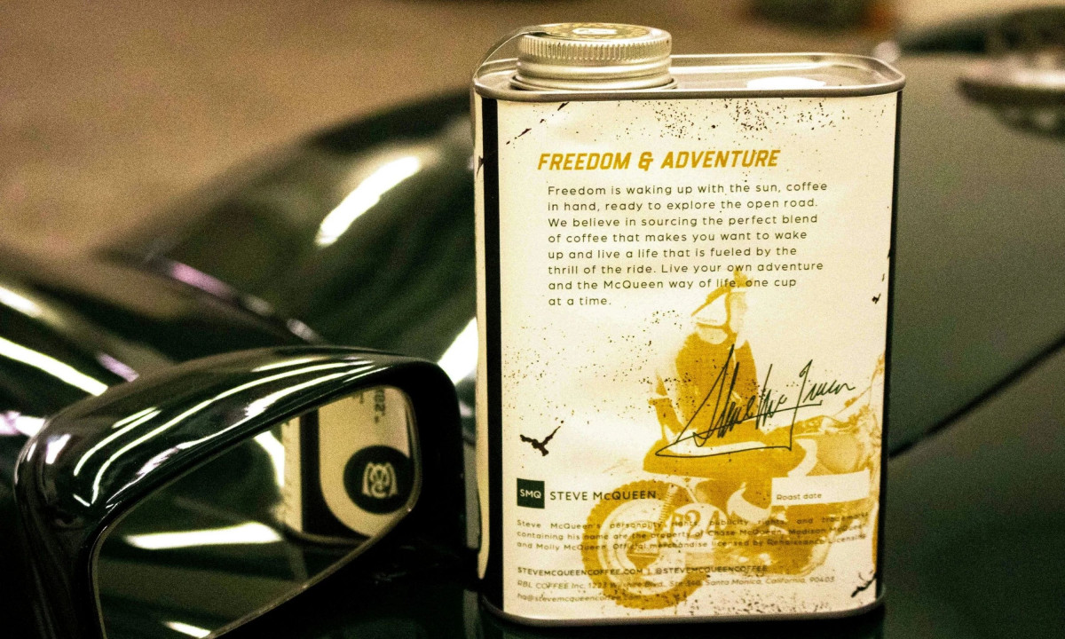
A coffee packaging design earns its shelf space by giving people a reason to pick it up before they know what's inside. Cactus Country's oil can tin for Steve McQueen Coffee does that by looking like it was pulled from a working garage — worn finish and all.
Vintage motorcycle tank emblems and radiator cap graphics map directly to each blend, giving the product line a visual logic that functions as a navigation system. Nothing here is interchangeable.
Retro, speed-driven typography and McQueen's signature monogram compress the brand's entire argument into three square inches of label. Metallic silvers, oil-black, and cream form the base palette, with red and blue accents borrowed directly from classic track livery.
The packaging holds craft coffee and motorsport heritage in the same space without explaining the connection. The tin does that work on its own.
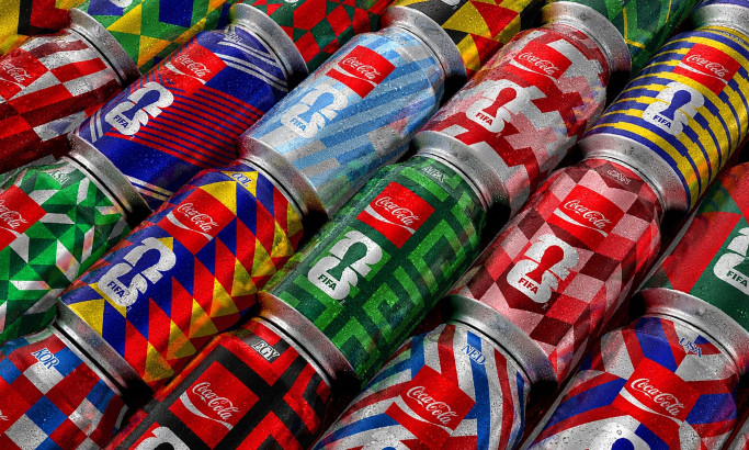
Coca-Cola FIFA World Cup 26 Collectible Country Cans
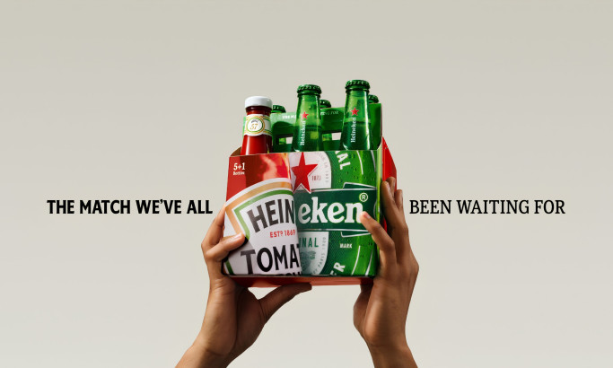
HEINZ x Heineken® Limited Edition Six-Pack
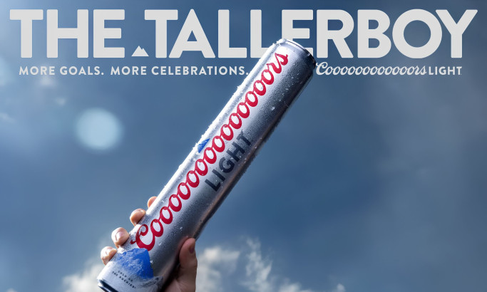
Coors Light Tallerboy
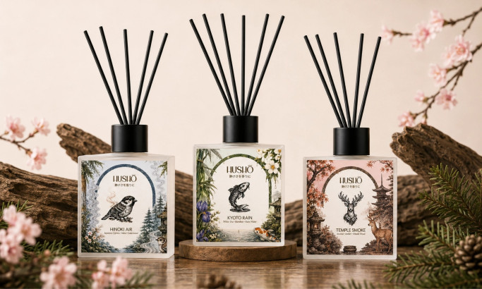
Hushō

Mật Mã Gift Set

I AM ITALIANO