- Article by
- Jermaine Dela Cruz


#EA2F02 #161C19 #FEFFEF #FFEF8D
- Agency: Wedge
- Client: Stone & Skillet
- Category: Packaging Design — Food
- Location: Montreal, Canada
- Project Brief: Create packaging that strengthens shelf impact, supports product expansion, and reinforces the brand’s artisan heritage.
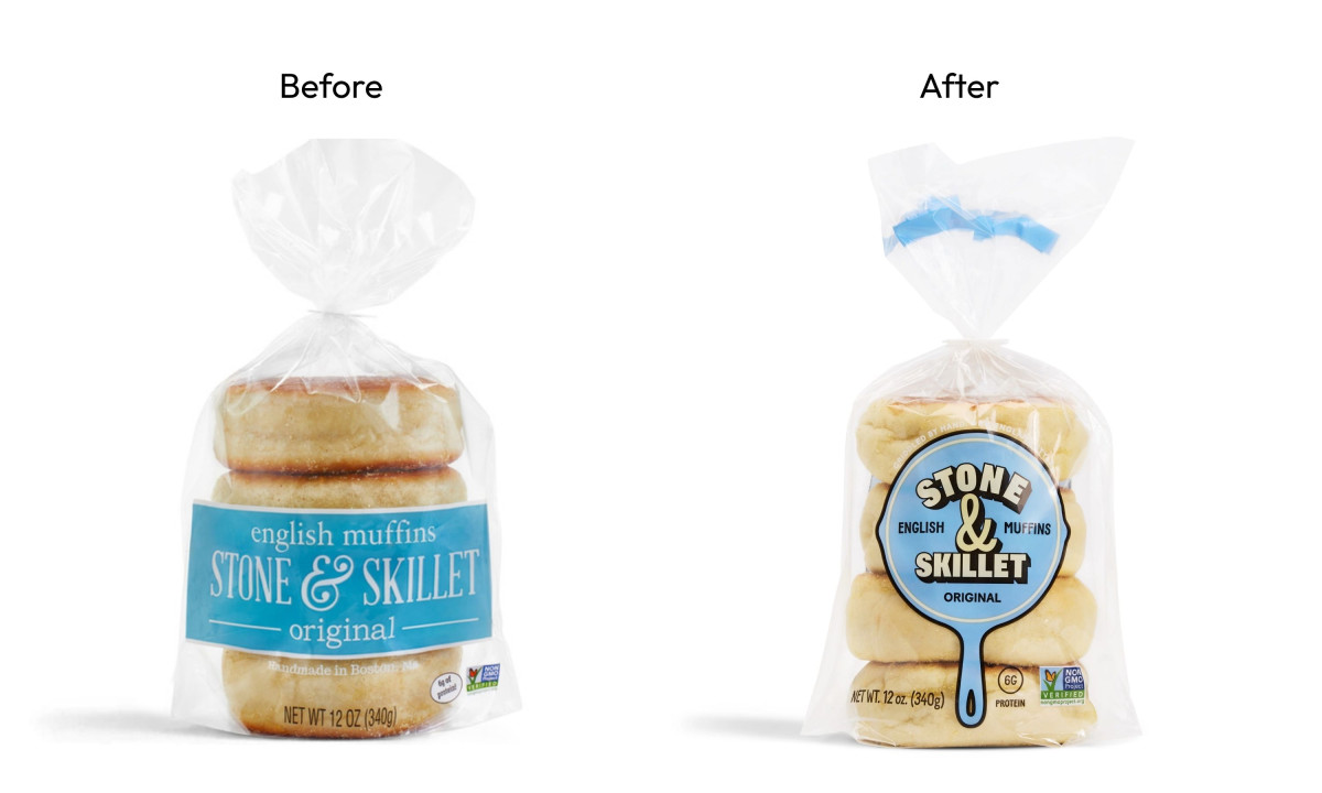
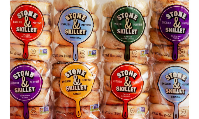
Most food packaging redesigns play it safe. Stone & Skillet's brief to Wedge was the opposite: take a brand stocked in over 3,000 stores and make it feel like it had always known what it was.
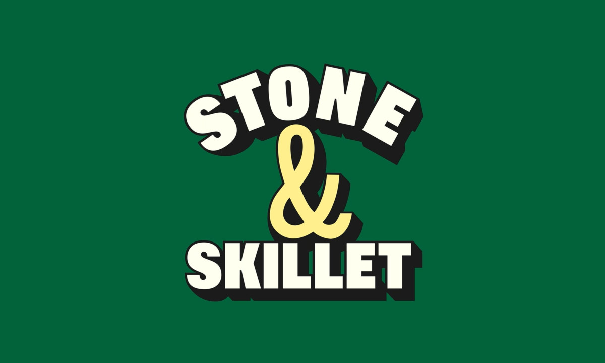
The skillet silhouette is the decision everything else follows from. Wedge stripped it back to its simplest form, a clean pan with a handle, then put the logo, product name and variant all inside it. The mark stopped being a name reference and became a container, which is a different and more useful thing for a packaging system to have at its center.
Color is where the redesign makes its boldest argument against the category. English muffins tend to sit in warm neutrals and soft bakery tones. Stone & Skillet pushes into deep purples, blues and greens, held in check by cream and black typography and a butter yellow ampersand. Each variant gets its own identity on shelf while the system stays immediately recognizable.
Baton Nouveau, the chosen typeface, does the warmth work the color palette cannot. Its thick rounded strokes feel crafted rather than corporate, and set heavy and tightly stacked on the front of pack, it reads as confident without tipping into precious. That balance between bold and approachable is harder to find than it looks in a food packaging brief.
Moctezuma
Fooshi
Stone & Skillet
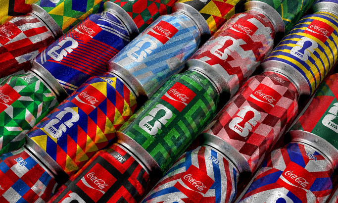
Coca-Cola FIFA World Cup 26 Collectible Country Cans
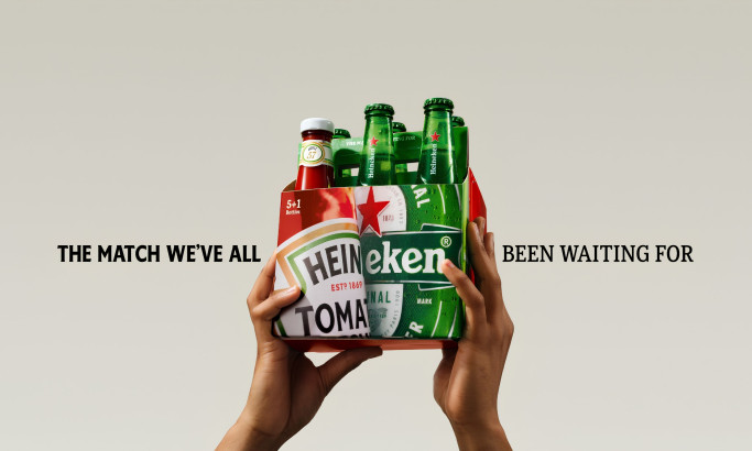
HEINZ x Heineken® Limited Edition Six-Pack

Coors Light Tallerboy
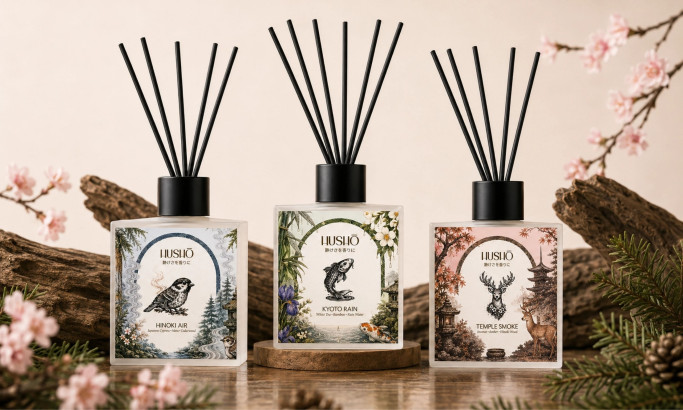
Hushō

Mật Mã Gift Set
