- Agency: Mechi Co. Design
- Client: Super Kind Company
- Category: Packaging Design — Retail
- Location: Pune, India
- Project Brief: Create retail packaging that reflects Super Kind Company’s mission of supporting refugee communities and celebrating indigenous craftsmanship.
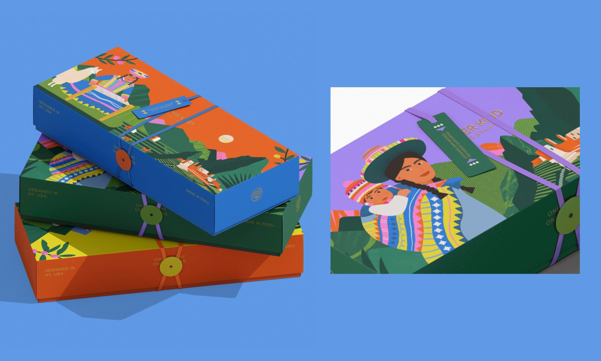
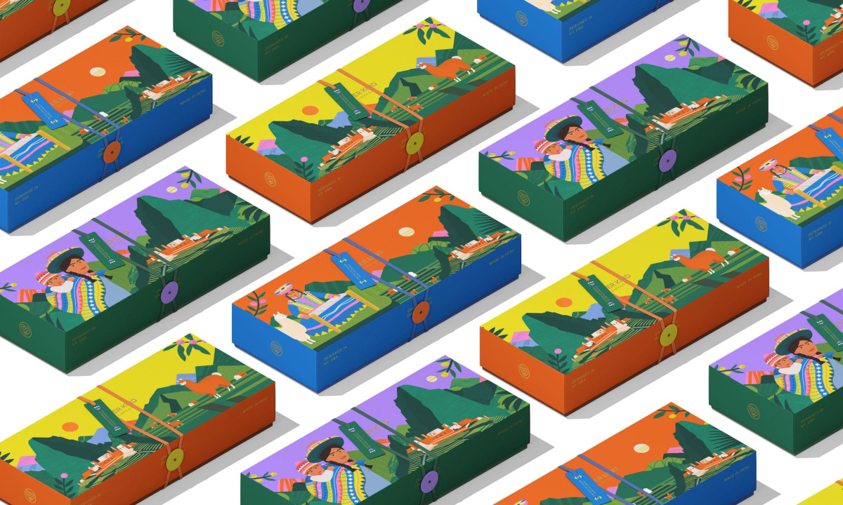
A cause-driven retail packaging should embody the values it's selling. Mechi Co. Design's identity for Super Kind Company runs on two devices: illustrated scenes for the boxes and raw graffiti strokes for the tubes.
Each shoebox carries an Andean tableau of women in woven shawls, a llama, terraced mountains, and the silhouette of Machu Picchu. Color blocks divide every panel into orange, yellow, purple, blue and green, so the stack reads as a marketplace rather than a SKU list.
A button-and-string closure replaces the standard sticker seal. The detail nods to handmade textile work and forces the user to slow down before opening.
The cylindrical tubes shift to gestural painted strokes in pink, blue, green and orange. "SUPER KIND" wraps the body in heavy sans-serif type, paired with the line "Empowering Artisans, Supporting Refugee Education."
The packaging system holds together because Mechi let the medium dictate the visual language. Illustrated scenes carry the story on the boxes and gestural marks carry the energy on the tubes, with one logo tying both ends of the brand together.