Tampout Packaging Design by Olivialand Studio
Tampout packaging introduces a bold, approachable identity for a first-of-its-kind feminine care tool. A confident color palette, clear instructional graphics, and transparent product windows build trust while educating users at point of sale. The system balances medical credibility with accessible branding to clearly communicate purpose and ease of use.
Bold shelf presence differentiates in feminine care
Clear instructional layout supports user confidence
This website uses a colour palette of 4 colours
  • #E13A4B
  • #B3343D
  • #DD9E95
  • #BC7B67
Technologies & Tools
Description
Team Behind the Design
  • Agency: Olivialand Studio
  • Client: Tampout
  • Category: Packaging Design — Retail
  • Location: Jersey City, New Jersey, United States
  • Project Brief: Create retail packaging for Tampout that communicates safety, innovation, and ease of use while standing out in the feminine hygiene aisle.

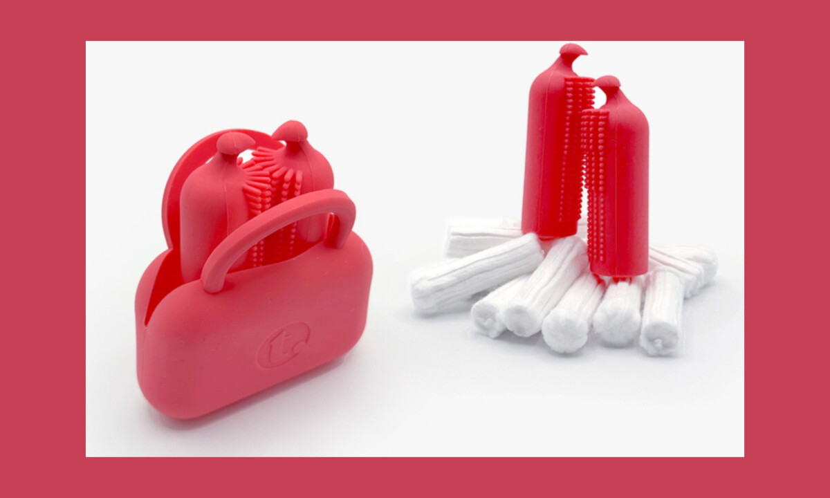
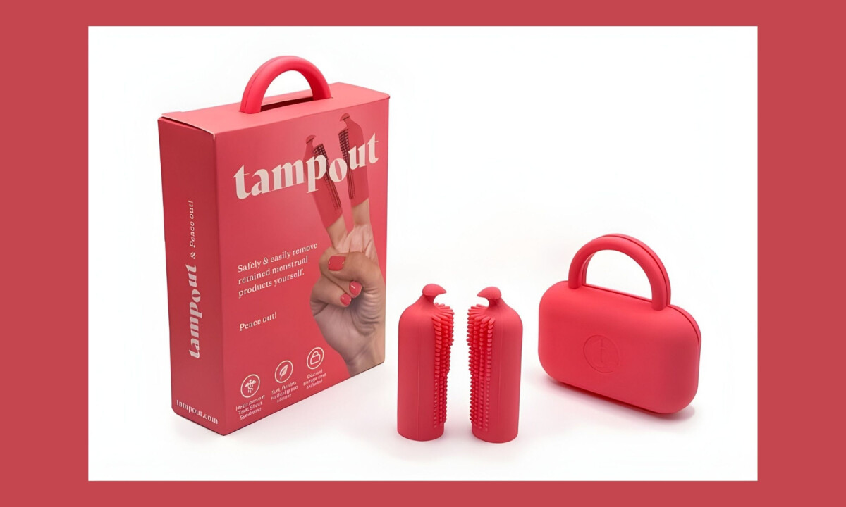
In the feminine hygiene aisle, retail packaging must communicate trust while standing apart. Tampout introduces a first-of-its-kind solution supported by confident branding and clear instructional design that immediately signals innovation and purpose.

Ready to elevate your designs?