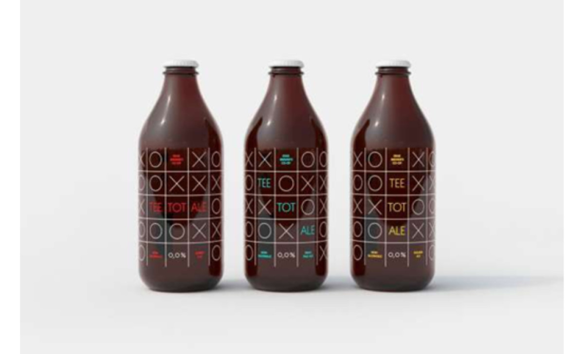
Standout Features:
- A bold Tic-Tac-Toe grid
- Minimalist typography and vibrant color accents
- A full-bottle wrap
Tee Tot Ale is what happens when beer branding doesn’t follow the script. Instead of watered-down versions of traditional beer labels, Erik Kirtley’s concept throws convention aside and builds a visual identity rooted in bold minimalism, nostalgia, and a nod to the straightedge movement. The result? A non-alcoholic beer that makes its stance loud and clear without saying much at all. At first glance, this bottle doesn’t even register as beer. The design borrows the aesthetics of Tic-Tac-Toe, covering the bottle in a clean, structured grid of white Xs and Os. The use of a familiar game as a packaging motif is unexpected, instantly engaging, and entirely fitting for a beer that rejects convention. It’s fun without feeling gimmicky. The words Tee Tot Ale (derived from “teetotalism”) are carefully placed within the grid, using a modern, thin sans-serif typeface. The contrast between the black-and-white pattern and the pops of red, blue, and yellow ensures that the branding remains visually striking while maintaining the grid’s structured, almost mathematical balance. Most beer labels exist as small, framed patches on a bottle. Tee Tot Ale takes the opposite approach, wrapping the entire surface in its design. The result is a 360-degree visual experience that ensures the bottle is identifiable from any angle — something few brands manage to achieve in such a clean, effective way. Unfortunately, Tee Tot Ale isn’t a real product — just a brilliant concept by Erik Kirtley. But that’s what makes it even more interesting. It proves that great beer packaging doesn’t need legacy, tradition, or even an actual brewery behind it. All it needs is a bold idea and a willingness to challenge everything we think we know about beer branding.
-preview.jpg)
-preview.jpg)