Standout Features:
- Vibrant, minimal color palette
- Iconic crow logo
- Storytelling-driven design approach
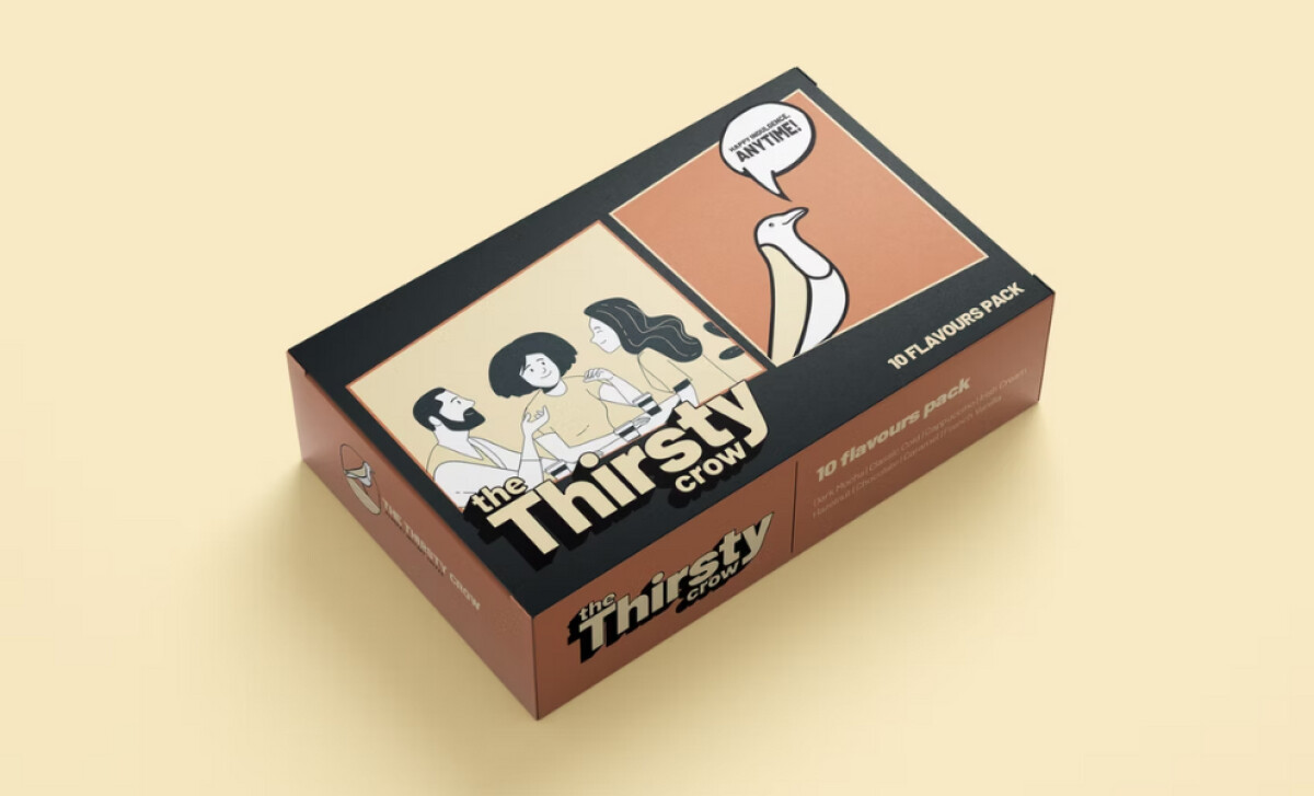
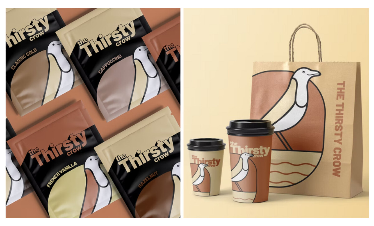
Inspired by the classic fable, The Thirsty Crow's packaging, designed by The Loud Minimalist, embodies perseverance and ingenuity through minimal yet impactful visuals. The clever crow symbol and earthy tones create a distinctive identity that helps the brand stand out and connect deeply with consumers.
The food and beverage packaging features a minimalist, earthy color palette of browns, creams, and blacks, aligning with the brand's theme of nature and authenticity. These tones evoke warmth and comfort suitable for coffee. Contrasting shades across different products also add visual interest yet preserve the overall clean aesthetic.
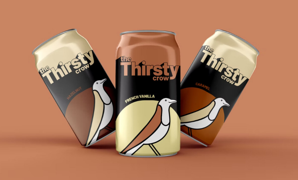
The Thirsty Crow's packaging also features an elegant line art crow illustration, symbolizing intelligence, creativity, and persistence. This highly recognizable symbol embodies the brand's creative, thought-driven experience. Appearing prominently across all packaging, the easily scalable logo reinforces the brand's identity and ensures instant recognition.
A compelling aspect is the packaging's storytelling approach, drawing from the fable of the clever crow. This narrative mirrors the brand's message about creativity and persistence. Such playful illustrations invite consumers to connect more deeply with your products, extending the experience beyond the product itself and capturing the brand's essence.
Its distinctive crow logo, refined color palette, and creative narrative effectively communicate the brand's values of creativity, perseverance, and quality. Ultimately, the packaging transforms the food and drinks it contains into an experience, fostering a personal connection with consumers.