- Article by
- Rafi Lim

#E2DACF #F66663 #365F4E #193830
- Agency: Meteorito Estudio
- Client: Nijasol (Carrefour Special Edition)
- Category: Packaging Design
- Location: Valencia, Spain
- Project Brief: Design packaging that transforms a healthy tomato snack into an engaging, child-friendly experience through structure, storytelling, and bold visual identity.
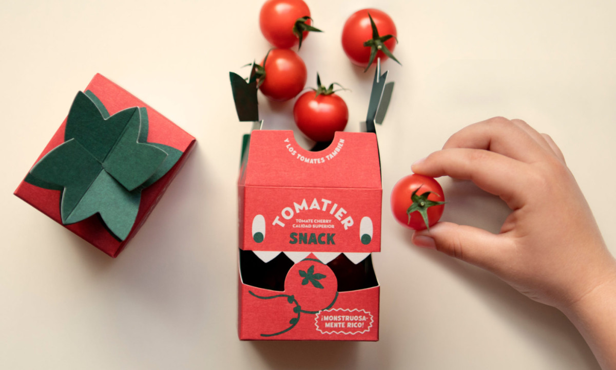
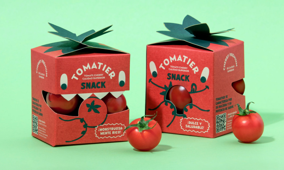
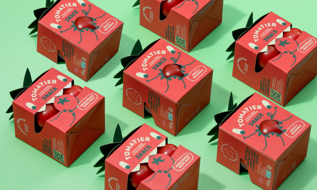
Effective snack packaging for children balances function with storytelling. Tomatier Snack achieves this through vibrant color, engaging characters, and a container design that invites interaction.
The structure plays a central role in the concept. A die-cut mouth reveals the tomatoes inside, turning the product into part of the character itself. This approach connects form and function, allowing visibility while reinforcing the idea of a playful, “tomato-eating” monster.
Color is used with intention and clarity. The saturated red directly references the product, while green accents tie into natural cues and create strong contrast. This palette helps the packaging stand out while remaining immediately recognizable.
The character system is built with minimal elements but a strong personality. Simple shapes — eyes, a smile, and line-based limbs — extend across the surface, creating a cohesive experience from every angle.
A leaf-inspired closure adds a tactile dimension. Beyond function, it reinforces the tomato identity while introducing a sculptural detail that enhances shelf presence.
Typography supports the playful tone without sacrificing clarity. Rounded forms and curved layouts integrate with the character, keeping the product readable while maintaining the visual narrative.