- Agency: Andy Currie Design
- Client: Total Oats
- Category: Packaging – Food & Beverage
- Location: Toronto, Canada
- Project Brief: Design food and beverage packaging for overnight oats kits that feels nutritious, approachable, and convenient for health-conscious, on-the-go consumers.
In assessing food packaging design, I look at how quickly a product communicates friendliness, flavor, and nutritional value without feeling clinical.
The Total Oats packaging strikes that balance by leaning into personality while keeping information easy to scan.
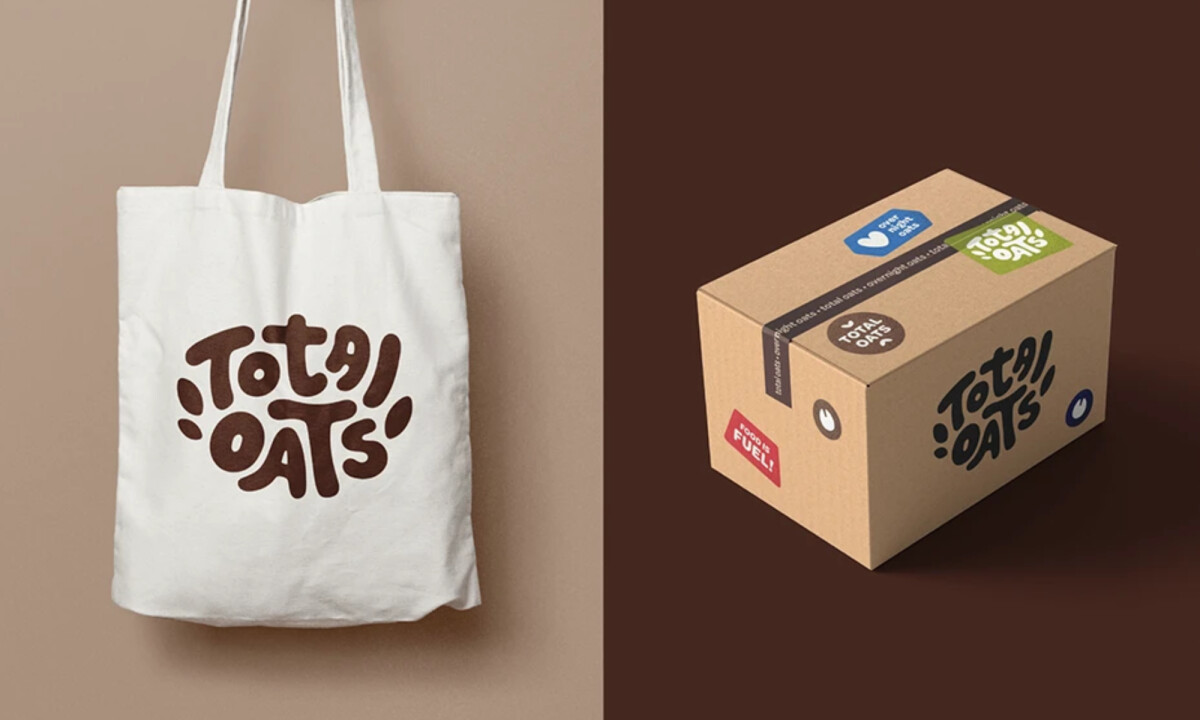
- Brand Expression: I like how the hand-drawn logotype immediately humanizes the brand. Its rounded, slightly irregular letterforms feel homemade and relaxed, which helps position the product as an everyday habit rather than a strict wellness solution.
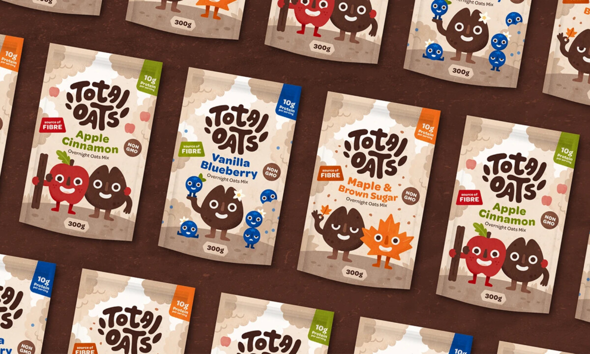
- Illustration System: The ingredient characters add warmth and memorability without overwhelming the layout. Using illustration instead of photography keeps the packaging clean and brand-owned, while still clearly signaling flavor.
- Color Strategy: The neutral oat-based palette grounds the brand in “real food” cues, while brighter flavor accents provide quick differentiation. This balance supports appetite appeal without drifting into artificial energy.
- Information Hierarchy: I appreciate the badge-driven approach to nutrition claims. Key benefits are visible at a glance, but they don’t compete with the brand or illustrations — an important detail for grab-and-go products.
- System Consistency: The visual language translates smoothly across pouches, boxes, and totes. Even when simplified, the brand remains recognizable, which signals a scalable and well-considered system.
What Brands and Agencies Can Learn from Total Oats
1. Make Healthy Choices Feel Emotionally Easy
Playful typography and illustration can lower the psychological barrier to entry for health-focused products, making them feel inviting rather than prescriptive.
2. Separate Personality From Nutrition Claims
Allow the brand to lead visually, then support it with clear, secondary health information. This keeps packaging friendly while still informative.
3. Build Systems That Scale Beyond One Pack
Designing with multiple formats in mind helps brands stay consistent across retail and direct-to-consumer touchpoints without losing character.