Standout Features:
- Bold, geometric label design
- Elegant color schemes with rich contrasts
- Playful patterns showcasing Portuguese heritage
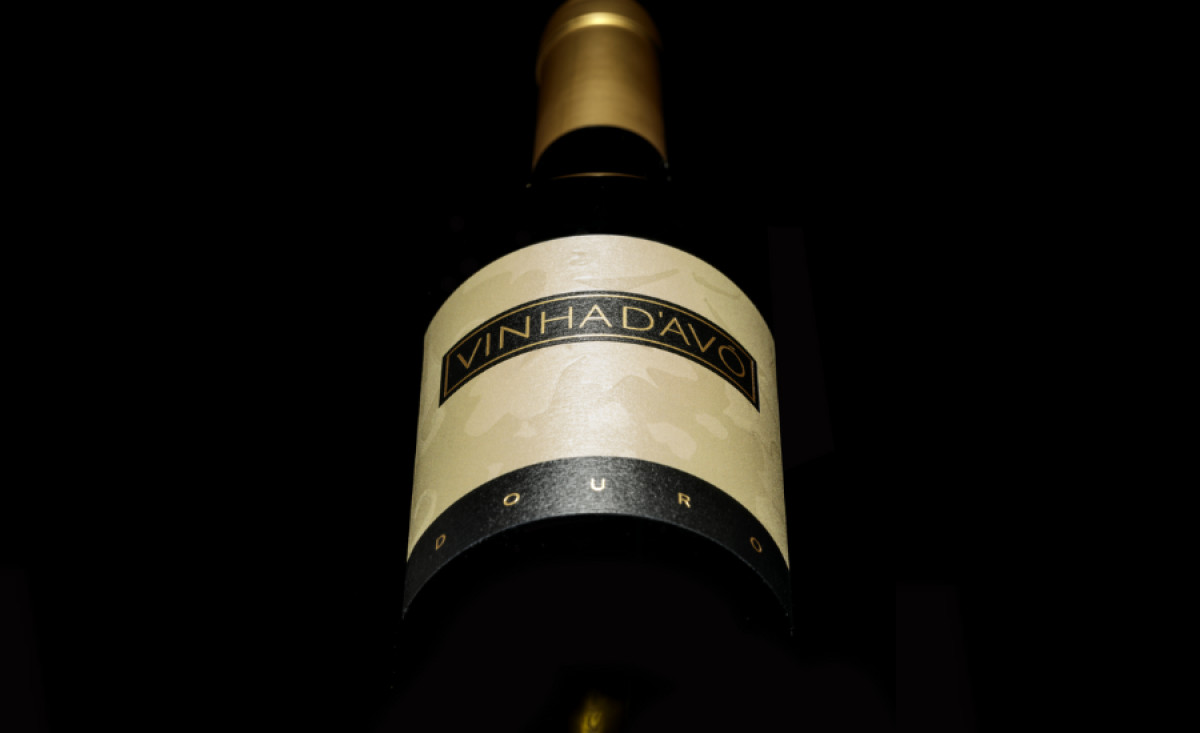
Vinha d'Avó, a Portuguese wine brand known for its deep roots in the country's winemaking traditions, sought a packaging design that would reflect both heritage and a sense of modernity. Working with Mano Brito, the brand’s identity was visually transformed through packaging that balances elegance with playful, bold design elements.
The bold, geometric label design captures immediate attention with its clean, modern lines. The prominent “Vinha d'Avó” logo sits within a sharp, rectangular frame, providing a refined and organized structure. This geometric approach contrasts with the free-spirited nature of the surrounding graphic elements, creating a harmonious yet dynamic visual.
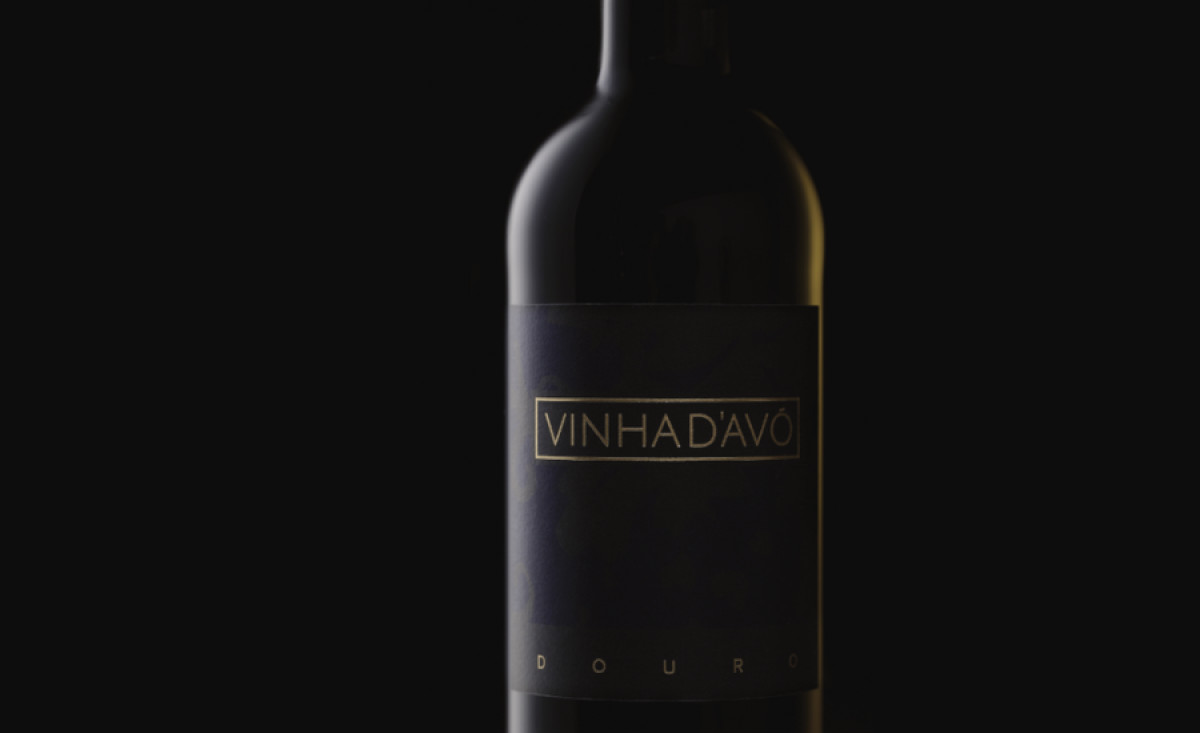
A key feature of the design is the elegant color schemes with rich contrasts. The deep gold, black, and purple not only evokes sophistication but also aligns with the luxurious and premium nature of the product. The subtlety of the color choices allows the wine bottles to stand out without feeling overwhelming, enhancing their overall allure on the shelf.
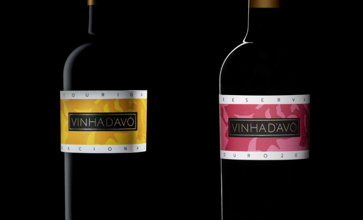
Finally, the playful patterns introduced on each label serve as a nod to Portugal’s rich cultural heritage. These motifs, reminiscent of traditional Portuguese tiles, add depth and character to the packaging, connecting the brand to its roots while still appealing to modern sensibilities.
This beverage packaging design by Mano Brito for Vinha d'Avó successfully merges classic elegance with contemporary design elements. The blend of geometric structure, rich color contrasts, and cultural patterns conveys a sense of prestige while remaining approachable to a diverse audience, making it a perfect representation of the brand’s values.
-preview.jpg)