- Article by
- Jermaine Dela Cruz

#FCEFDF #0367D1 #41A0B0 #72A09D
- Agency: Herefor
- Client: Yala
- Category: Packaging Design — Food & Beverage
- Location: New York City, New York, United States
- Project Brief: Design packaging that enhances shelf appeal and brand identity through bold typography and culturally inspired visuals.
Yala started as a scoop shop in Washington, D.C. Now it's heading to retail shelves, and the packaging had to carry the same energy as the counter. Here, we built a system that feels like a 1940s Greek-American ice cream parlor: bold, loud, warm, and a little bit proud.
The visual language draws on two sources at once. The structural framing and wavy dividers reference Greek architectural shapes.
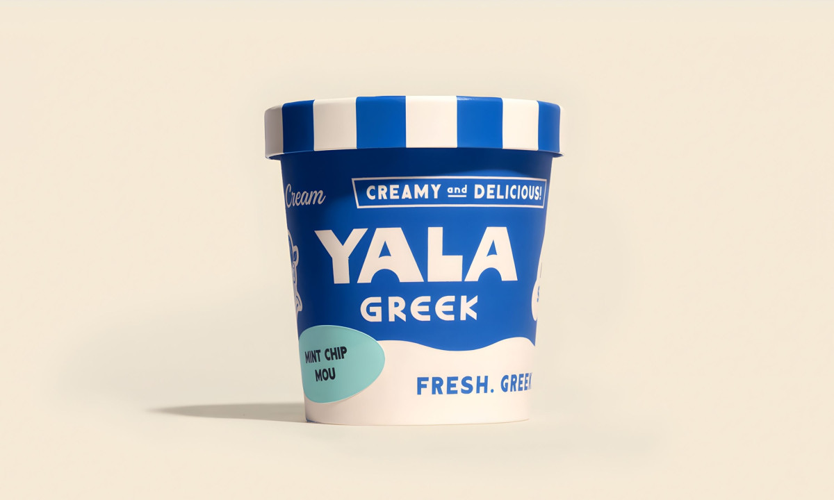
The chunky condensed lettering, the "Creamy and Delicious!" banner, and the blue-and-white striped lid reference the hand-painted signage of midcentury Greek-American soda shops and parlors. The packaging looks vintage without looking old. That's a hard line to walk, and Herefor stays on the right side of it.
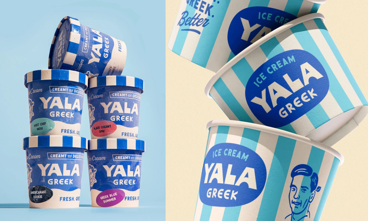
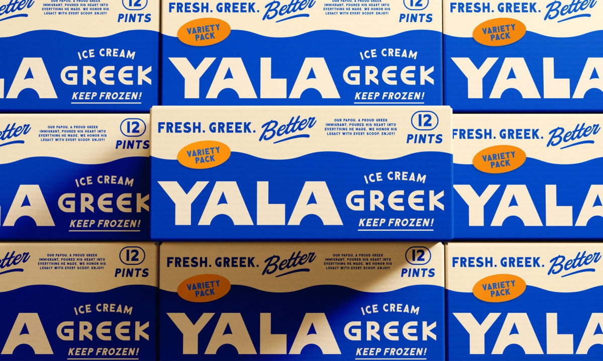
At the center of the brand is Papou, the founder's grandfather. His line-drawn portrait appears on the smaller cups, tying the brand to a real person rather than an abstract idea of Greek culture. The variety pack carries his story in small type on the side: "Our Papou, a proud Greek immigrant, poured his heart into everything he made. We honor his legacy with every scoop." That copy does more brand work than any graphic element on the box.
The color system runs on saturated cobalt blue, white, and cream with orange accents on flavor tags and the "Better" script in the tagline "Fresh. Greek. Better."
The palette nods to the Mediterranean coast, but the saturation level pushes it past pastoral and into something closer to vintage signage. Bright, confident, meant to be seen from across a freezer aisle.
Flavor differentiation stays simple. Colored oval tags (mint green, red, orange) sit on the same blue-and-white template. Five pints together read as a unified wall. The system scales from a single pint to a 12-count variety pack without losing anything.
Herefor made Greek ice cream packaging that feels like it's been around for decades on its first day at retail. The vintage register is the strategy. In a freezer full of minimalist wellness brands, Yala shows up with stripes, a family story, and a grandfather who would have loved how it turned out.
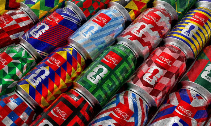
Coca-Cola FIFA World Cup 26 Collectible Country Cans
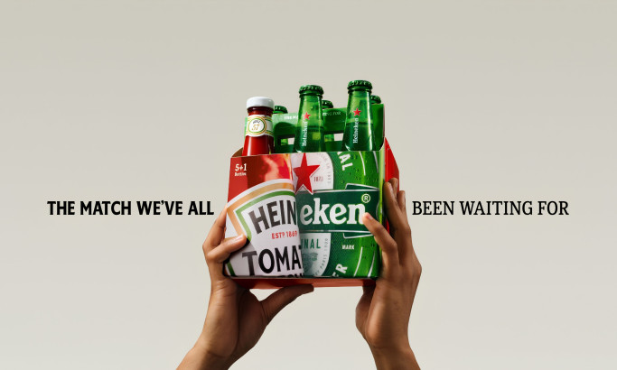
HEINZ x Heineken® Limited Edition Six-Pack

Coors Light Tallerboy
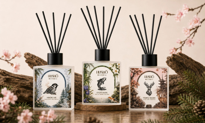
Hushō

Mật Mã Gift Set

I AM ITALIANO