Standout Features:
- Chronological collage grid of historical images
- Utilitarian and clean sans-serif typography
- Deep-toned minimalist background for high contrast
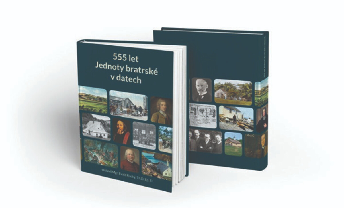
FS Interactive designed the cover for 555 let Jednoty bratrské v datech, a book mapping a long and complex history. The design's challenge was to visually represent 555 years of moments, figures, and artifacts.
The design features a structured collage of historical images in a tight grid layout. These visuals, from paintings to photos, document the 555-year history of the Unity of the Brethren.
Wrapping around the front and back of the book cover, this approach visually communicates that the book is not purely a textual tome, but a work richly enhanced by carefully curated archival materials.
The title uses a modern sans-serif typeface with uniform strokes and generous line spacing for clarity. This utilitarian approach to typography is fitting for a fact-based historical volume.
It suggests editorial neutrality and academic seriousness, which is important for a publication aimed at historians, educators, or institutional libraries.
A dark, cool hue serves as the book’s background, acting as a unifying canvas for the vibrant imagery and white text. This minimalist backdrop extends across the spine and back cover uninterrupted.
This book cover design illustrates that for historical or scholarly works, a design that balances visual density with editorial clarity can be highly successful.
The combination of a rich image collage with utilitarian typography and a minimalist background positions the book as both a serious historical archive and a visually appealing, modern resource for readers.
Ultimately, this thoughtful approach is a direct appeal to its target market, where, according to research, cover design is a major purchasing factor for 79% of readers.


