Standout Features:
- Extreme minimalism which maximizes negative space
- Elegant serif mark paired with clean sans-serif
- Strict neutral cappuccino tone color palette
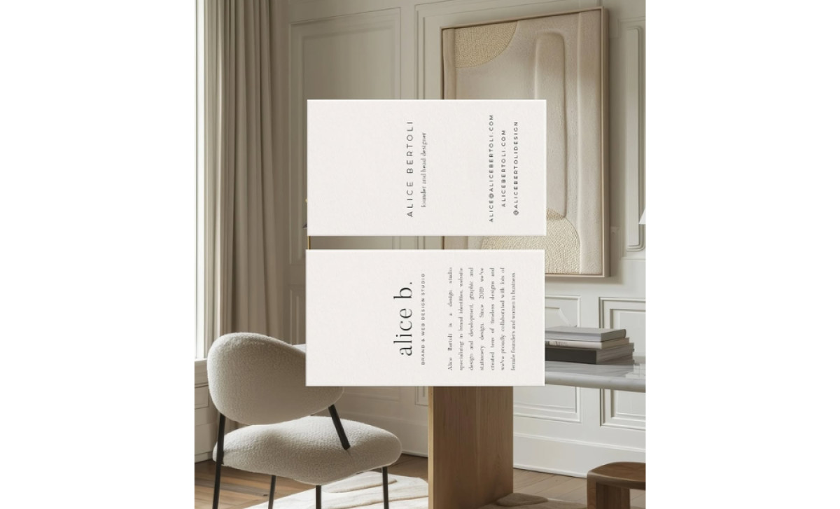
If you're running a creative boutique studio like Alice Bertoli's based over in Milan, and you're specifically aiming for clients who appreciate modern minimalism, your own business card has to perfectly nail that specific vibe. These card designs serve as a fantastic example.
The card's high-end air comes from its super minimalist style and masterful use of empty space. There’s simple, justified layouts on both sides, with text positioned thoughtfully to let the warm, neutral paper really breathe. Such a move prioritizes elegance over density, and acts as a physical demo of Bertoli’s style.
The fonts chosen really nail the "modern classic" vibe too. You see the primary "alice b." mark set in a classy high-contrast serif all in lowercase, which is, by nature, timeless. Then, all the informational text uses a clean, light sans-serif font that's modern and clear. Using type this well together adds to that aesthetic the card is going for.
Color-wise, the card strictly follows their preferred neutral tones — simply using dark text on warm cream stock, which really nails the brand's cappuccino vibes. This limited color palette instantly gives off a calm and premium look, which just feels very authentic to the designer’s art style.
By working to embody the design studio's philosophy of "modern classic" and "minimal luxury" through every design choice, this piece can help attract the right kind of clientele almost automatically. Plus, the business card itself becomes a miniature portfolio piece, capable of demonstrating Bertoli's unique design philosophy and taste level instantly.