- Agency: FIXGU
- Client: DRYBOSS
- Category: Print Design — Retail
- Location: Ubá, Brazil
- Project Brief: Produce retail print materials that communicate moisture-control solutions through bold branding, expressive typography, and impactful visuals.
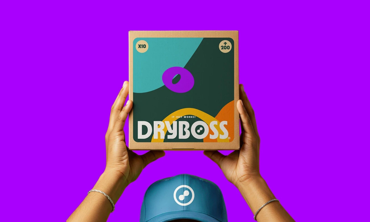
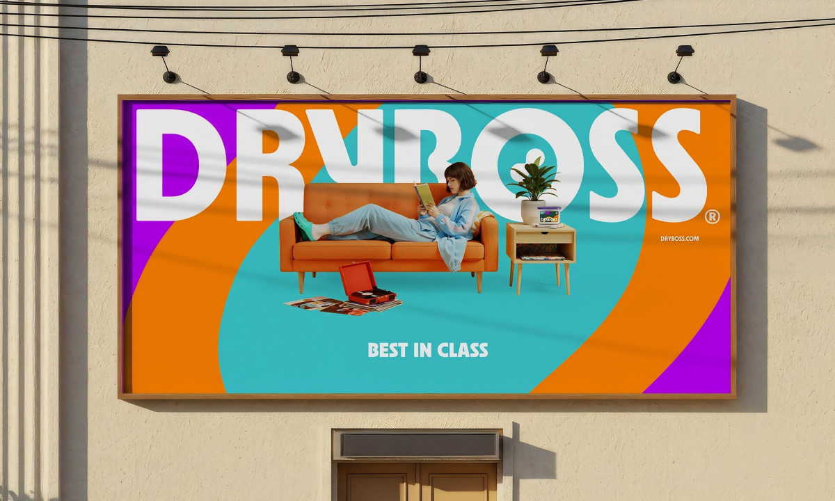
A retail print system earns its shelf space by making a functional product feel like a deliberate choice. FIXGU's identity for DRYBOSS gives moisture-control products a visual presence that has no business being in the same aisle as the competition.
Safety orange, deep cobalt blue and electric purple hit before the product claims do. High-contrast photography and heavy typography push the brand into territory hardware goods rarely occupy, the kind of shelf presence that makes a dehumidifier look like something a person would actually want to own.
The print design scales from large-format collateral down to the takeaway bag without losing its intensity. Every physical surface the customer touches delivers the same graphic weight, ensuring the brand stays consistent whether it's filling a wall or leaving the store in someone's hand.
DRYBOSS makes moisture control look like a category worth caring about, which is the harder half of the brief. FIXGU delivers an identity assertive enough to own whatever surface it lands on.