Standout Features:
- Clean and professional layout
- Clear visual hierarchy
- Consistent branding elements
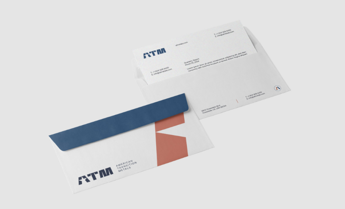
CDJ Design's print suite for American Transition Metals achieves a striking level of professional clarity. Encompassing business cards and a quarterly report, the materials are meticulously crafted to prioritize clear communication and a unified aesthetic, thereby projecting an image of corporate dependability.
The materials are immediately distinguished by their clean, professional layout. Generous white space and a focus on clear information prevent the visual clutter that’s all too common in collaterals, resulting in an easily digestible design. It's this simple aesthetic and structured format that provides the print that overall polished feel.
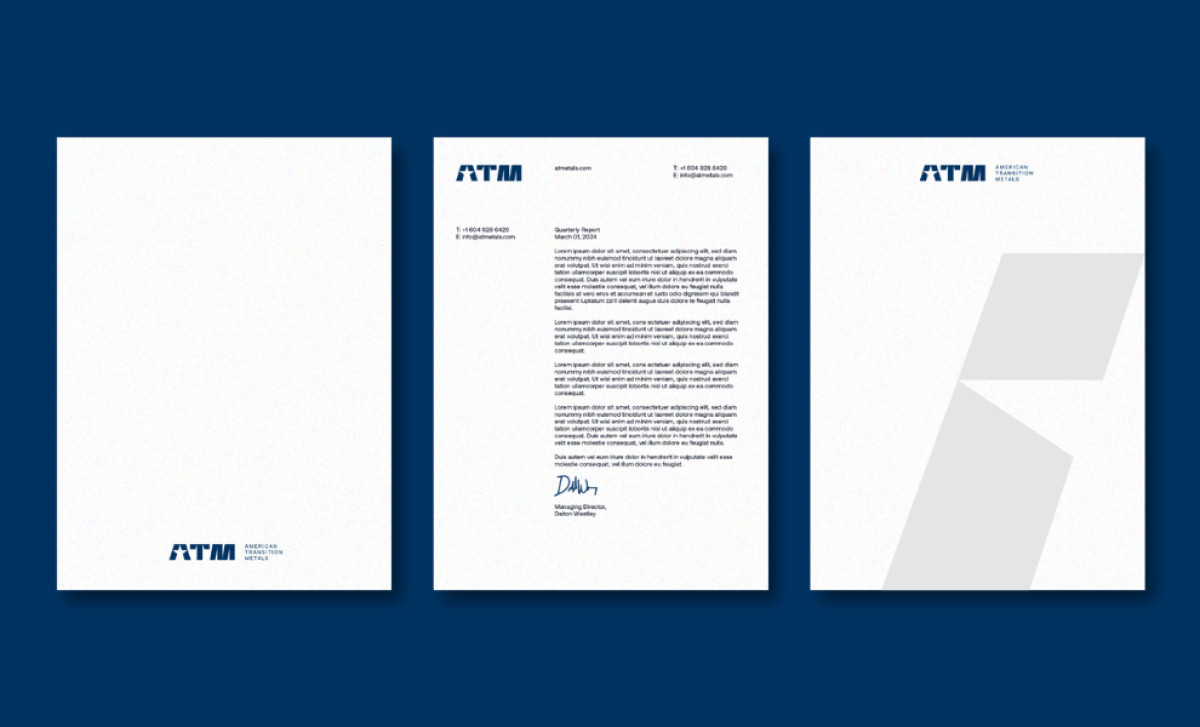
The print materials also establish a clear visual hierarchy. It follows the best practices in font sizes, weights, and spacing for strategically guiding the reader's eye. For instance, the headings and key contact information stand out, while supporting details are presented in a less prominent manner.
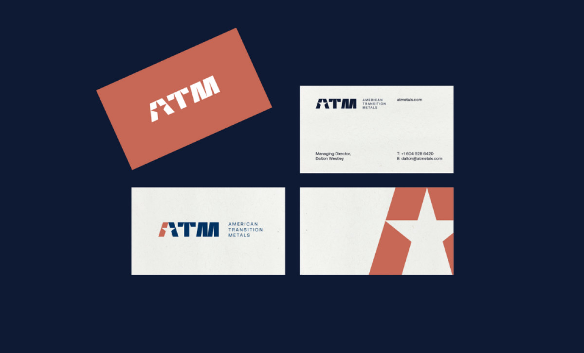
Across all the different professional services print materials, brand consistency is meticulously maintained. The "ATM" logo, along with a simple and professional color palette of dark blue and burnt orange, plus the typography, are used uniformly across all printed items, which is a professional standard often overlooked by other brands.
The print materials for American Transition Metals leave little to chance. CDJ Design's strategic use of simplicity and consistency creates a silent narrative of competence. The design's strength lies in what it doesn't say — it doesn't need to. It simply is, projecting a quiet competence that resonates more profoundly than any verbose claim.