Anderson Strathern is a long-established law firm headquartered in Edinburgh, serving clients across Scotland and beyond. As the firm evolved its visual identity, it partnered with Ricky Stevens to develop a print design system reflecting both authority and forward momentum.
The resulting work delivers clarity, confidence, and narrative depth, which are essential qualities for a legal brand operating in a trust-driven environment.
Industry Insight: Print continues to influence real business decisions. According to a FedEx Office survey, 85% of consumers say they are more likely to shop with businesses that use professionally printed materials.
Anderson Strathern Print Design: Key Findings
Structured Layouts Improve Clarity and Information Retention
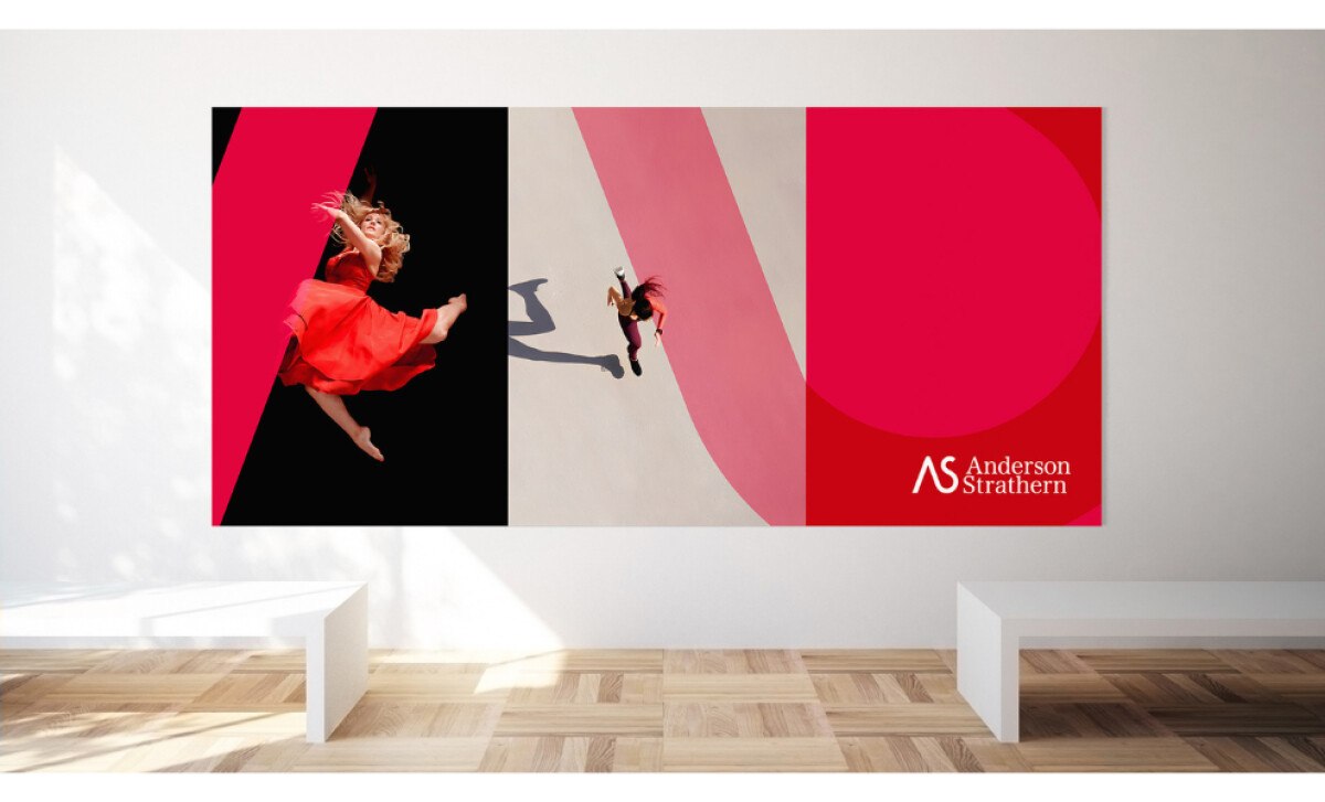
Designed by Ricky Stevens, the system is anchored by a triptych layout that introduces order and rhythm across all applications.
This rule-of-thirds approach allows complex legal information to be presented in a clear, digestible way while maintaining visual interest.
"The triptych rule-of-thirds layout provides an outstanding balance and translates well to the web."— Jefferson Brett, DesignRush Awards Jury
His observation highlights how structural clarity ensures high-stakes messages are understood and trusted. Research from SEO Sandwitch supports this, indicating that print materials are processed with up to 70% higher recall than digital media.
High-Quality Print Reinforces Professional Credibility
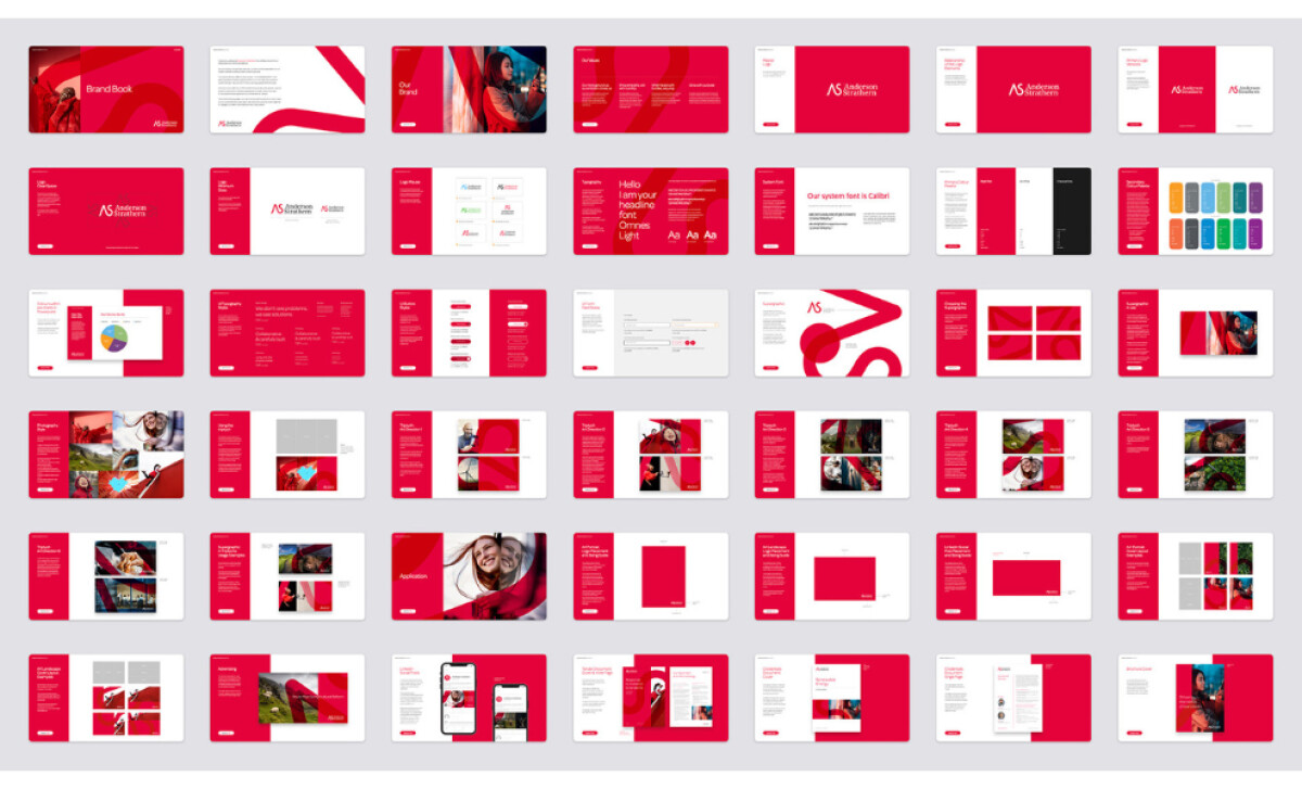
The production quality, from sharp typography to precise color execution, signals a high level of professionalism. In the legal sector, clients often equate visual quality with service reliability, making attention to detail a direct driver of brand perception.
"Bold words, and strong visuals convey meaning with each nuance. Dramatic meets understated simplicity."— Andrea Owsinek-Brucker, DesignRush Awards Jury
While the bold visuals convey meaning, experts suggest that moving beyond default system fonts like Calibri would further distinguish the brand. FedEx Office research confirms that print reinforces legitimacy, serving as a strategic asset during critical client-facing moments.
Explore the best print designs to see how other professional services are using physical media to build trust.
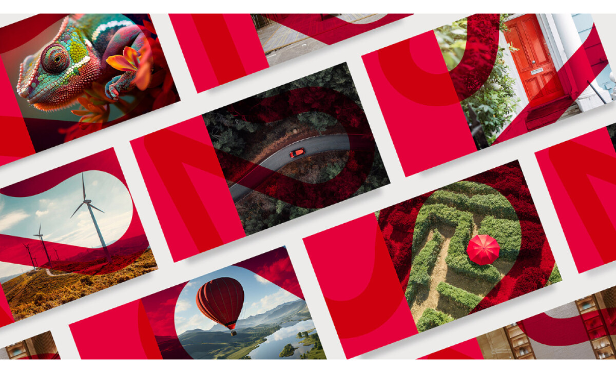
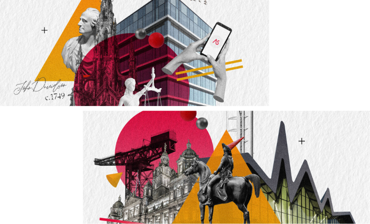
Regional Imagery Builds Emotional Connection
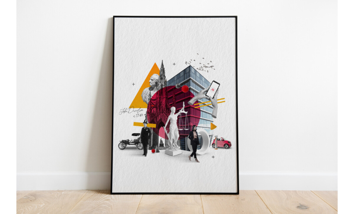
Custom illustrations of Edinburgh and Glasgow introduce a strong sense of place, avoiding generic stock visuals. By celebrating the firm’s geographic roots, the design feels more human, grounded, and authentic.
"The bespoke digital illustrations are like works of art and very pleasing to the eye."— Jefferson Brett, DesignRush Awards Jury
Jefferson’s feedback emphasizes how fresh, emotive concepts with vibrant colors create a powerful narrative. Data from G2 suggests that 93% of consumers are influenced by visual content when making purchasing decisions, proving that localized storytelling strengthens brand recognition in the firm's core market.
Bold Graphics Signal a Progressive Legal Brand
Oversized typography and confident color blocking inject modern energy into a traditionally conservative category. These choices challenge outdated visual norms while maintaining the restraint expected of a legal print design.
"Best Brand Storytelling in Print – Powerful narrative conveyed through printed design."— Jefferson Brett, DesignRush Awards Jury
This recognition of powerful storytelling aligns with data showing that design-led organizations historically outperform competitors by over 200%. For Anderson Strathern, these bold choices position the firm as a forward-thinking leader without compromising its established authority.
What Brands & Agencies Can Learn from Anderson Strathern
Ricky Stevens’ work for Anderson Strathern shows how a legal brand can move beyond conventional seriousness and use modern design tools to communicate authority with energy. It’s a reminder that even tradition-heavy sectors benefit from bold visual clarity.
1. Structure Can Support Storytelling
The triptych layout system gives each composition order and rhythm. This approach demonstrates how structure can guide narrative without feeling restrictive, especially in content-dense industries like law.
2. Regional Character Builds Authenticity
Illustrations of Edinburgh and Glasgow add humanity and local pride to the brand. This blend of bespoke art and photography shows how geographic identity can deepen trust and recognition.
3. Clean Typography Amplifies Confidence
The contemporary type choices create a clear hierarchy that reinforces professionalism. It proves that typography alone can elevate a legal brand’s presence when handled with precision.
About DesignRush Featured Designs
At DesignRush, we review hundreds of agency projects each month. The featured selections stand out for clarity, creativity, and execution across digital and brand experiences.
Exceptional works proceed to our Monthly Design Awards, where they’re recognized as leading examples of design craft.
Explore standout print design projects that push creativity forward:
- Best Print Designs
- Best Website Designs
- Best App Designs
- Best Logo Designs
- Best Packaging Designs
- Best Video Designs
For a full list of design agencies and related services, see our Agency Directory.