Standout Features:
- Serif typography and versatile monogram
- Mocked up with realistic imagery
- Minimalist and cohesive design variations
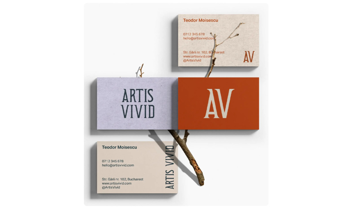
The main goal driving the design for the Artis Vivid business cards was to create a truly sophisticated visual signature that accurately reflects the artistic quality hinted at by the brand name itself. DeadSky Studio focused on achieving this by using elegant serif fonts and then adding unique organic touches, all presented within a polished framework.
The whole identity is built beautifully on elegant font choices. The designer used a sharp-edged, classic serif for "ARTIS VIVID" and the corresponding "AV" monogram. Then, a clean, light sans-serif handles contact info clearly, while the monogram in that same pointed serif provides a versatile anchor for the whole design too.
Designers who need to present card designs in mockup form, take note. In this one particularly, the twig or branch featured adds a really unique, organic element to the presentation. It complements the elegant typography by bringing in a natural feel. This is reinforced well by the choice of muted, earthy colors and the cards’ textured paper.
The whole system follows sophisticated minimalist ideas nicely throughout the variations shown. All the different layout options look clean and make good use of negative space too. Having these differently colored and laid out options suggests a well-considered system that thought of the best way to present the client’s information, which is key.
This business card system demonstrates quite beautifully how genuine elegance often comes directly from thoughtful restraint in design. Combining classic typography with subtle textures or details softens the overall feel and helps ensure their crucial first impression is both undoubtedly professional and distinctively, authentically theirs.