Standout Features:
- Streamlined, tech-forward visual identity
- Cohesive brand pattern with arc motifs
- Smart integration of digital elements
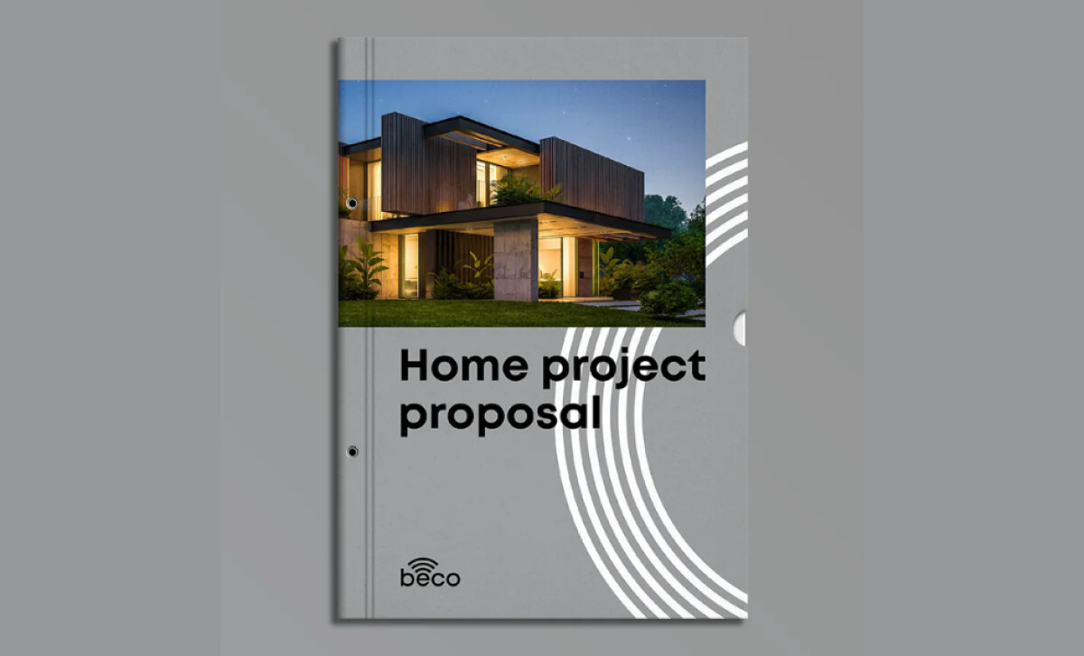
The print design for Beco, developed by Val-Or, perfectly aligns with the brand’s mission to simplify home automation through intelligence. Through sleek layouts, modern typography, and clever use of brand patterns, the materials convey technological sophistication with minimal effort.
A clean sans-serif typeface in deep black delivers clarity and professionalism, while generous white space and precision-aligned elements echo the brand's focus on automation and efficiency. Additionally, the muted grey backdrop subtly reflects high-tech minimalism, allowing the architectural photography to command attention.
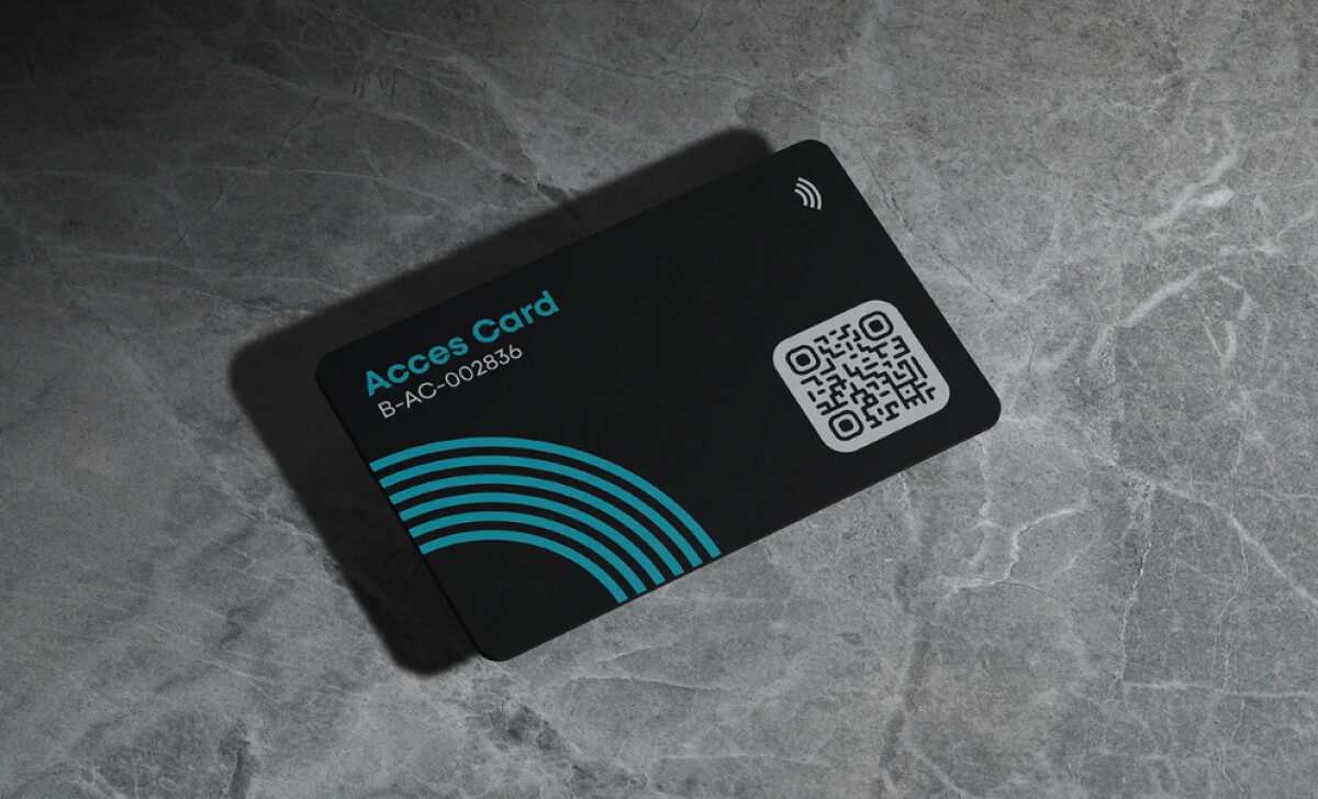
A standout element across Beco’s print materials is its distinctive arc motif, composed of concentric curves. Seen prominently on both the proposal cover and the access card, these arcs serve as a visual metaphor for signal flow, data waves, and connectivity — all core to smart home systems.
Featuring a scannable QR code and NFC symbol, the access card bridges physical interaction with the digital — perfectly embodying the Beco brand promise. The use of teal blue against a black matte background enhances legibility while reinforcing a sense of tech precision and innovation. This design doesn’t just look smart; it functions smart.
The Beco print design, conceptualized by Val-Or, presents a masterfully restrained yet intelligent visual identity. These designs prove that best technology print design can deliver both form and function, empowering brands in tech to communicate complex systems with clarity, consistency, and style.


