Standout Features:
- Modern geometric patterns
- Bold and cohesive typography
- Minimalist yet impactful color palette
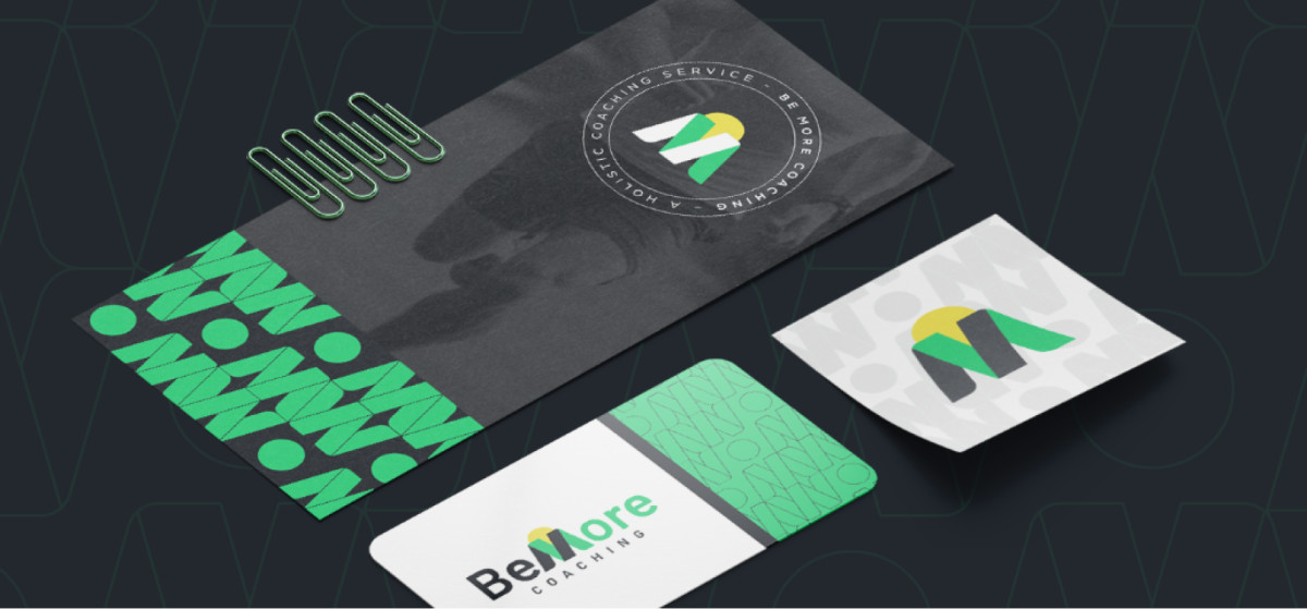
Crevo’s print design for BeMore Coaching perfectly encapsulates the brand's growth and holistic wellness values through an innovative and modern approach. The design merges sleek minimalism with bold elements, creating a professional and approachable identity.
One of the standout features is the geometric pattern design. Used consistently across various print materials, these patterns exude a sense of movement and energy, aligning with BeMore Coaching’s mission to inspire growth. The green hues within the pattern stand out vibrantly against the elegant background, establishing a balance between innovation and calm.
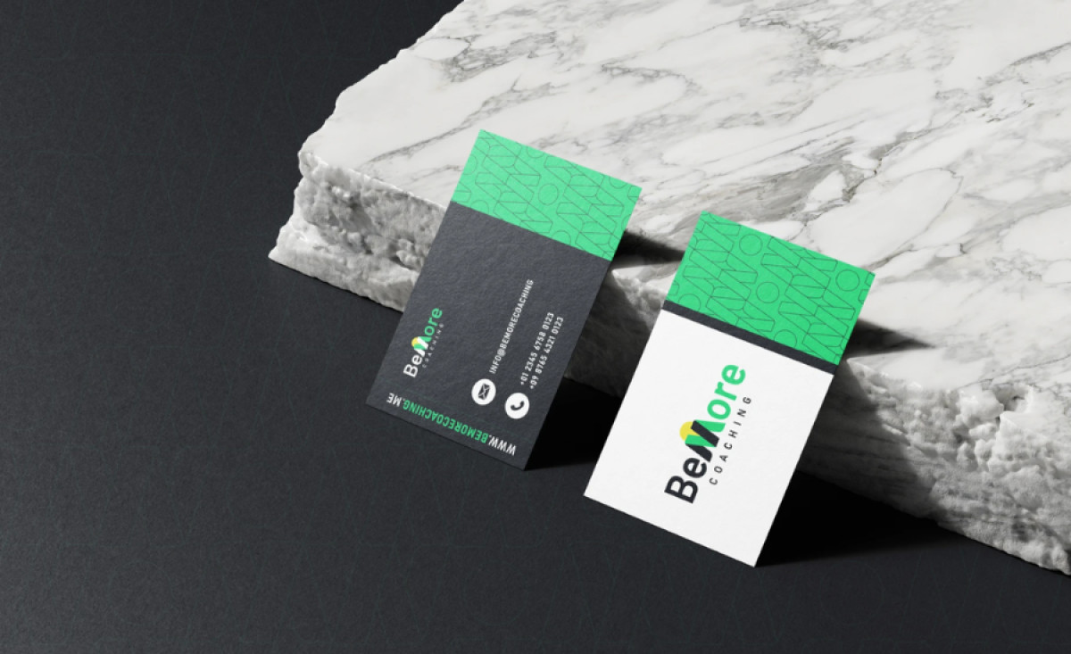
Furthermore, bold typography solidifies the brand identity. The typeface is modern yet accessible, featuring clean lines that enhance readability while conveying a sense of professionalism. The arrangement of the text on the business cards and letterheads ensures hierarchy and clarity, a crucial element in professional communication.
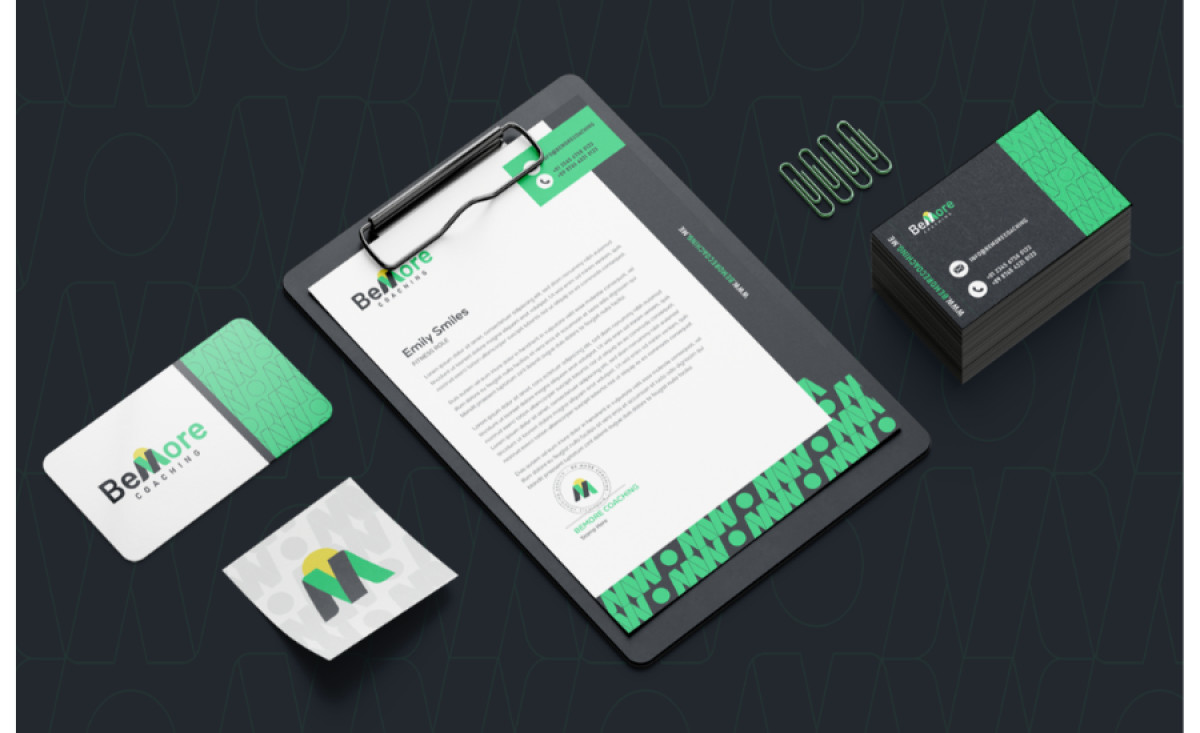
The minimalist color palette is another noteworthy aspect. The design’s primary use of green, white, and black creates a harmonious visual experience that communicates trust and positivity. The subtle incorporation of yellow in the logo adds a bright, optimistic accent, effectively highlighting the brand's forward-thinking ethos.
This health and wellness print design achieves a seamless blend of functionality and aesthetics. It not only serves its practical purposes but also strengthens BeMore Coaching’s brand identity, making it memorable and impactful in the competitive wellness industry.
-preview.jpg)